Correlação
Introdução à Estatística em R

Maggie Matsui
Content Developer, DataCamp
Relações entre duas variáveis
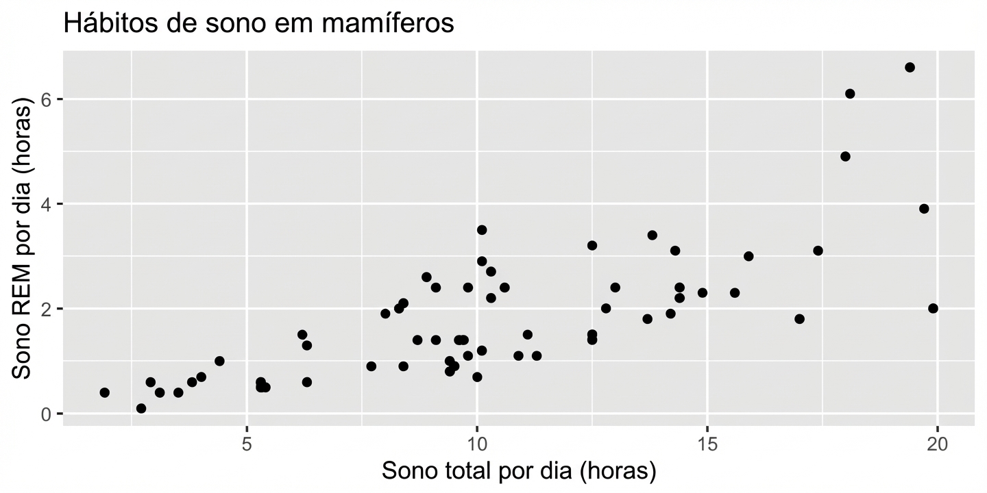
- x = variável explicativa/independente
- y = variável resposta/dependente
Magnitude = força da relação
0,99 (relação muito forte)
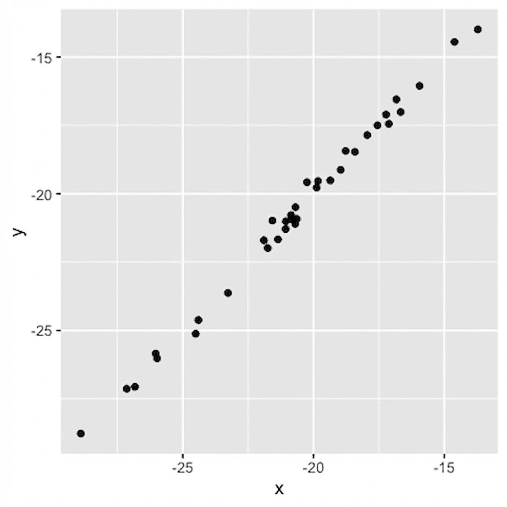
Magnitude = força da relação
0,99 (relação muito forte)
0,75 (relação forte)
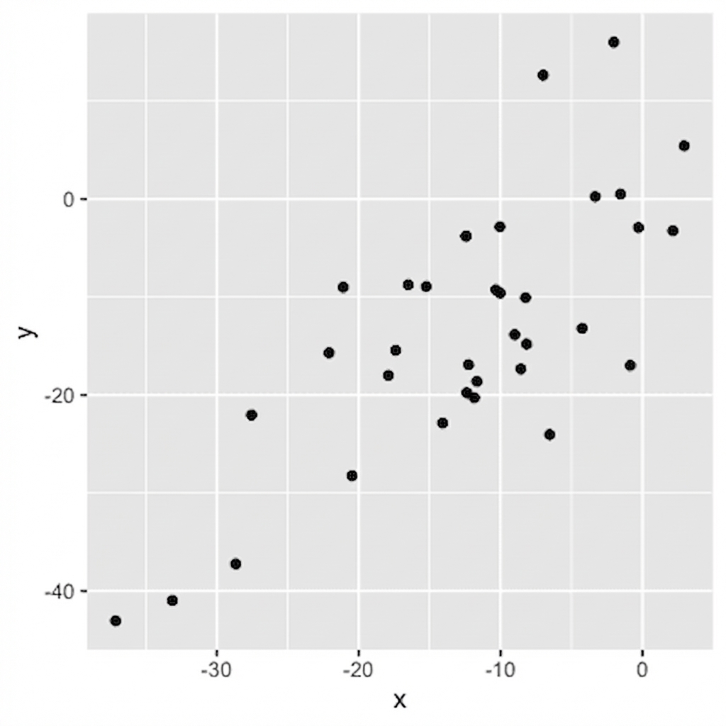
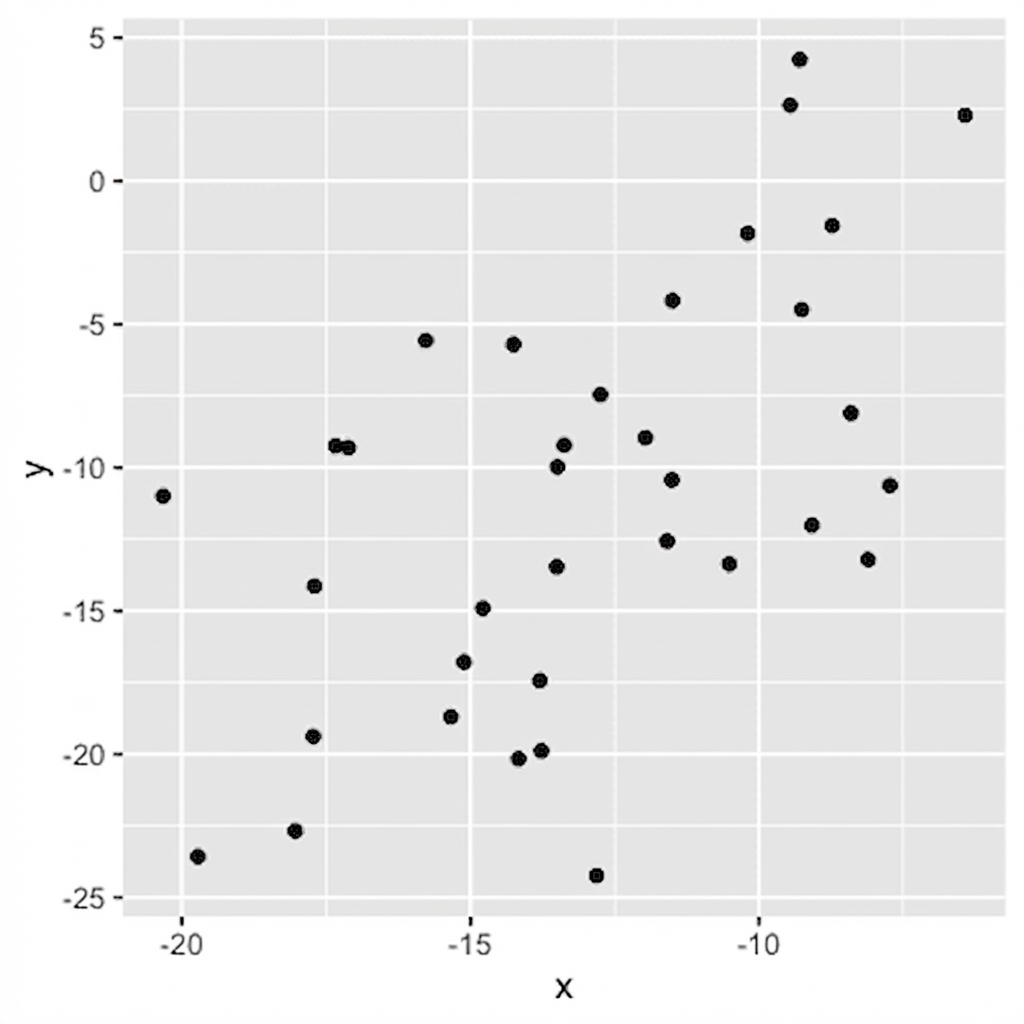
Magnitude = força da relação
0,56 (relação moderada)
Magnitude = força da relação
0,56 (relação moderada)
0,21 (relação fraca)
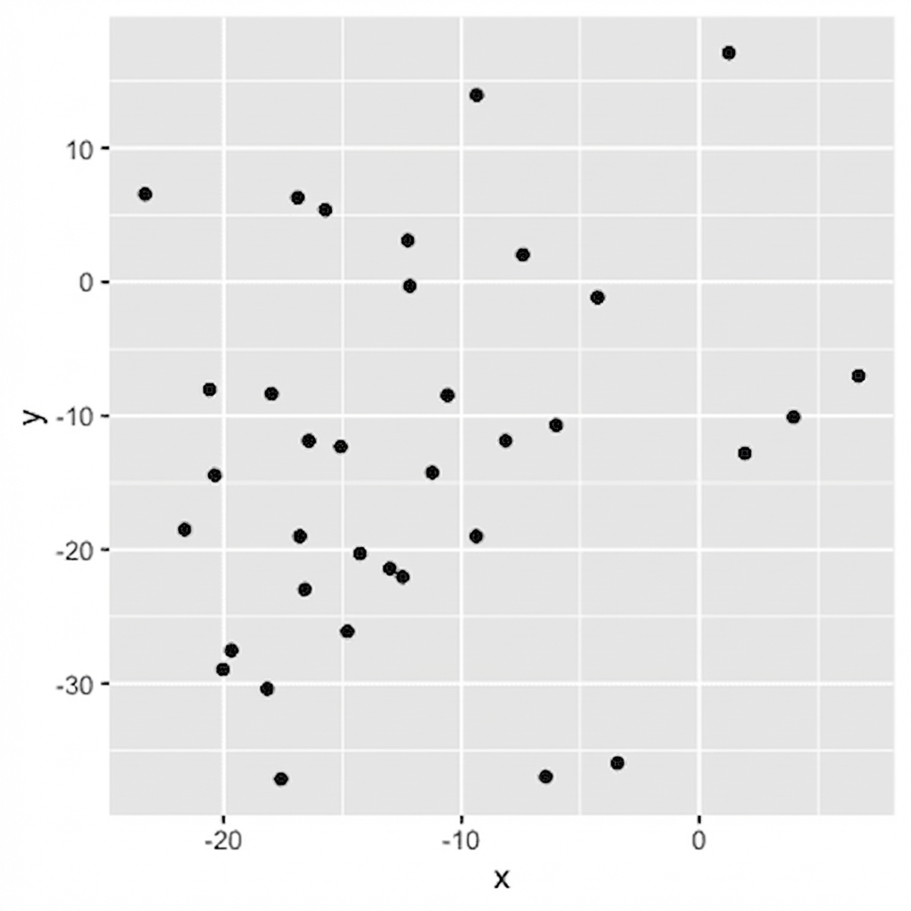
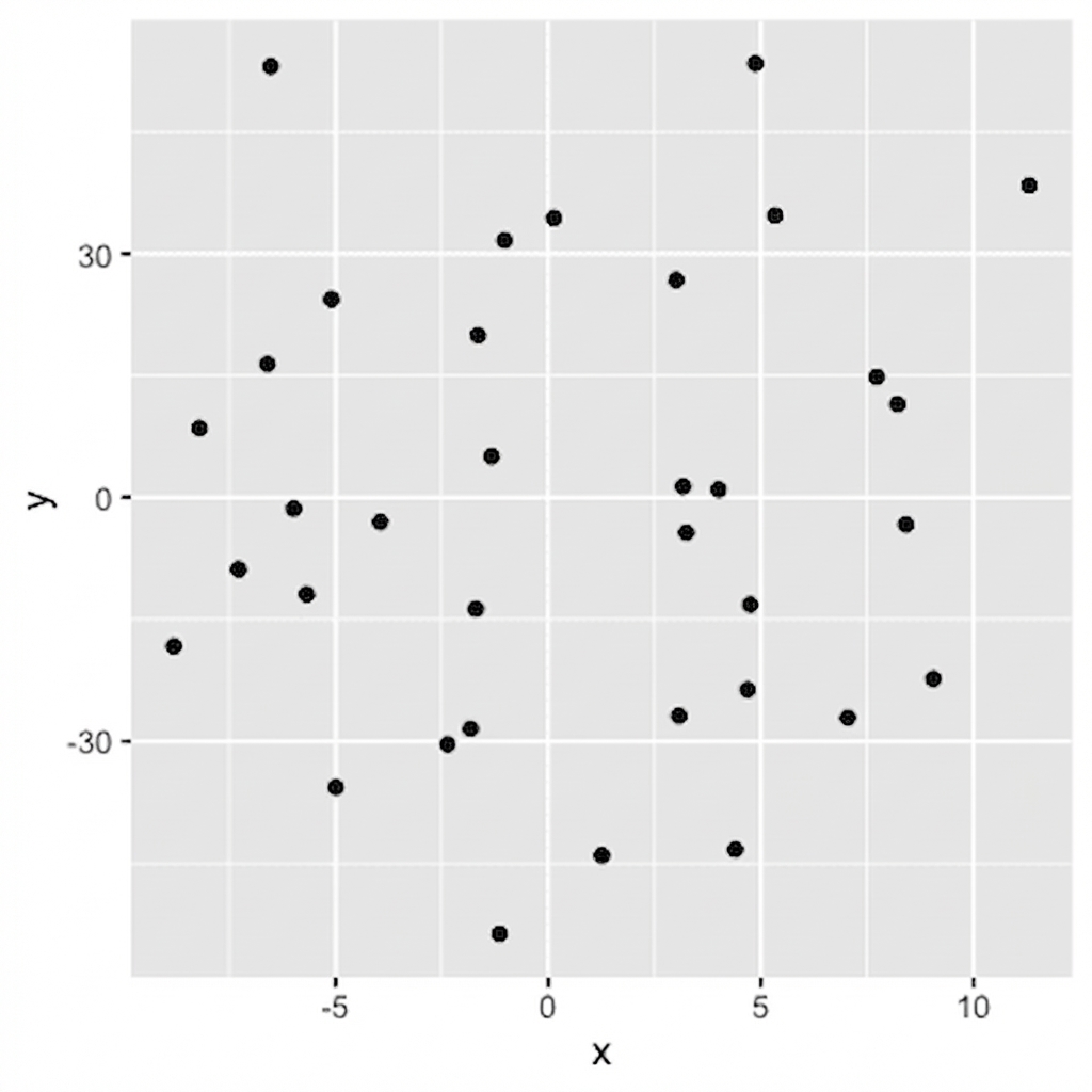
Magnitude = força da relação
0,04 (sem relação)
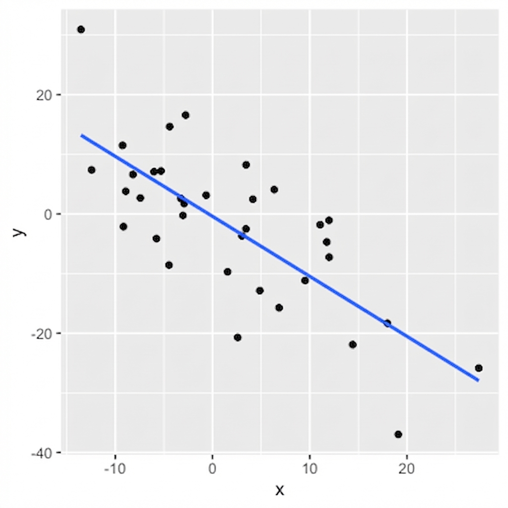
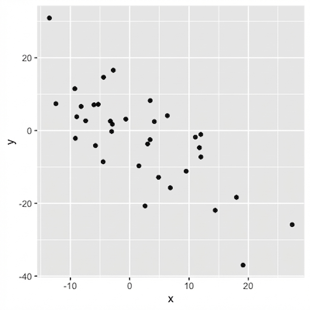
Sinal = direção
0,75: conforme x aumenta, y aumenta
-0,75: conforme x aumenta, y diminui
Visualizando relações
Adicionando uma linha de tendência