A arte da visualização de dados
Visualização de dados no Excel

Agata Bak-Geerinck
Senior Data Analyst, Telenet
Quando menos é mais

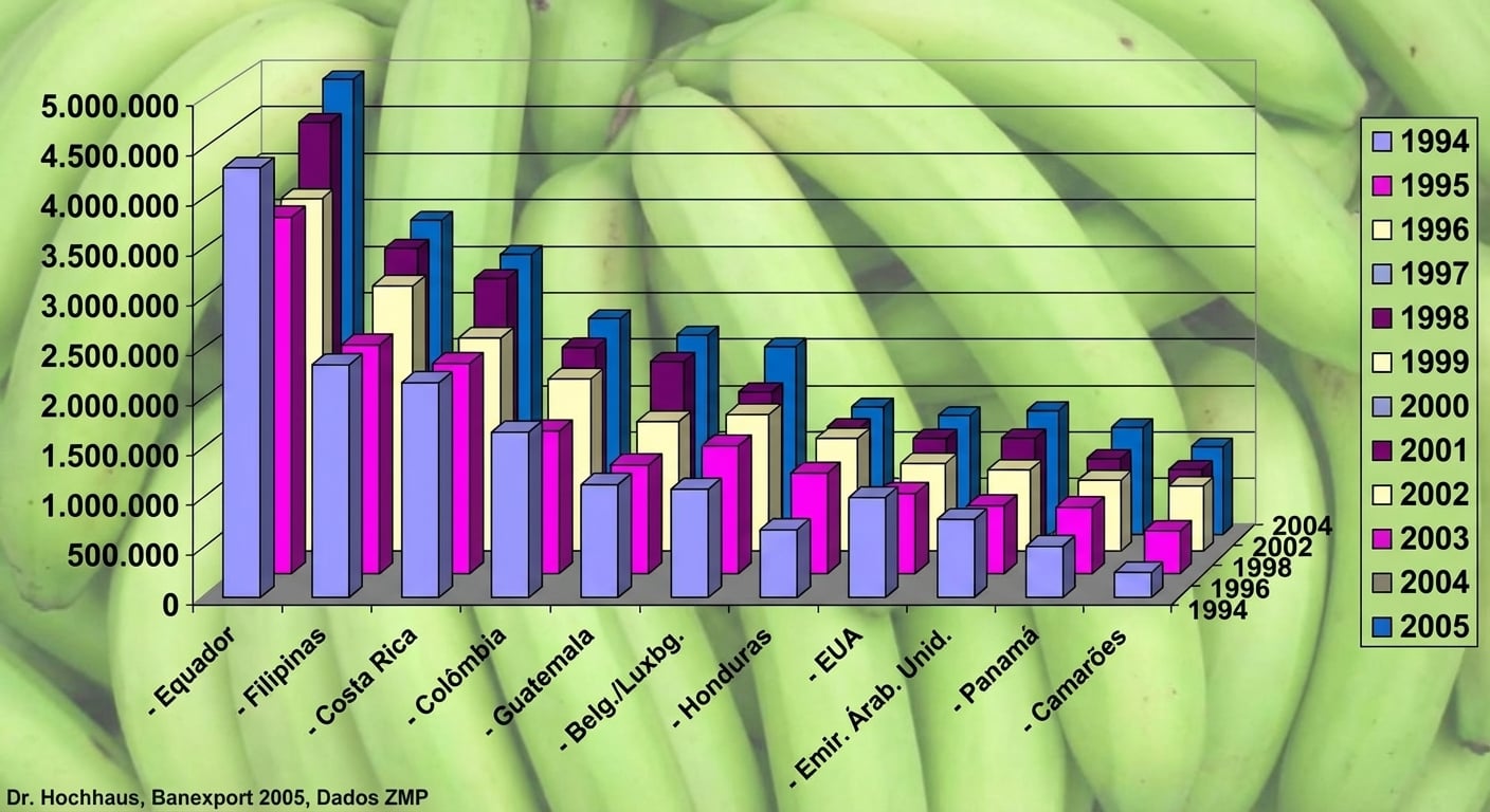
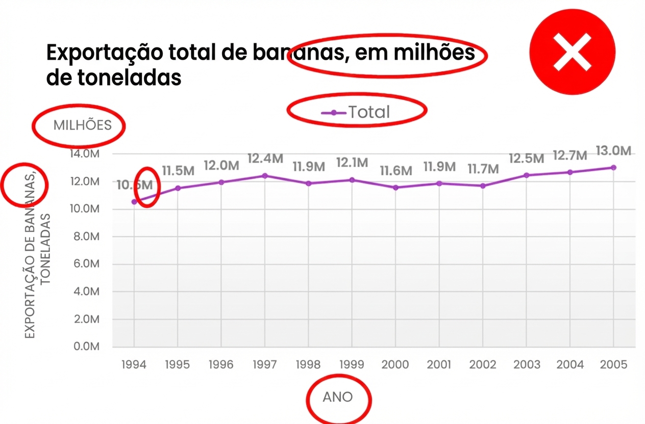
Exportação de bananas 1994–2005, versão 1
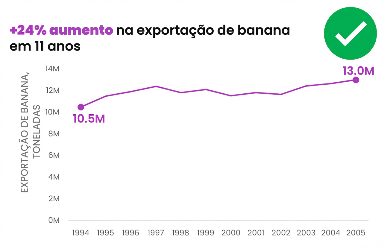
Exportação de bananas 1994–2005, versão 2
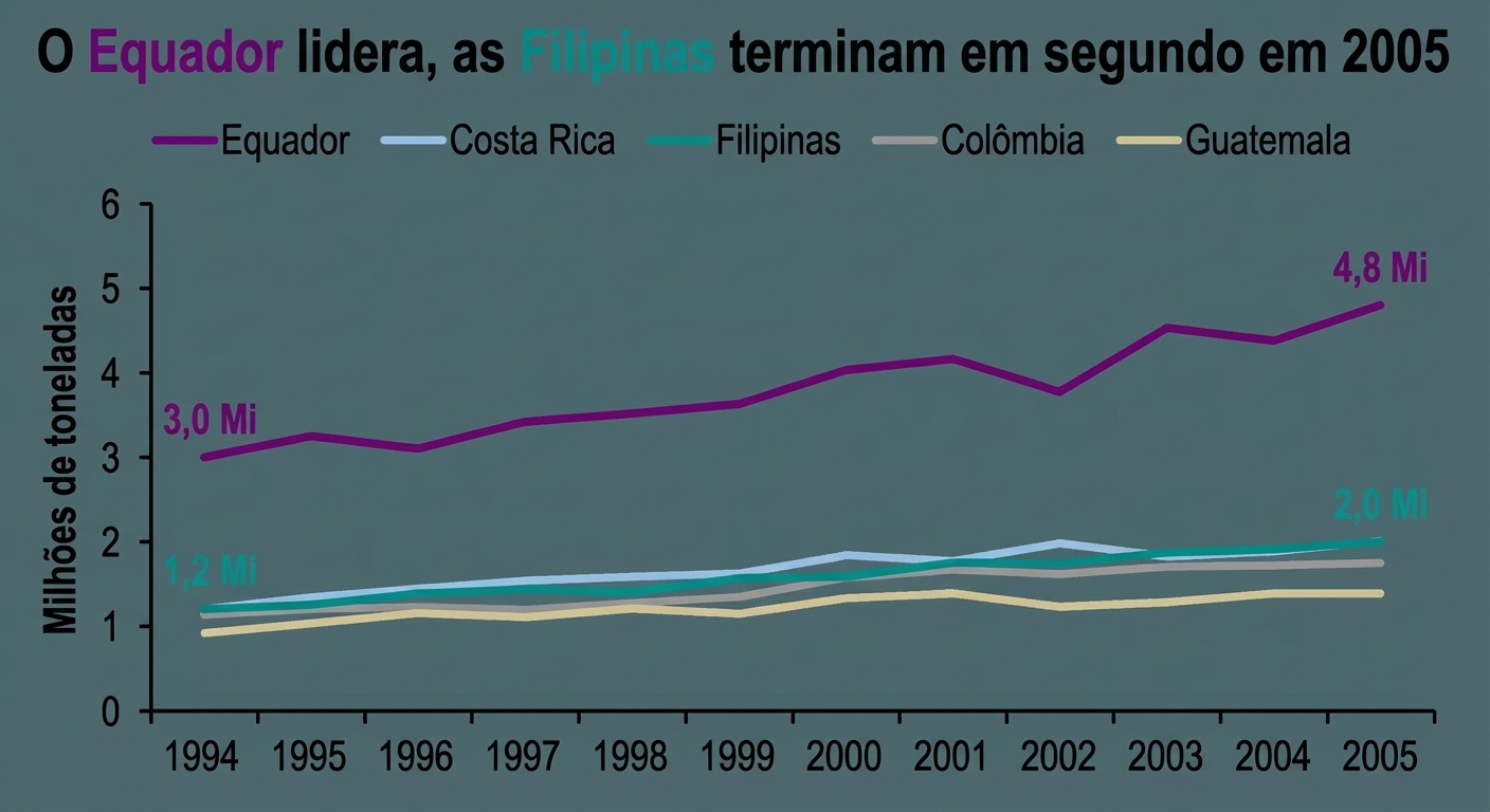
Duas dimensões OU três dimensões?
- Difícil ler os valores corretos
- Perspectiva distorce e confunde
- Fácil de interpretar
- Versátil e sem distrações
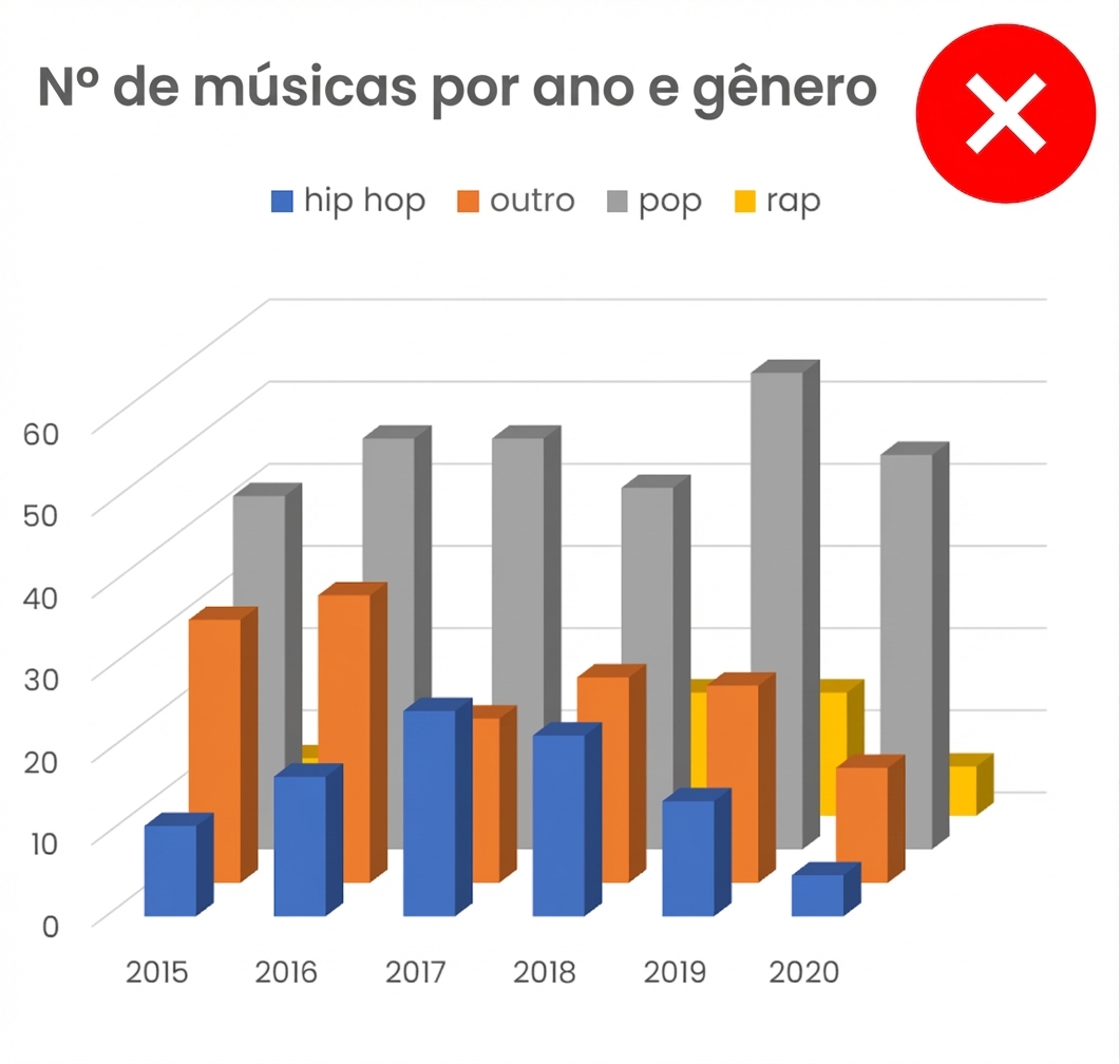
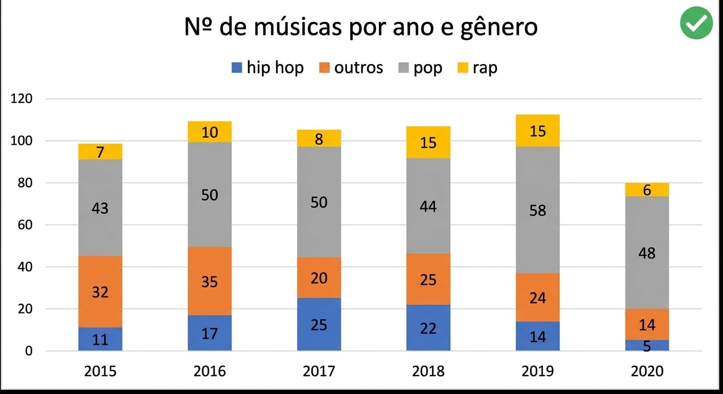
Rótulos, legendas e títulos
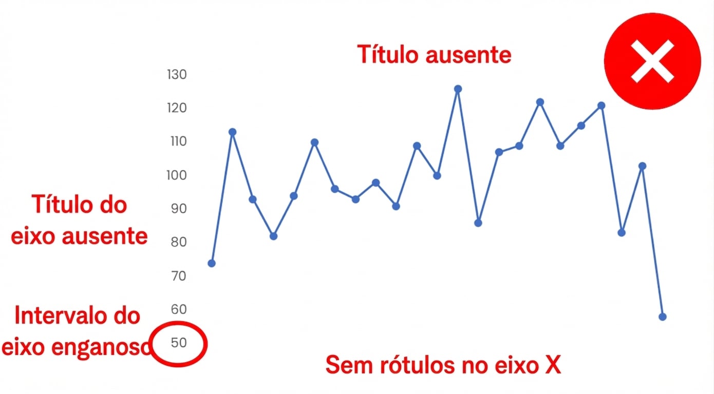
- Não é autoexplicativo
- Eixo não começa em
0e induz ao erro
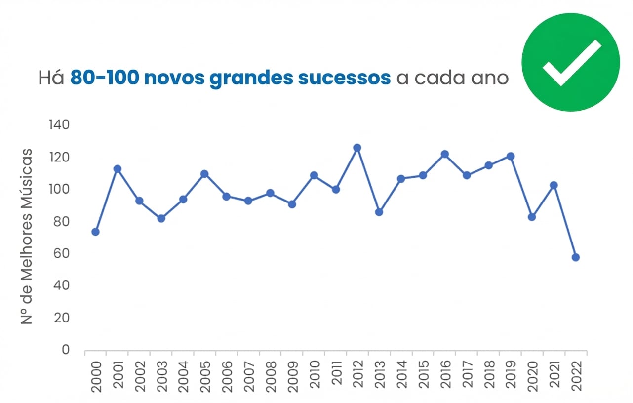
- Eixos, rótulos e título informativo claros
- Eixo Y começando em
0é boa prática
Cor: aliada ou inimiga?
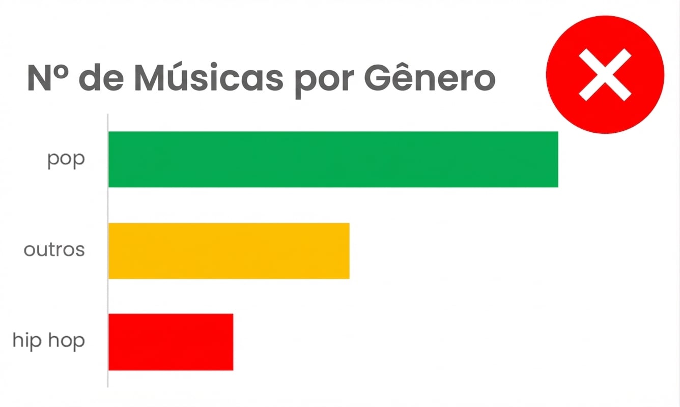
- Gráficos “arco-íris”: cores não agregam valor
- Evita usar vermelho/amarelo/verde em legendas categóricas
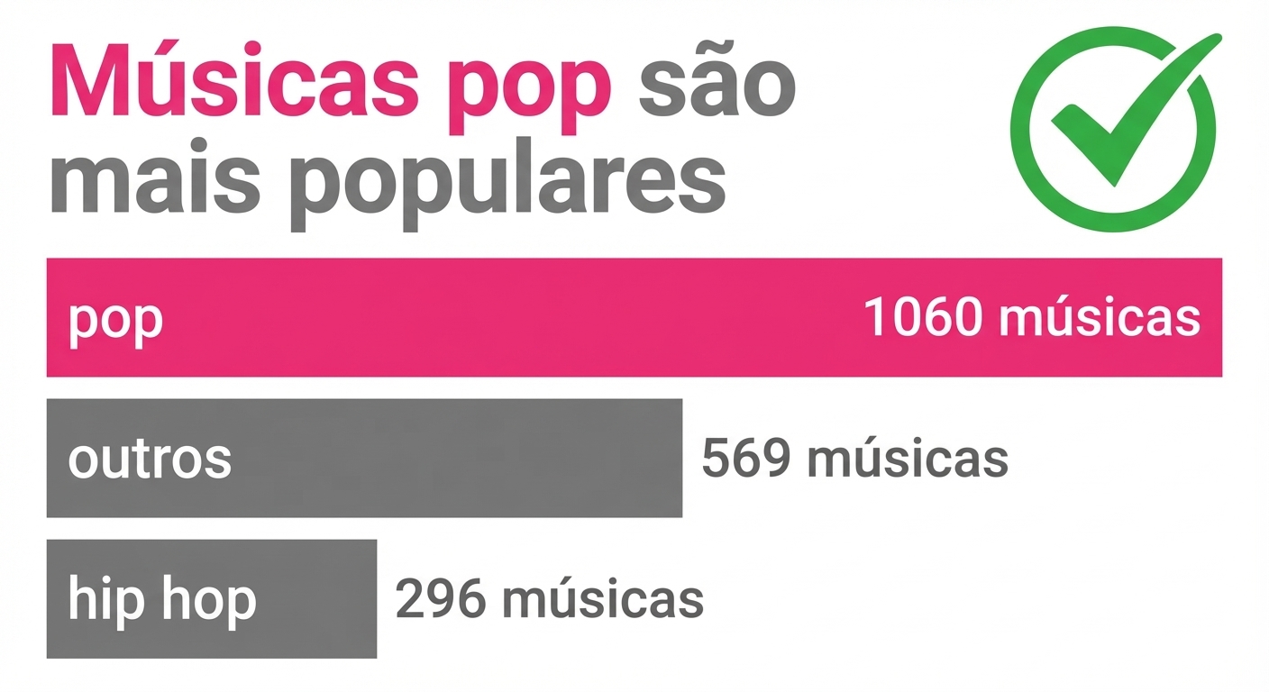
- Use cor para destacar um ponto de dado
- Repetir a cor no título reforça a mensagem
A Grande Faxina de Gráficos: eliminando a bagunça
- Eixos e títulos redundantes
- Legendas desnecessárias
- Avalie cada elemento do gráfico
- “Menos é mais”
Realçando a mensagem principal como um(a) pro

- Foque elementos-chave do gráfico
- Use título e cor para destacar a mensagem principal
- Rótulos só para ressaltar pontos principais
- Considere cinza/transparência para dados menos importantes
A arte perdida da “graficologia”: escolhendo o gráfico ideal

- Cada caso de uso pede um tipo de gráfico (ou dois)
- Teste até o gráfico ficar bom
- Considere variações do gráfico
- Busque inspiração:
- DataCamp data viz cheat sheet
- Blog e livro Storytelling with Data
1 https://www.datacamp.com/cheat-sheet/data-viz-cheat-sheet and https://www.storytellingwithdata.com/

