Regression Plots in Seaborn
Intermediate Data Visualization with Seaborn

Chris Moffitt
Instructor
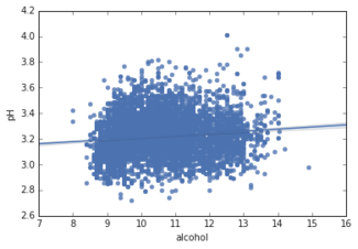
Introduction to regplot
- The
regplotfunction generates a scatter plot with a regression line - Usage is similar to the
displot - The
dataandxandyvariables must be defined
sns.regplot(data=df, x="alcohol", y="pH" )
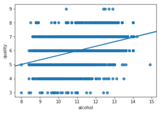
lmplot() builds on top of the base regplot()
regplot- low level
sns.regplot(data=df,
            x="alcohol",
            y="quality")
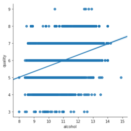
lmplot- high level
sns.lmplot(data=df,
           x="alcohol",
           y="quality")
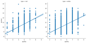
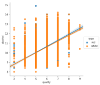
lmplot faceting
- Organize data by colors (
hue)
sns.lmplot(data=df,
           x="quality",
           y="alcohol",
           hue="type")
- Organize data by columns (
col)
sns.lmplot(data=df,
           x="quality",
           y="alcohol",
           col="type")