EDA com variáveis categóricas
Análise Exploratória de Dados no Power BI

Maarten Van den Broeck
Content Developer at DataCamp
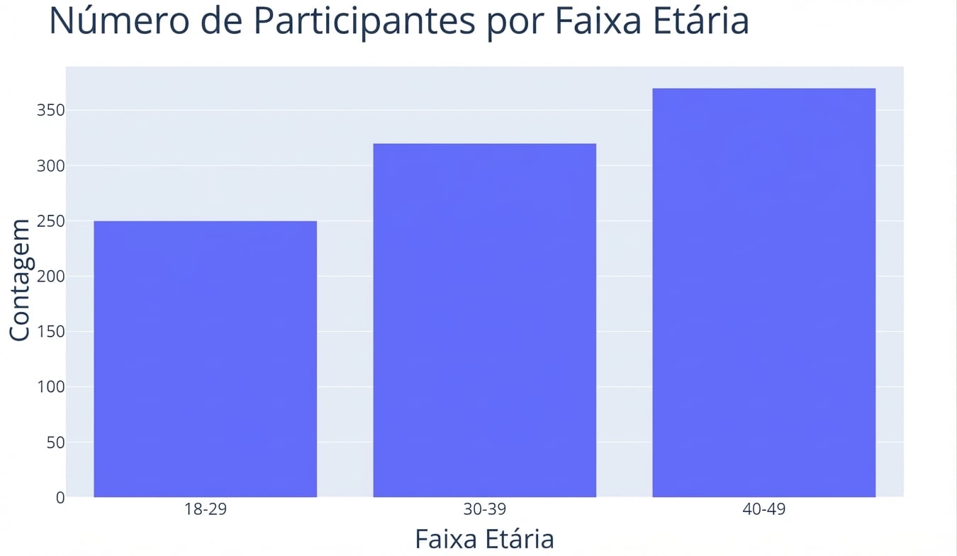
Variáveis categóricas e frequência
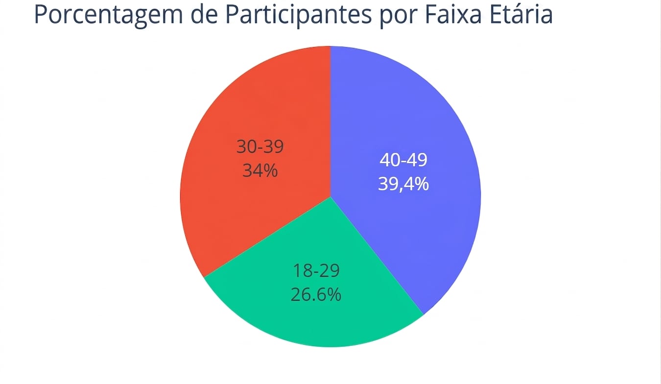
Variáveis categóricas e porcentagens
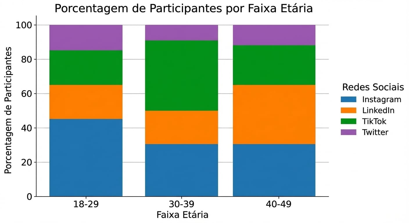
Proporções em múltiplas variáveis categóricas
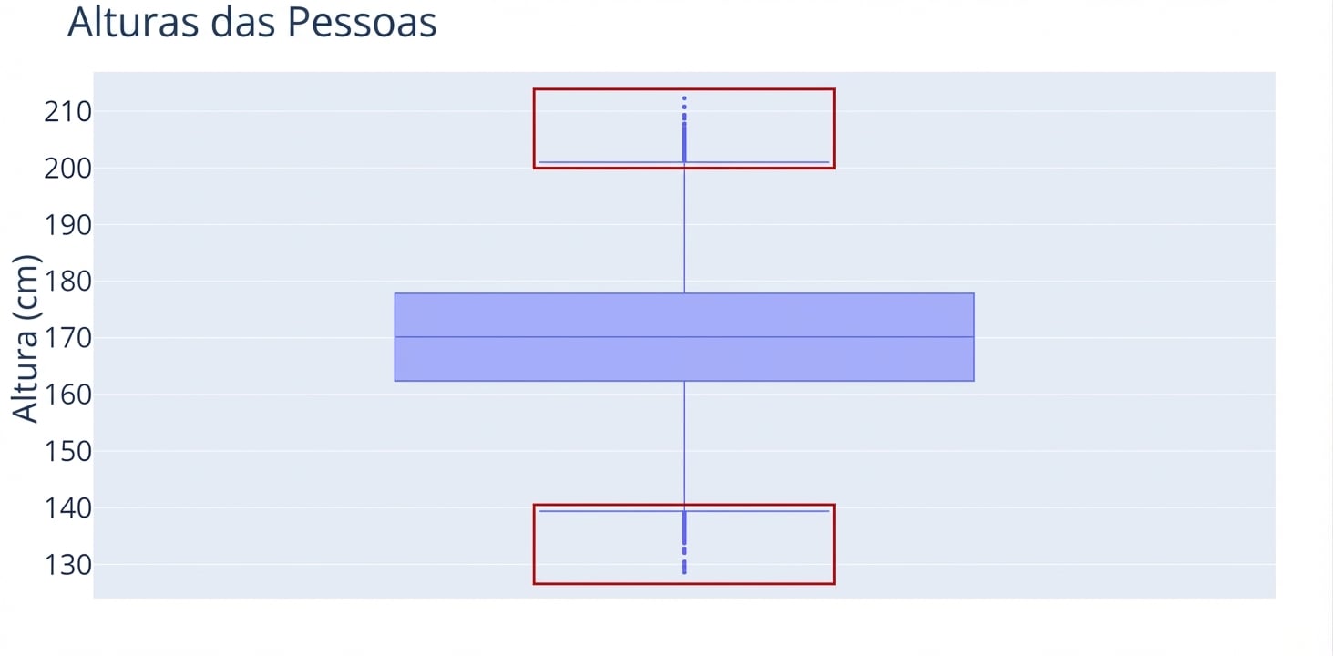
O que são boxplots?
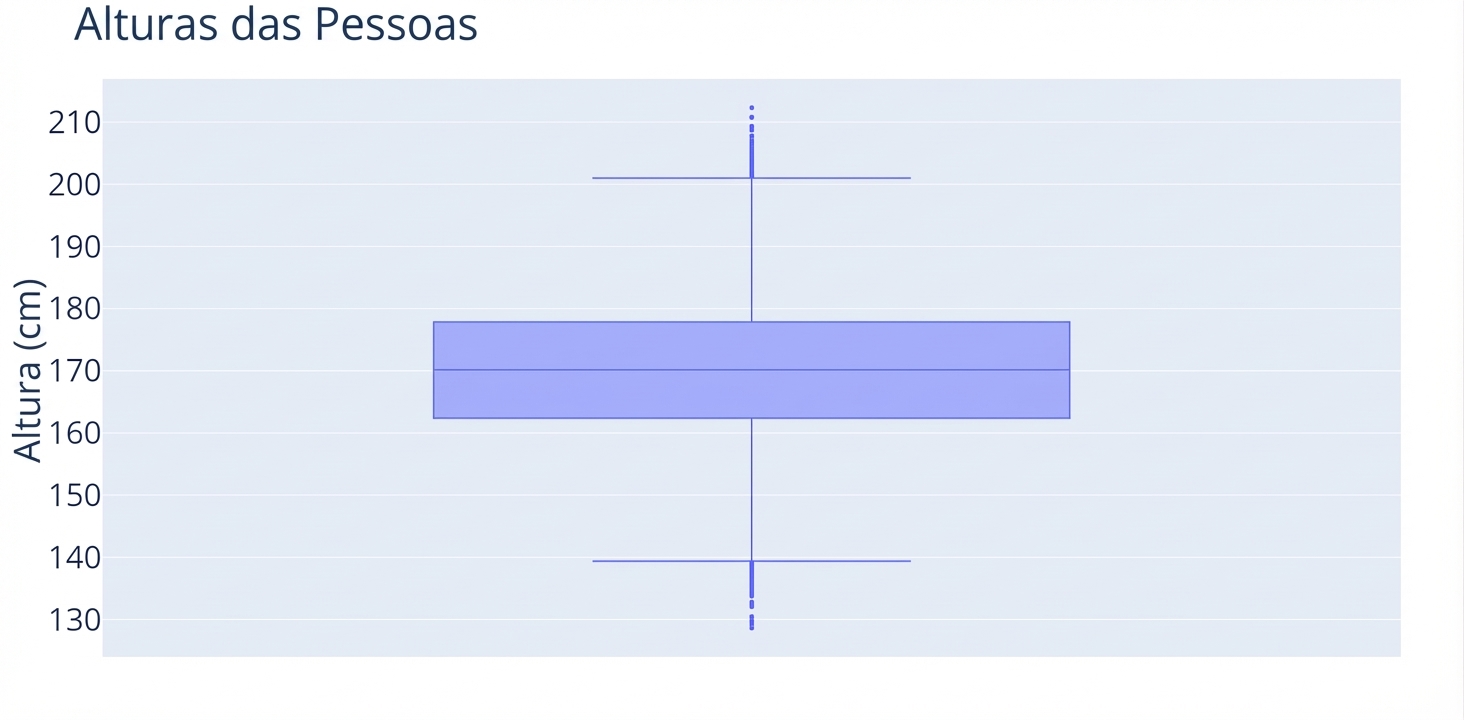
O que são boxplots?
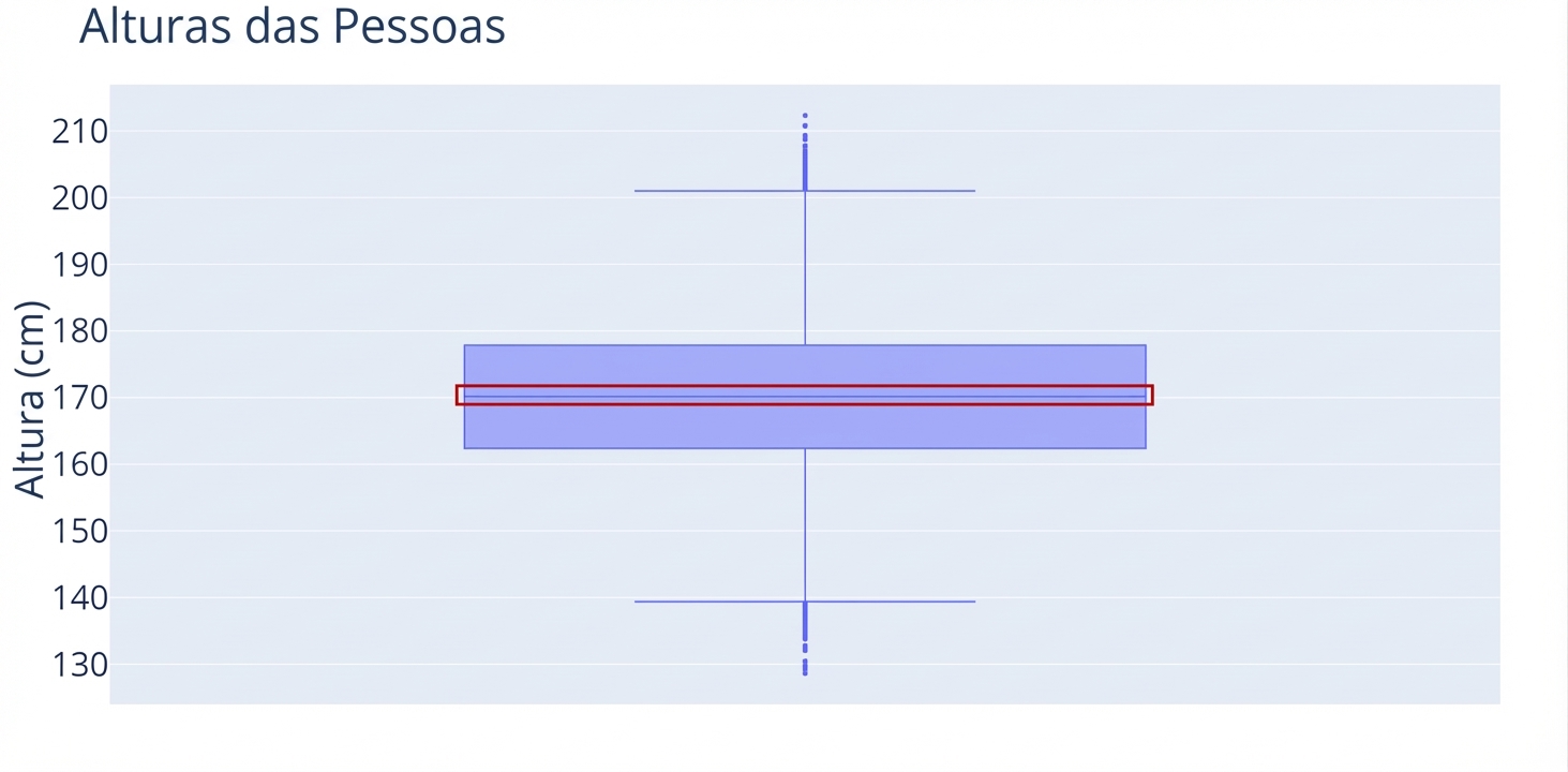
O que são boxplots?
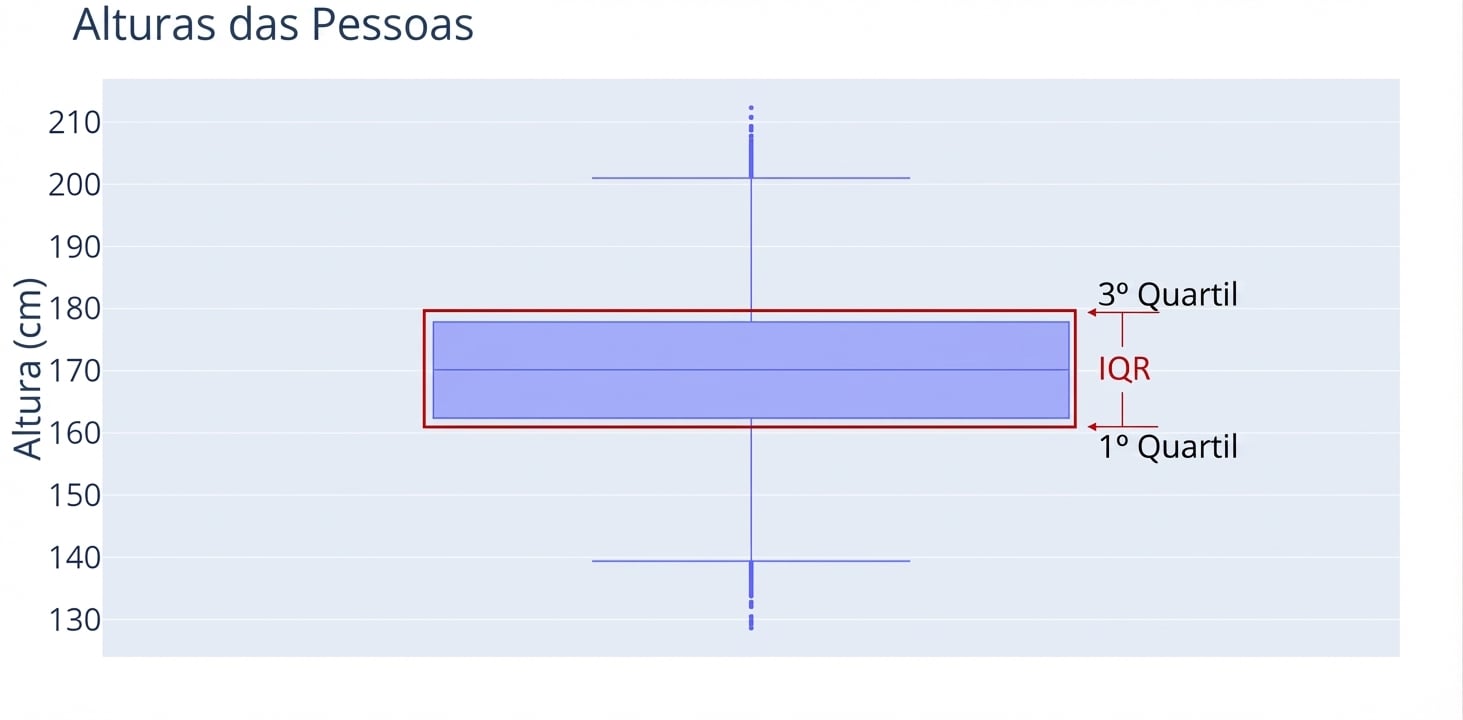
O que são boxplots?
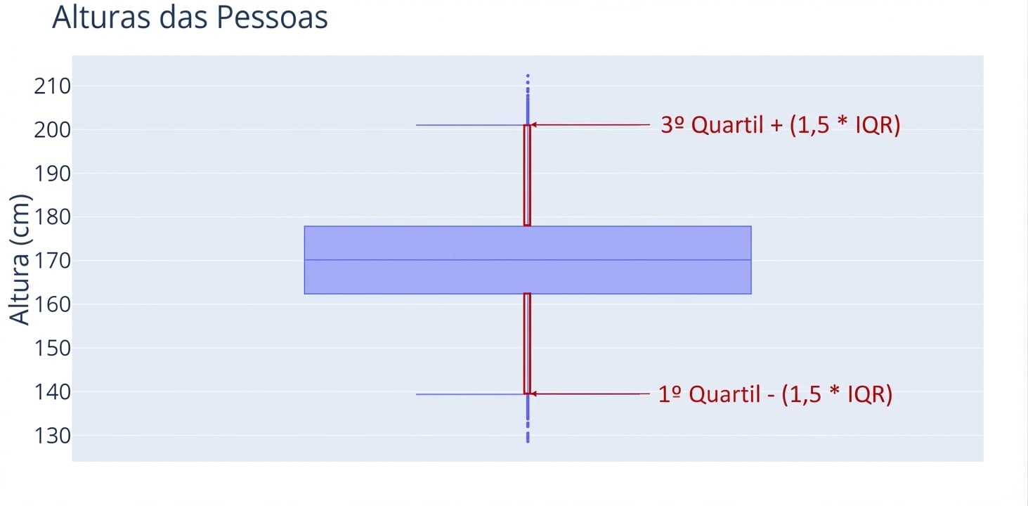
O que são boxplots?
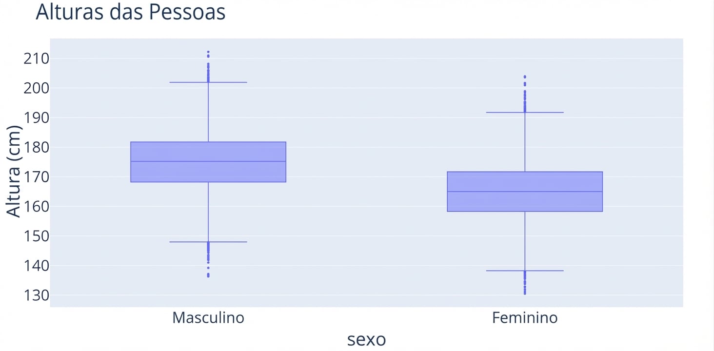
Comparando distribuições com variáveis categóricas