Cenário de uso: heatmaps
Visualização de Dados Intermediária com ggplot2

Rick Scavetta
Founder, Scavetta Academy
Heatmap básico
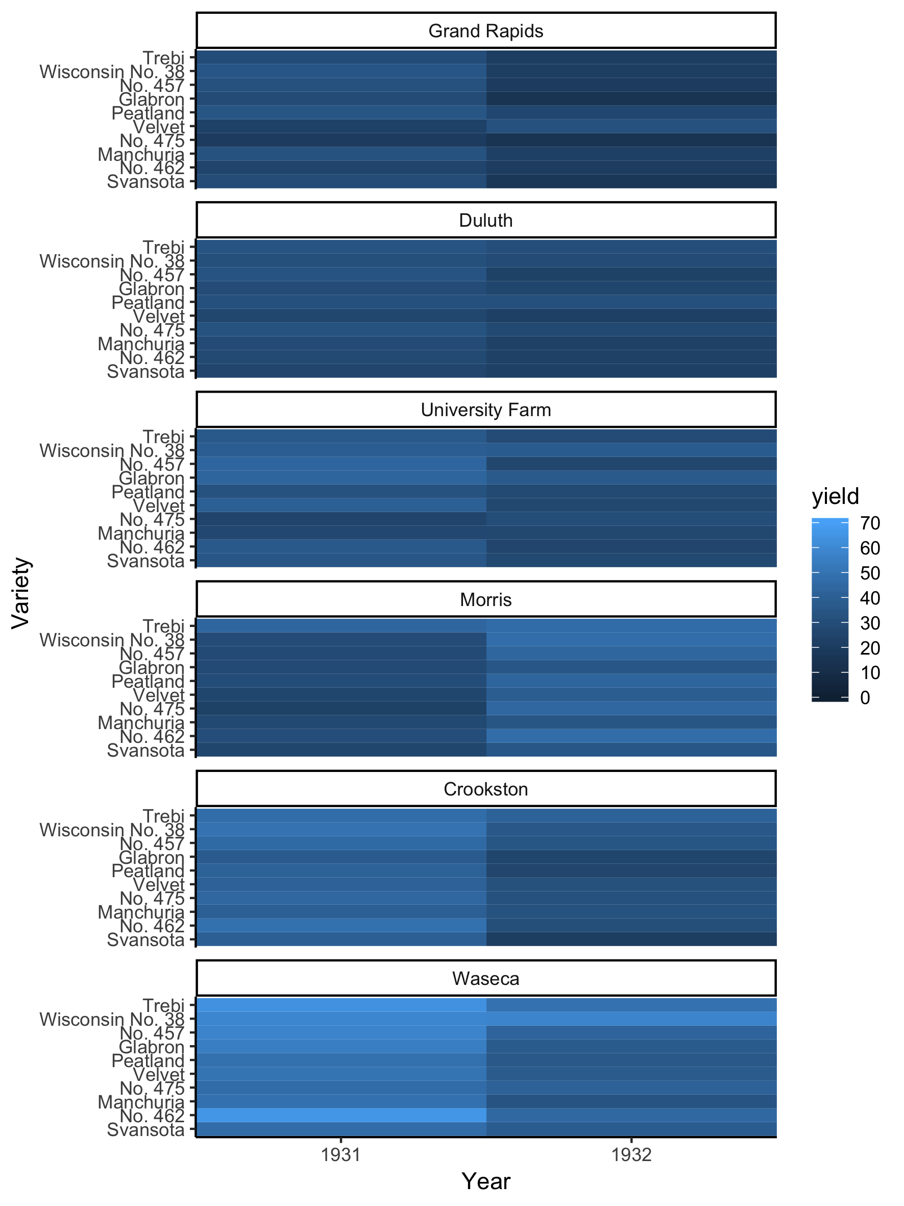
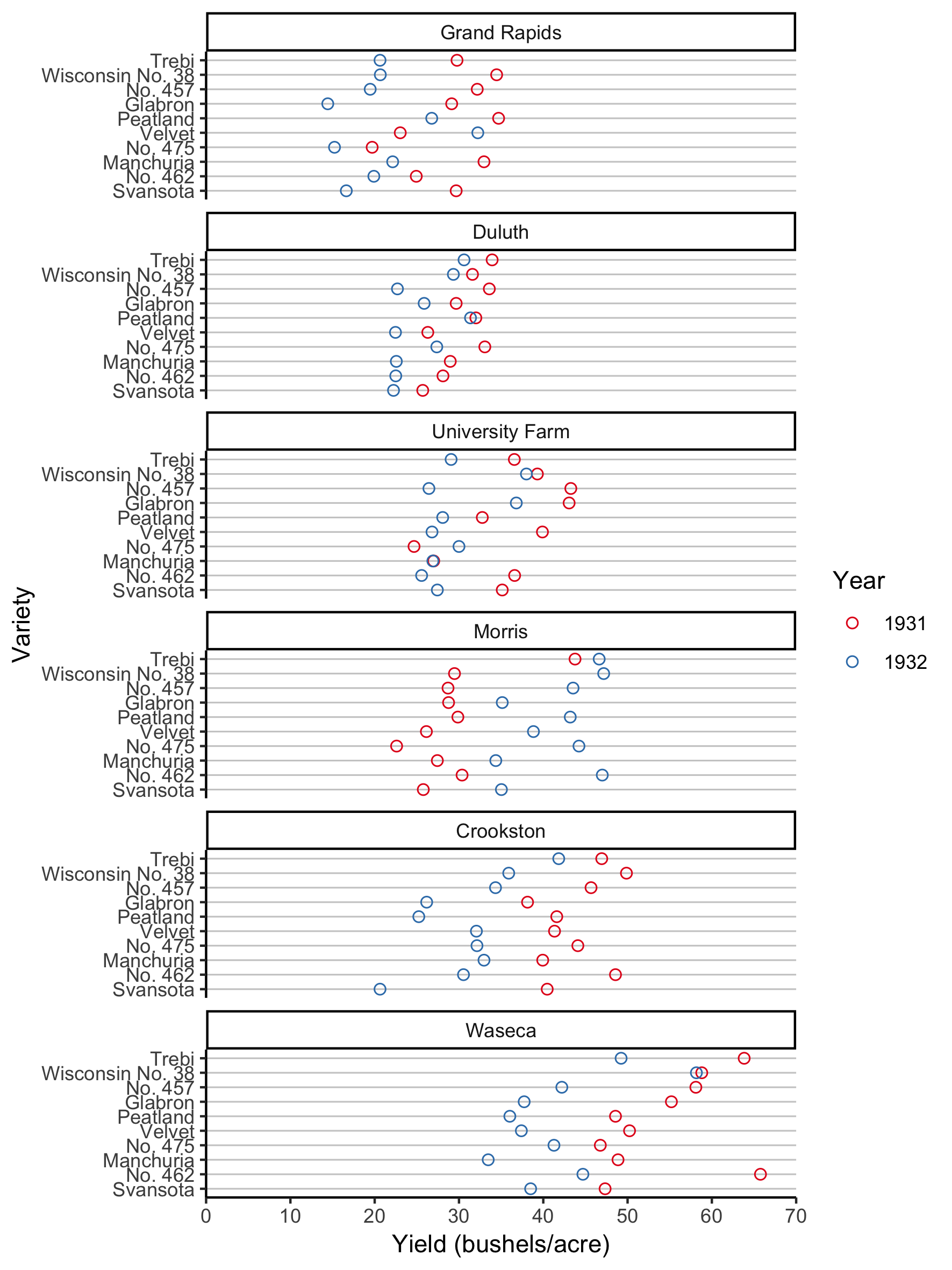
Gráfico de pontos
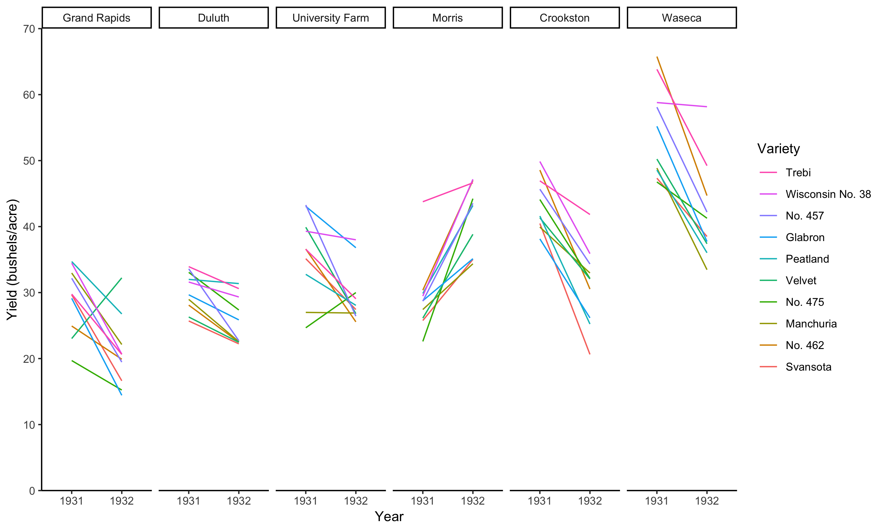
Como série temporal
Usando barras de erro lado a lado
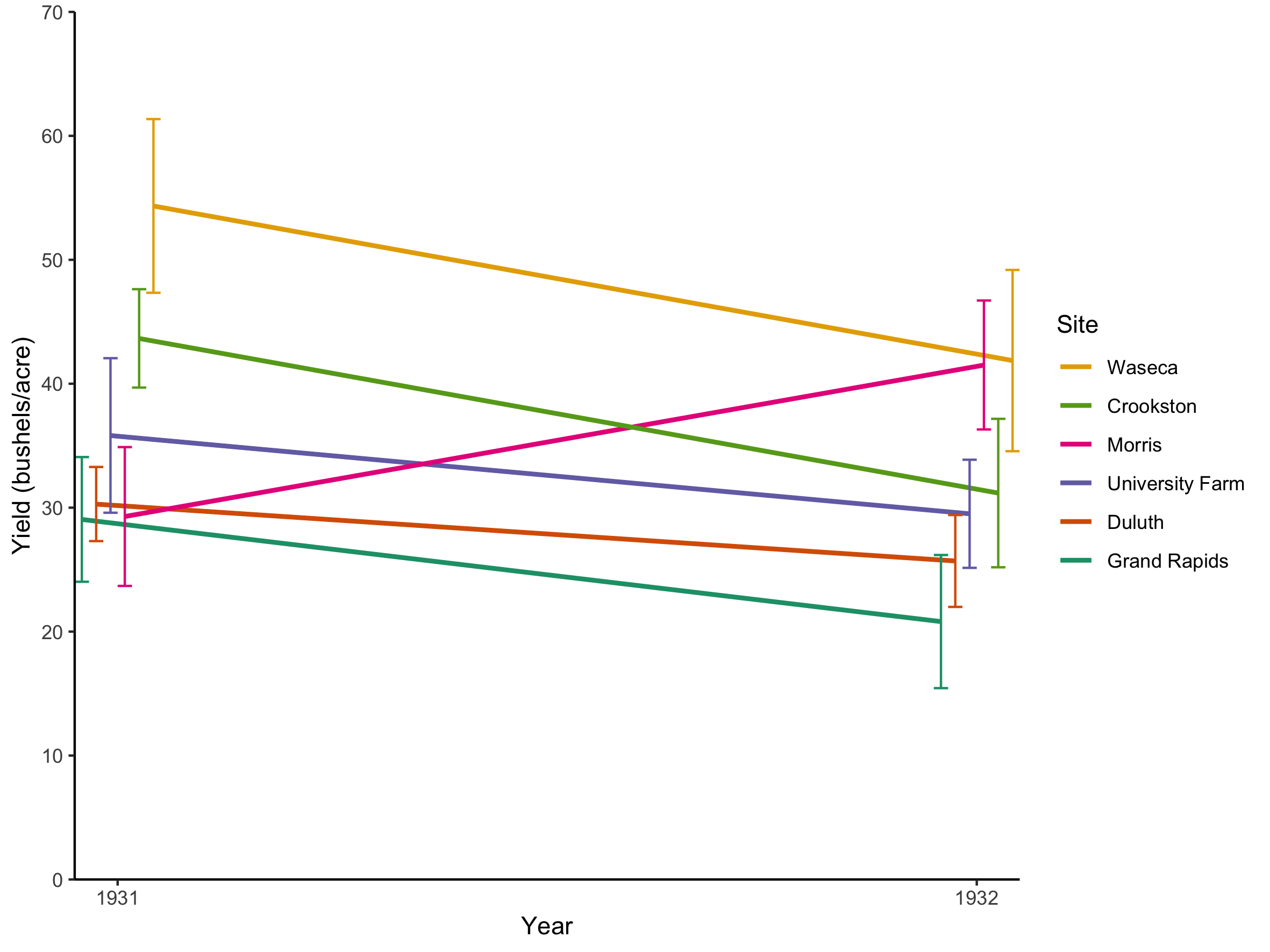
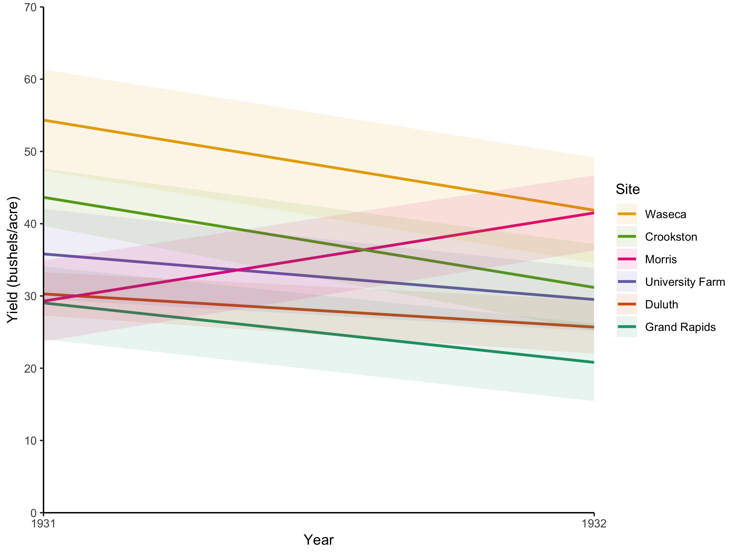
Usando faixas para erro
Visualização de Dados Intermediária com ggplot2
Rick Scavetta
Founder, Scavetta Academy

