Personalização de gráficos de dispersão
Introdução à Visualização de Dados com o Seaborn

Content Team
DataCamp
Subgrupos com tamanho de pontos

1 Waskom, M. L. (2021). seaborn: statistical data visualization. https://seaborn.pydata.org/
Tamanho do ponto e hue

1 Waskom, M. L. (2021). seaborn: statistical data visualization. https://seaborn.pydata.org/
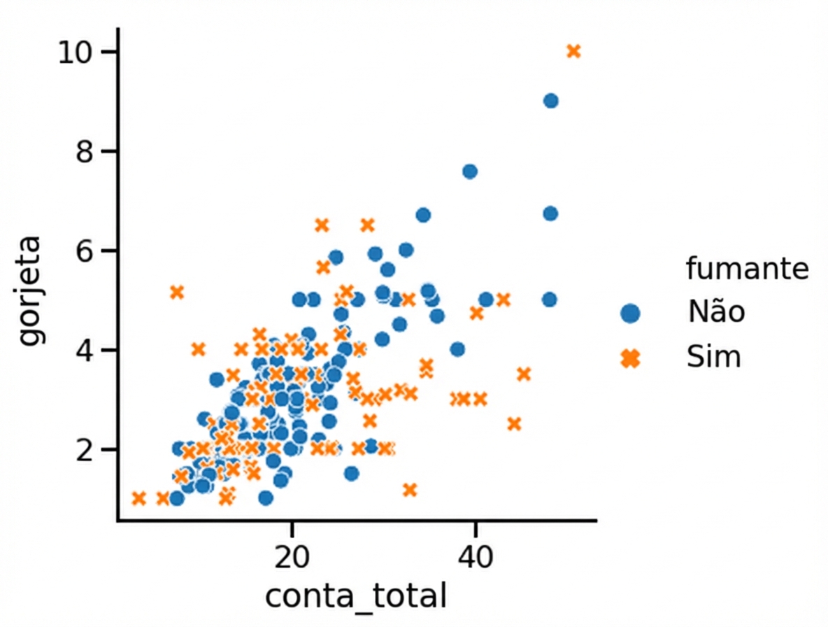
Subgrupos com estilo de pontos
1 Waskom, M. L. (2021). seaborn: statistical data visualization. https://seaborn.pydata.org/
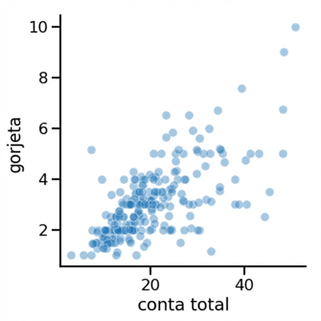
Como mudar a transparência dos pontos
1 Waskom, M. L. (2021). seaborn: statistical data visualization. https://seaborn.pydata.org/

