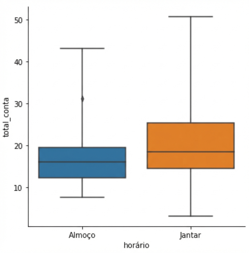
Criando um box plot
Introdução à Visualização de Dados com o Seaborn

Content Team
DataCamp
O que é um box plot?
1 Waskom, M. L. (2021). seaborn: visualização estatística de dados. https://seaborn.pydata.org/
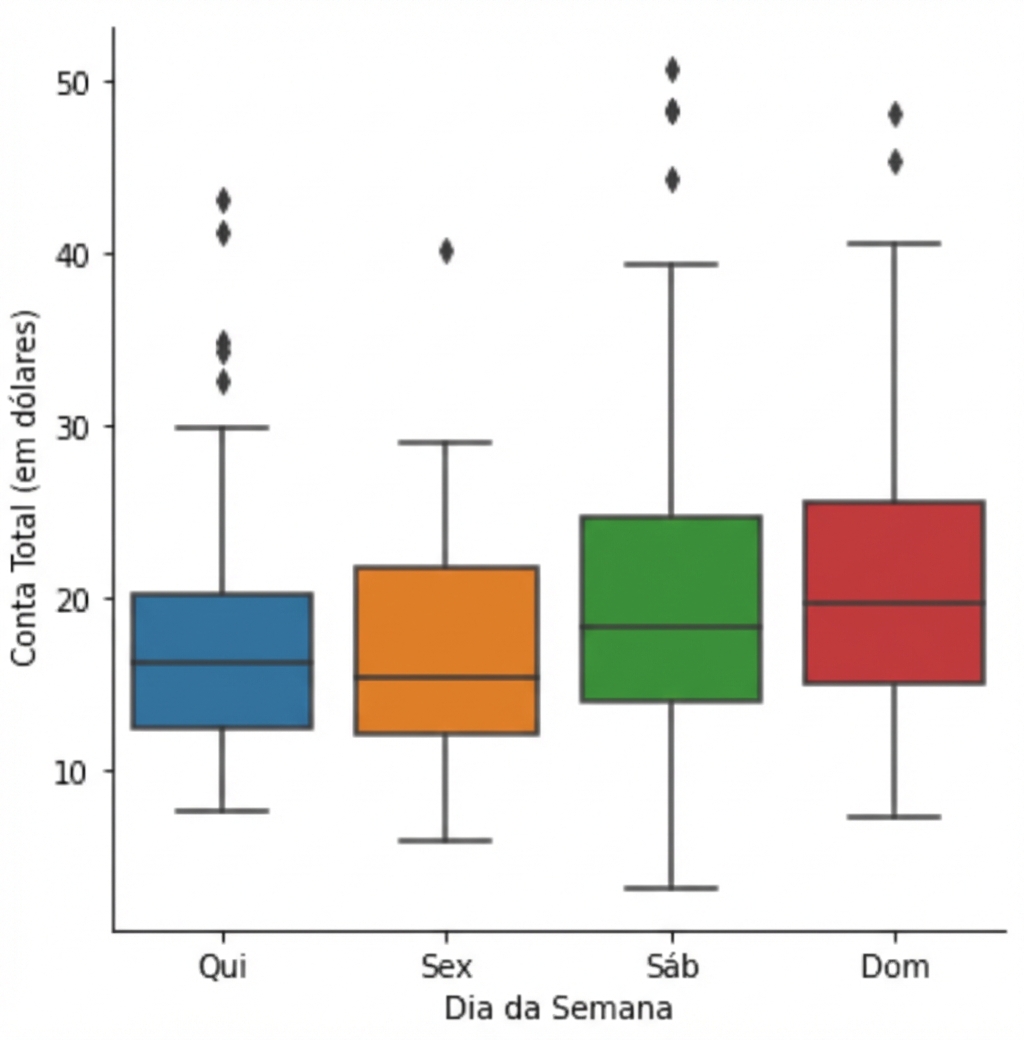
Como criar um box plot
1 Waskom, M. L. (2021). seaborn: visualização estatística de dados. https://seaborn.pydata.org/
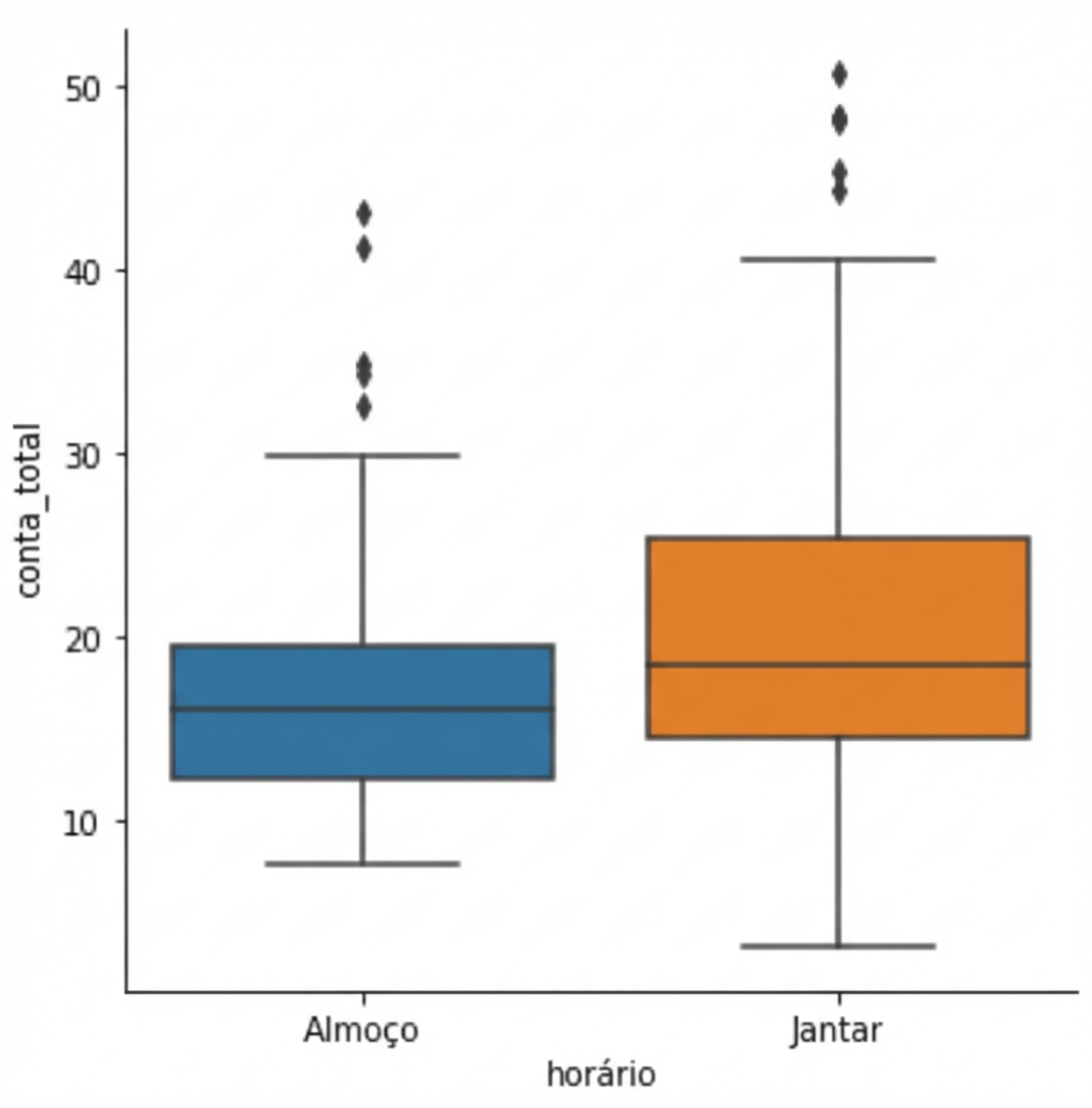
Mudar a ordem das categorias
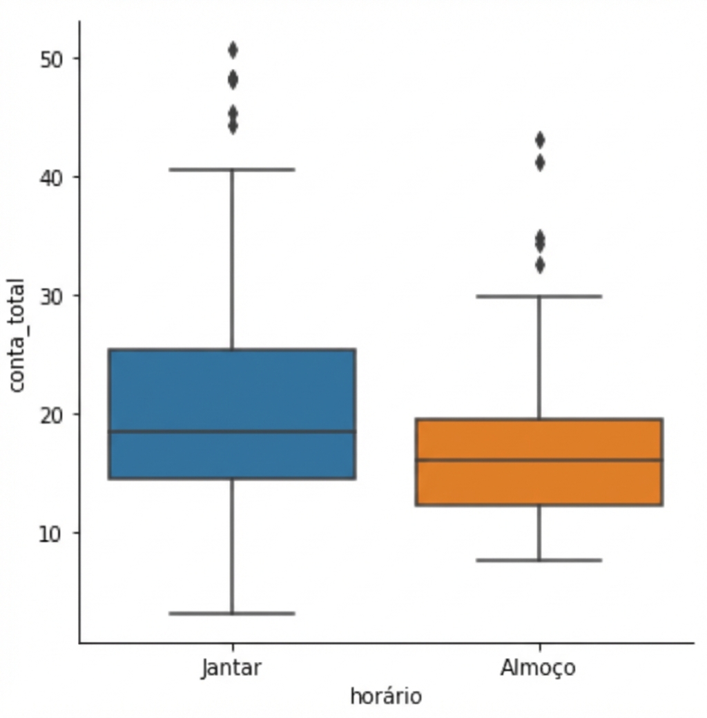
1 Waskom, M. L. (2021). seaborn: visualização estatística de dados. https://seaborn.pydata.org/
Omitindo os outliers
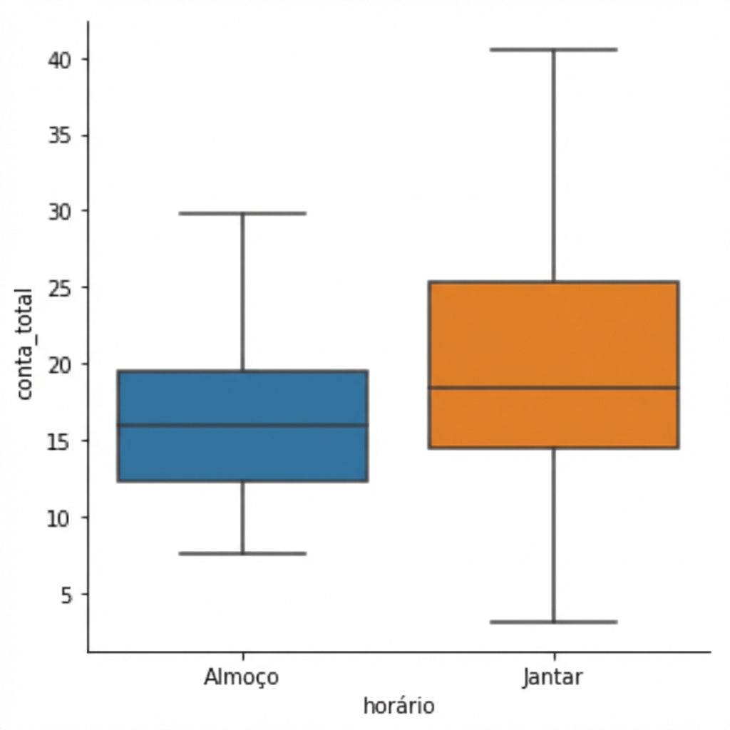
1 Waskom, M. L. (2021). seaborn: visualização estatística de dados. https://seaborn.pydata.org/
Alterando os bigodes com `whis`
1 Waskom, M. L. (2021). seaborn: visualização estatística de dados. https://seaborn.pydata.org/

