Como alterar o estilo e a cor do gráfico
Introdução à Visualização de Dados com o Seaborn

Content Team
DataCamp
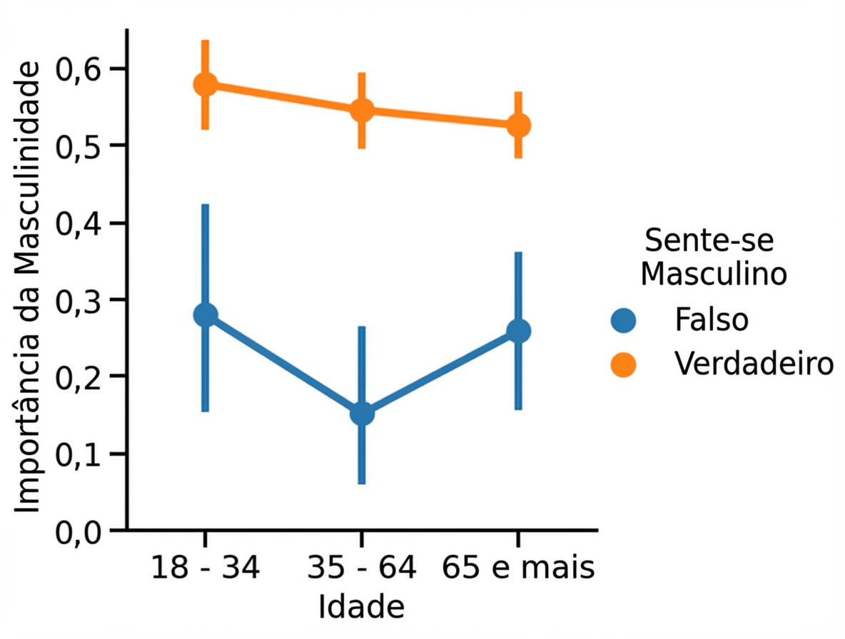
Estilo padrão da figura (“white”)
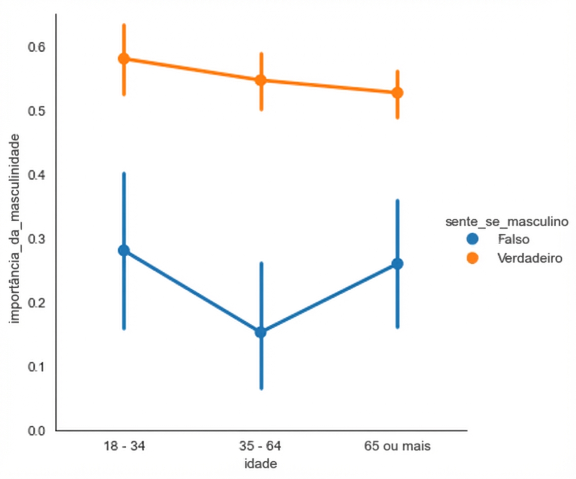
Estilo da figura: “whitegrid”
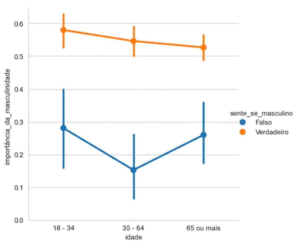
Outros estilos
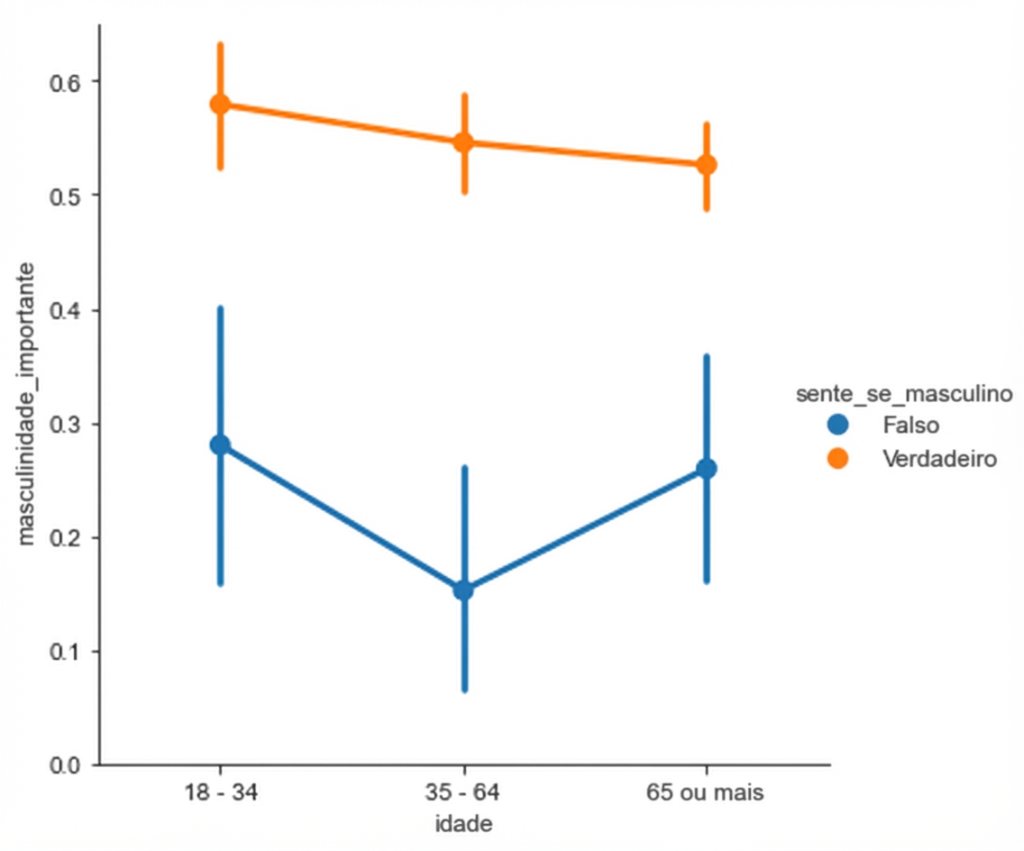
Outros estilos
Outros estilos
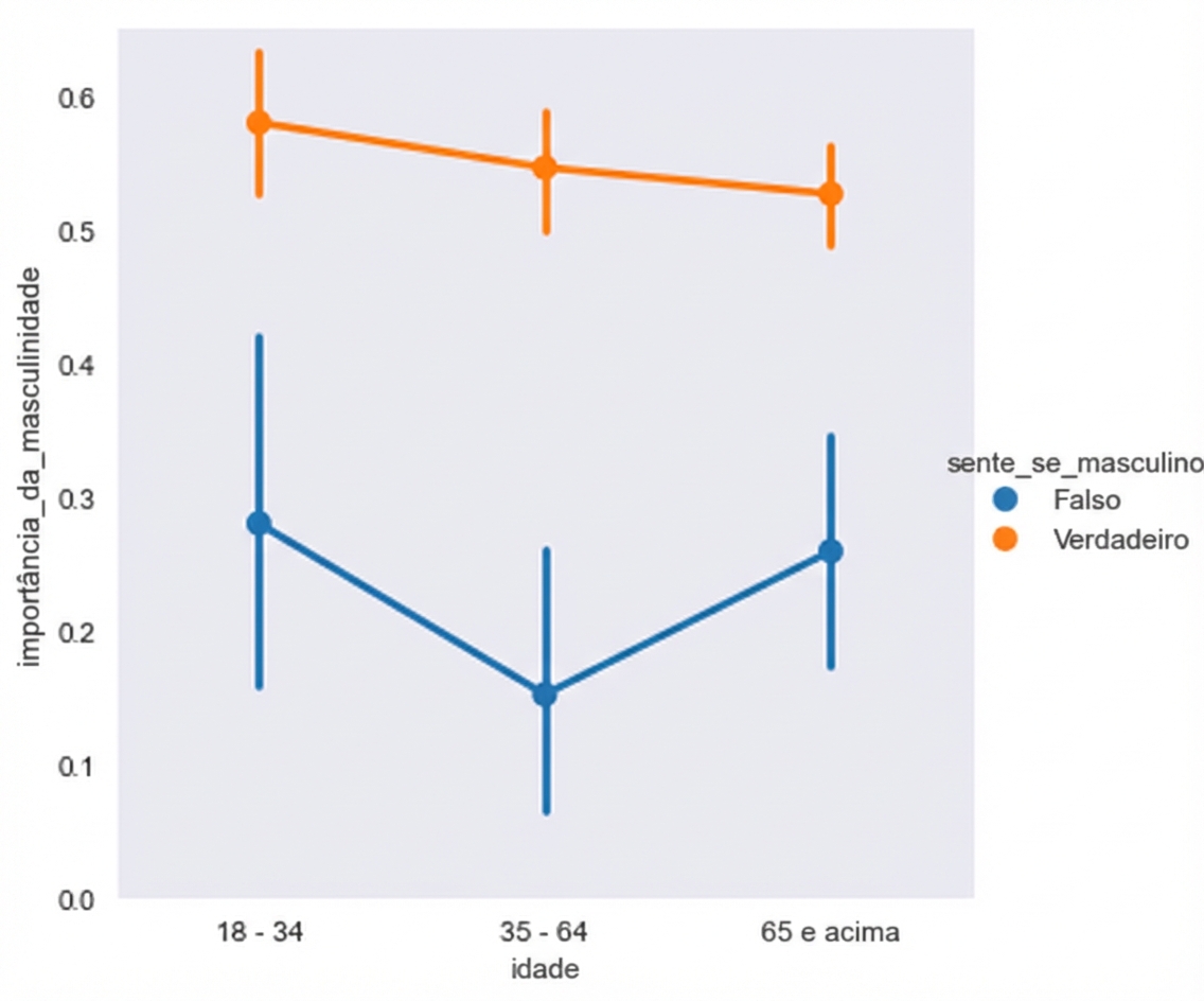
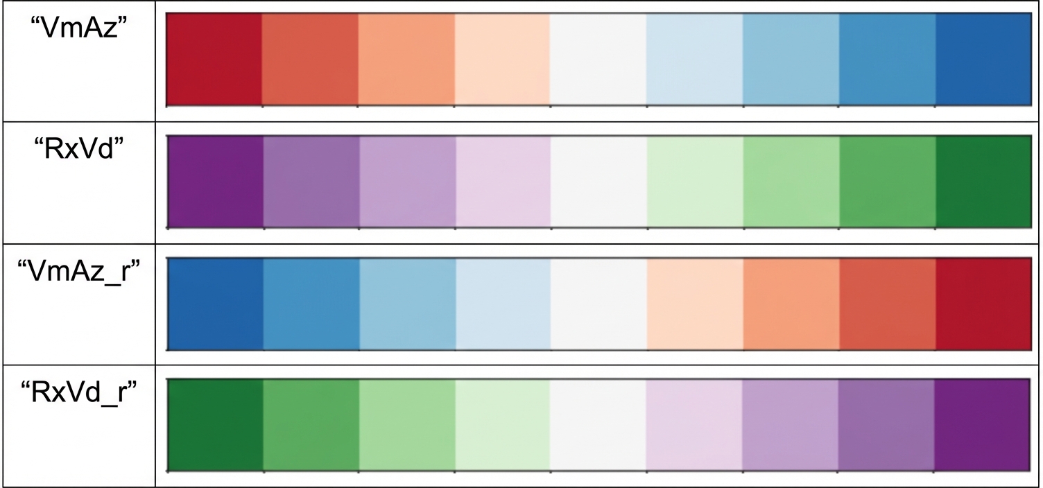
Paletas divergentes
Exemplo (paleta padrão)

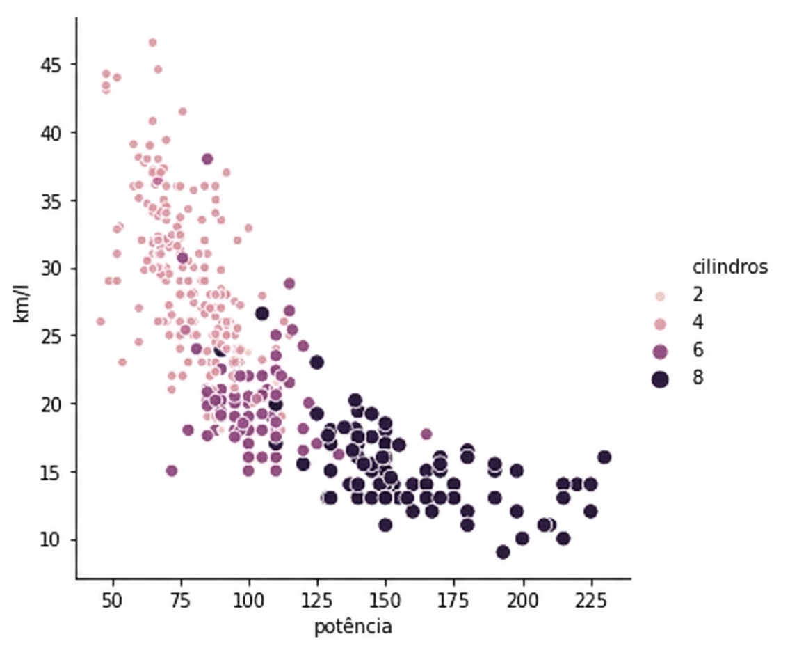
Exemplo (paleta divergente)
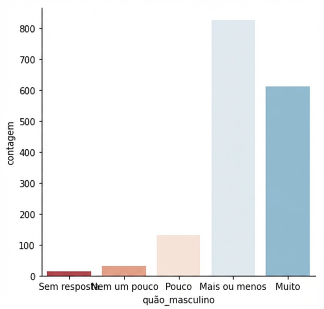
Paletas sequenciais
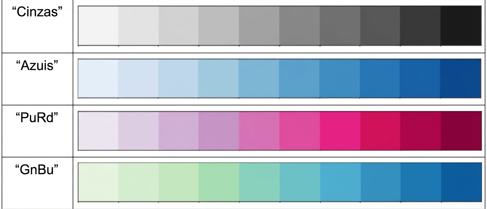
Exemplo de paleta sequencial
1 Waskom, M. L. (2021). seaborn: statistical data visualization. https://seaborn.pydata.org/
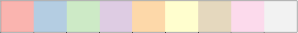
Paletas personalizadas

Paletas personalizadas
Contexto padrão: “paper”
Contexto maior: "talk"