Gráficos de contagem e de barras
Introdução à Visualização de Dados com o Seaborn

Content Team
DataCamp
Gráficos categóricos
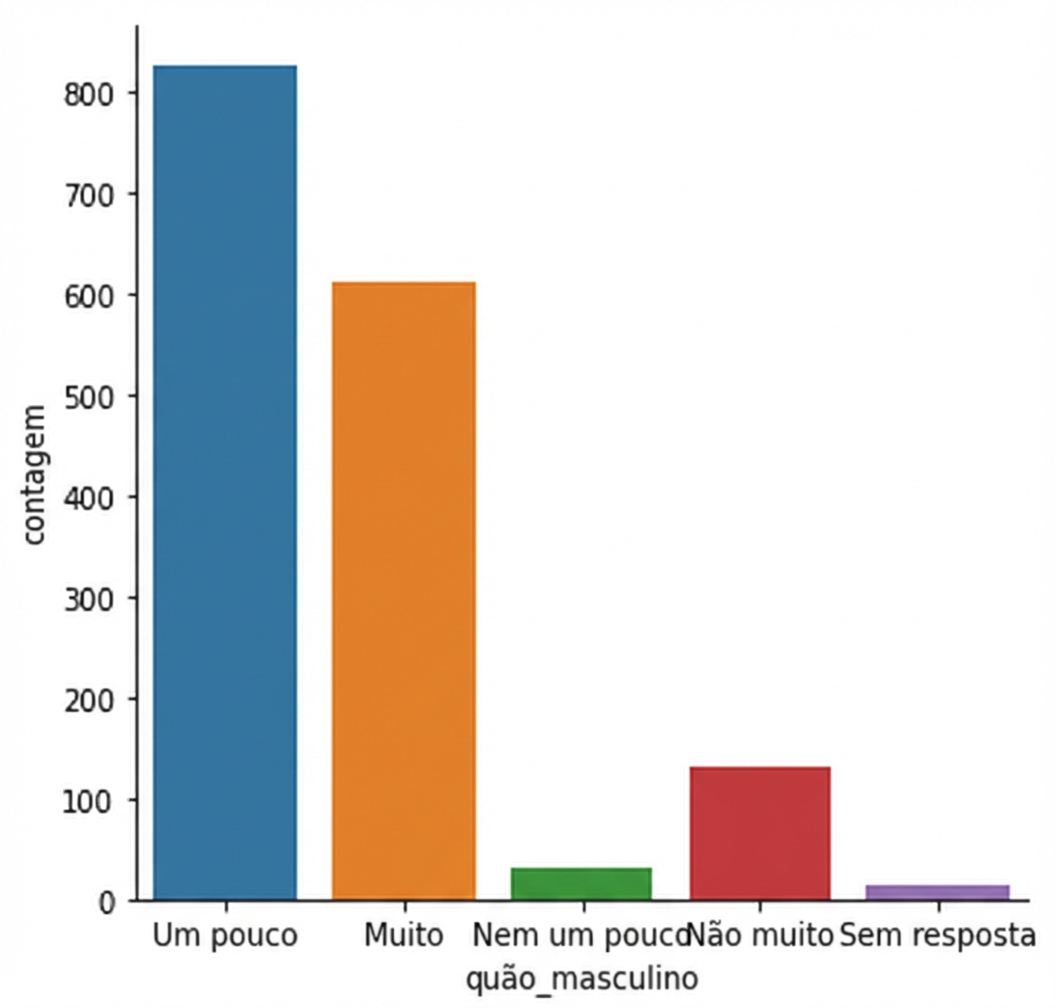
countplot() vs. catplot()
countplot() vs. catplot()
Mudando a ordem

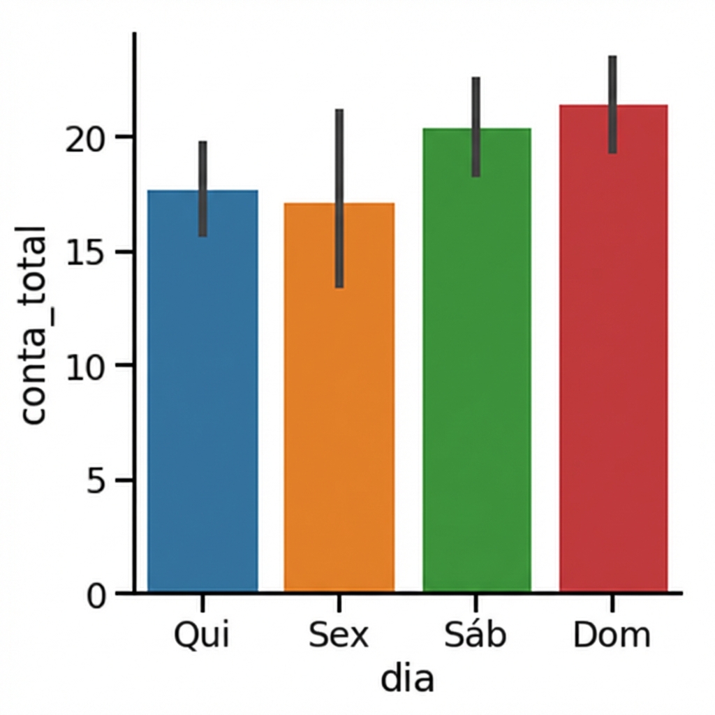
Gráficos de barras
1 Waskom, M. L. (2021). seaborn: statistical data visualization. https://seaborn.pydata.org/
Intervalos de confiança
1 Waskom, M. L. (2021). seaborn: statistical data visualization. https://seaborn.pydata.org/
Desativando intervalos de confiança

1 Waskom, M. L. (2021). seaborn: statistical data visualization. https://seaborn.pydata.org/
Mudando a orientação

1 Waskom, M. L. (2021). seaborn: statistical data visualization. https://seaborn.pydata.org/

