Juntando tudo
Introdução à Visualização de Dados com o Seaborn

Content Team
DataCamp
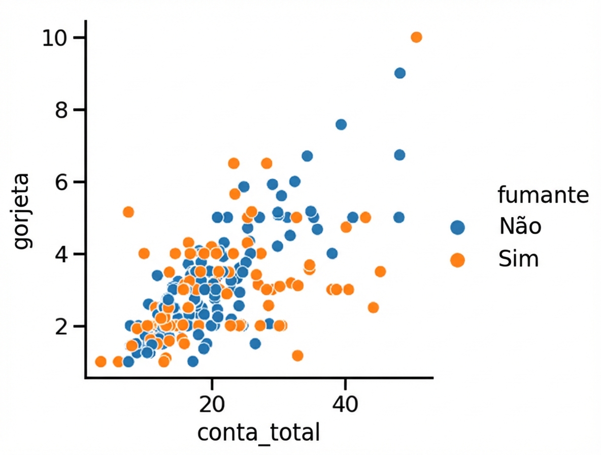
Adicionando uma 3ª variável (hue)
1 Waskom, M. L. (2021). seaborn: statistical data visualization. https://seaborn.pydata.org/
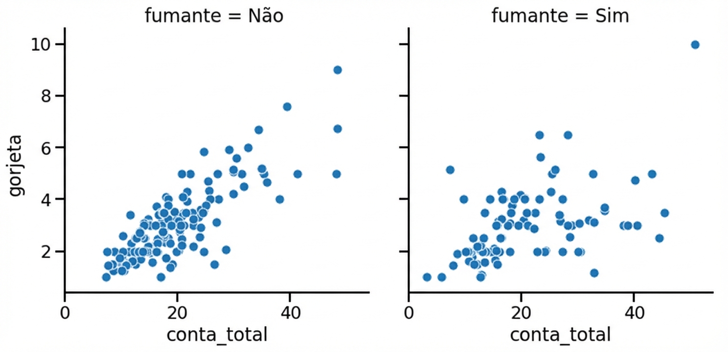
Adicionando uma 3ª variável (row/col)
1 Waskom, M. L. (2021). seaborn: statistical data visualization. https://seaborn.pydata.org/

