Visualizing simulation results
Monte Carlo Simulations in Python

Izzy Weber
Curriculum Manager, DataCamp
Pairplot
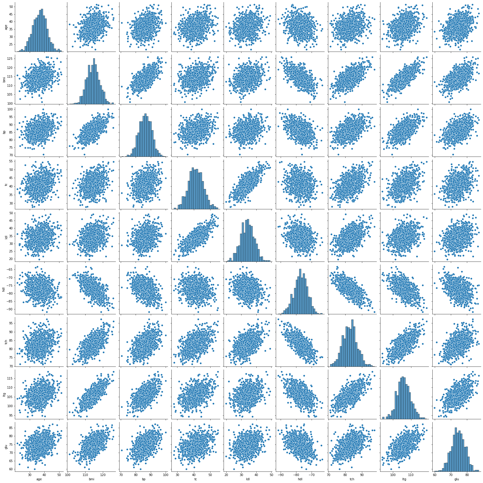
Pairplot
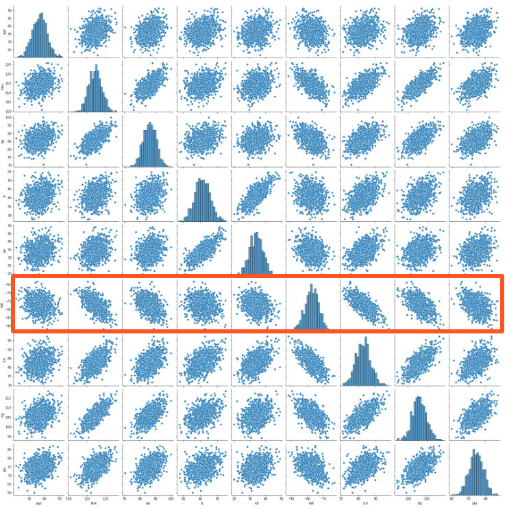
Clustermap

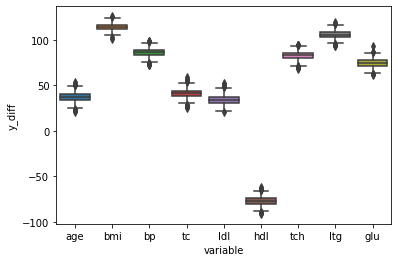
Boxplot
sns.boxplot(x="variable", y="y_diff", data=df_diffs_long)
Monte Carlo Simulations in Python
Izzy Weber
Curriculum Manager, DataCamp
sns.boxplot(x="variable", y="y_diff", data=df_diffs_long)

