Abbildungen vorbereiten, um sie mit anderen zu teilen
Einführung in die Datenvisualisierung mit Matplotlib

Ariel Rokem
Data Scientist
Diagrammstil ändern
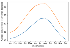
import matplotlib.pyplot as plt
fig, ax = plt.subplots()
ax.plot(seattle_weather["MONTH"], seattle_weather["MLY-TAVG-NORMAL"])
ax.plot(austin_weather["MONTH"], austin_weather["MLY-TAVG-NORMAL"])
ax.set_xlabel("Time (months)")
ax.set_ylabel("Average temperature (Fahrenheit degrees)")
plt.show()
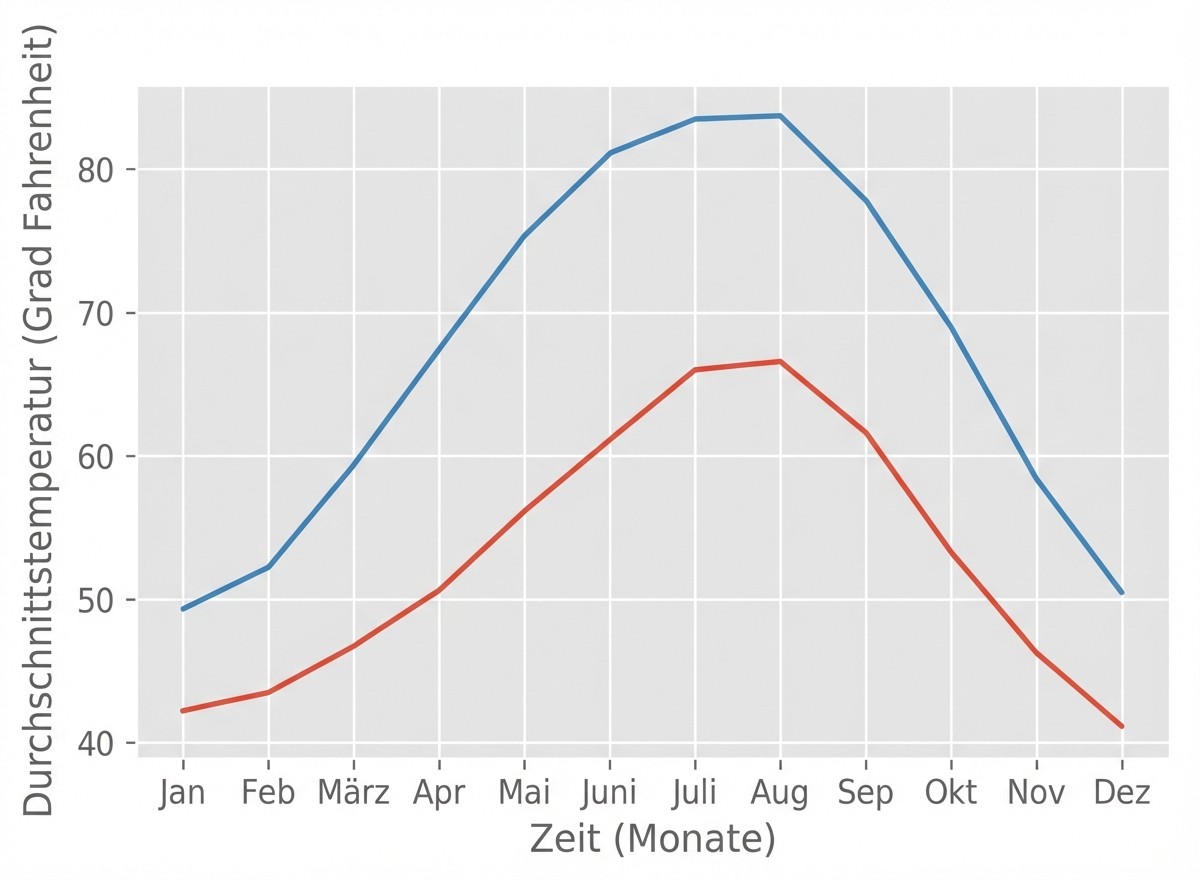
Stil auswählen
plt.style.use("ggplot")fig, ax = plt.subplots() ax.plot(seattle_weather["MONTH"], seattle_weather["MLY-TAVG-NORMAL"]) ax.plot(austin_weather["MONTH"], austin_weather["MLY-TAVG-NORMAL"]) ax.set_xlabel("Time (months)") ax.set_ylabel("Average temperature (Fahrenheit degrees)") plt.show()
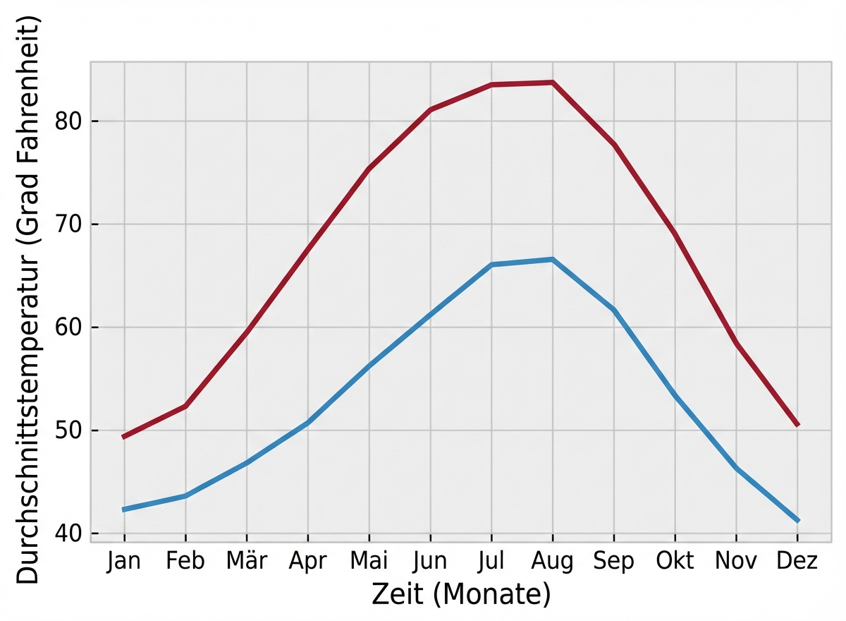
Der „bmh“-Stil
plt.style.use("bmh")fig, ax = plt.subplots() ax.plot(seattle_weather["MONTH"], seattle_weather["MLY-TAVG-NORMAL"]) ax.plot(austin_weather["MONTH"], austin_weather["MLY-TAVG-NORMAL"]) ax.set_xlabel("Time (months)") ax.set_ylabel("Average temperature (Fahrenheit degrees)") plt.show()
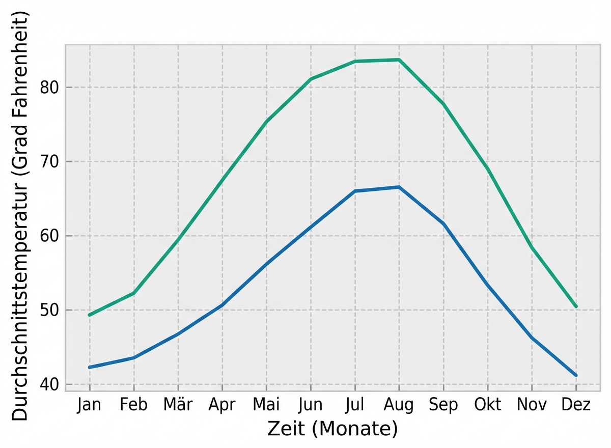
Seaborn-Stile
plt.style.use("seaborn-colorblind")fig, ax = plt.subplots() ax.plot(seattle_weather["MONTH"], seattle_weather["MLY-TAVG-NORMAL"]) ax.plot(austin_weather["MONTH"], austin_weather["MLY-TAVG-NORMAL"]) ax.set_xlabel("Time (months)") ax.set_ylabel("Average temperature (Fahrenheit degrees)") plt.show()