Streudiagramme
Einführung in die Datenvisualisierung mit ggplot2

Rick Scavetta
Founder, Scavetta Academy
Streudiagramme
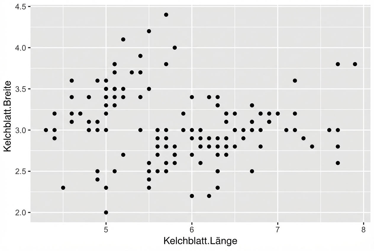
ggplot(iris, aes(x = Sepal.Length,
                 y = Sepal.Width)) +
  geom_point()
Streudiagramme
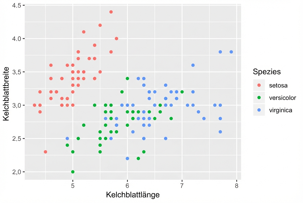
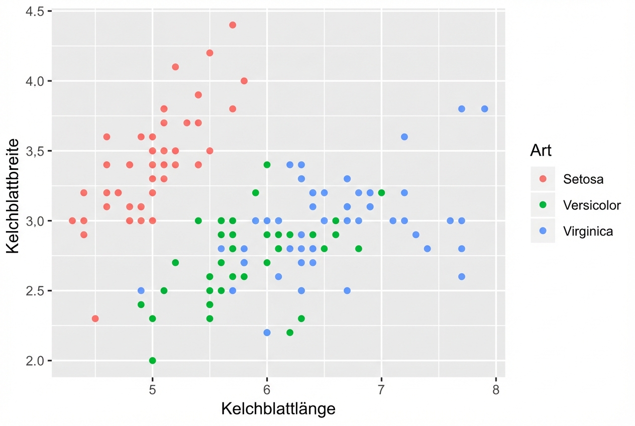
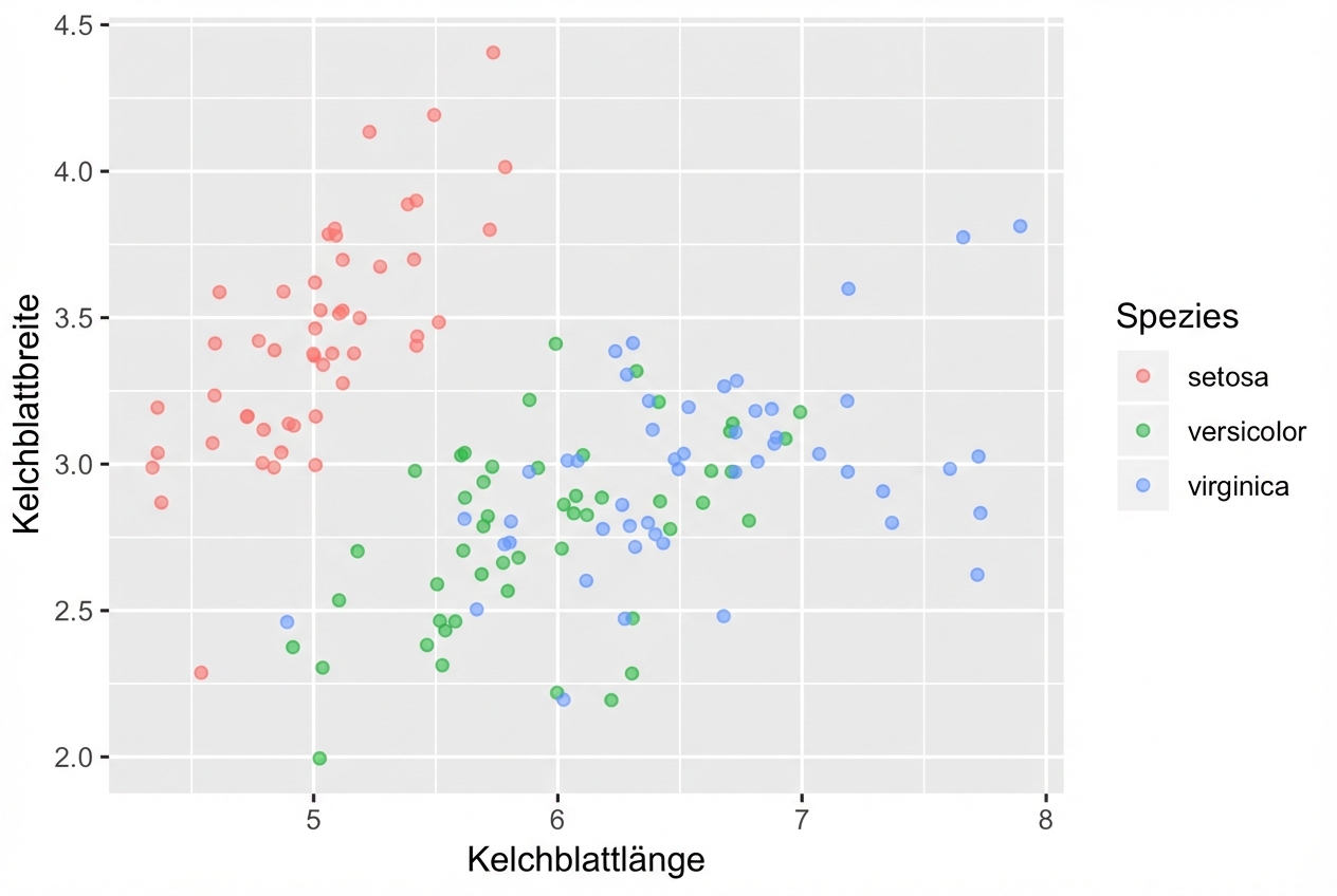
ggplot(iris, aes(x = Sepal.Length,
                 y = Sepal.Width,
                 col = Species)) +
  geom_point()
Geom-spezifische Zuordnungen von ästhetischen Elementen
# These result in the same plot!
ggplot(iris, aes(x = Sepal.Length, y = Sepal.Width, col = Species)) +
  geom_point()

ggplot(iris, aes(x = Sepal.Length, y = Sepal.Width)) +
  geom_point(aes(col = Species))
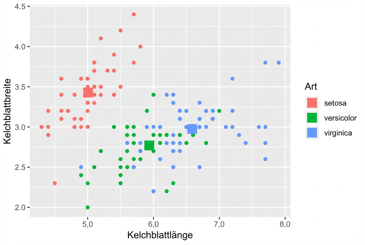
Kontrolliere die ästhetischen Zuordnungen der einzelnen Ebenen unabhängig voneinander:
ggplot(iris, aes(x = Sepal.Length, y = Sepal.Width, col = Species)) +
  # Inherits both data and aes from ggplot()
  geom_point() +
  # Different data, but inherited aes
  geom_point(data = iris.summary, shape = 15, size = 5)
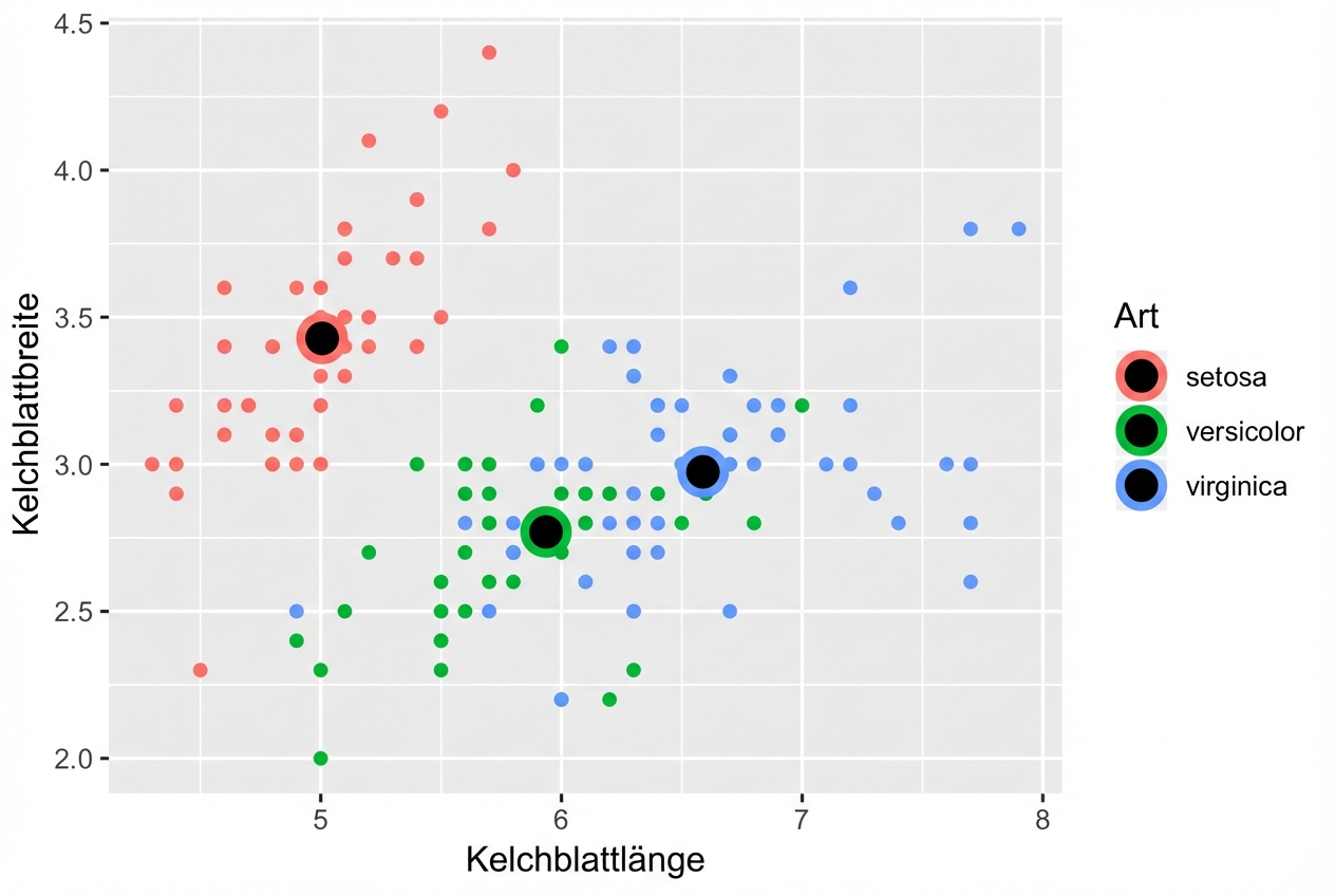
Form Attributwerte
Beispiel
ggplot(iris, aes(x = Sepal.Length, y = Sepal.Width, col = Species)) +
  geom_point() +
  geom_point(data = iris.summary, shape = 21, size = 5,
             fill = "black", stroke = 2)
On-the-fly-Statistiken mit ggplot2
- Siehe den zweiten Kurs für die Statistik-Ebene.
- Hinweis: Vermeide es, nur den Mittelwert ohne ein Maß für die Streuung, z. B. die Standardabweichung, darzustellen.
position = "jitter"
ggplot(iris, aes(x = Sepal.Length, y = Sepal.Width, col = Species)) +
  geom_point(position = "jitter")
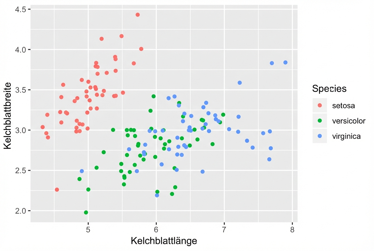
geom_jitter()
Eine Abkürzung zu geom_point(position = "jitter")
ggplot(iris, aes(x = Sepal.Length, y = Sepal.Width, col = Species)) +
  geom_jitter()

Vergiss nicht, Alpha einzustellen
- Kombiniere Jittering mit Alpha-Blending, wenn nötig
ggplot(iris, aes(x = Sepal.Length, y = Sepal.Width, col = Species)) +
  geom_jitter(alpha = 0.6)
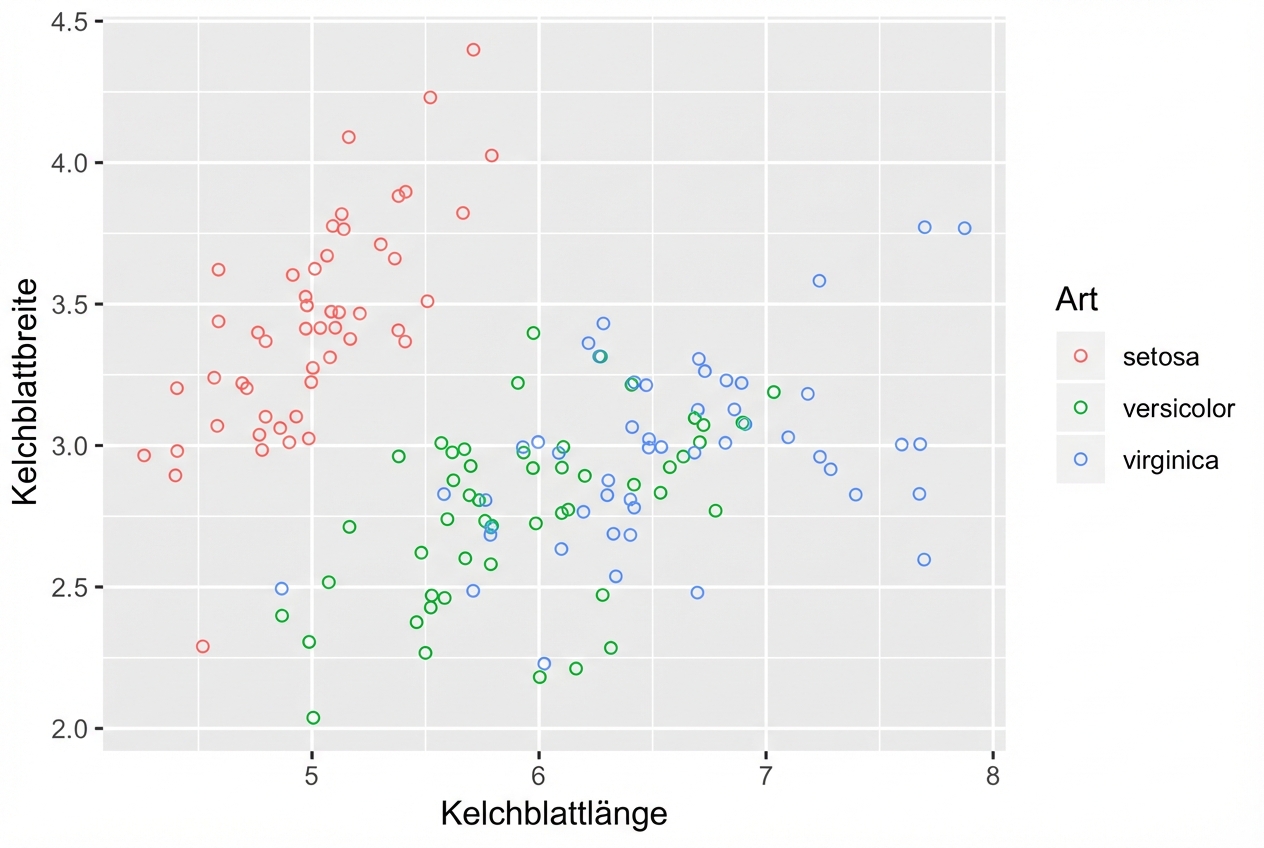
Hohle Kreise helfen auch
shape = 1ist ein hohler Kreis.- Es ist nicht notwendig, auch Alpha-Blending zu verwenden.
ggplot(iris, aes(x = Sepal.Length, y = Sepal.Width, col = Species)) +
  geom_jitter(shape = 1)