Gráficos de pontos e contagem
Trabalhando com dados categóricos em Python

Kasey Jones
Research Data Scientist
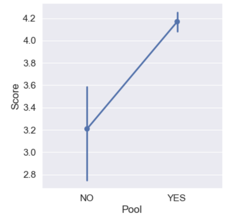
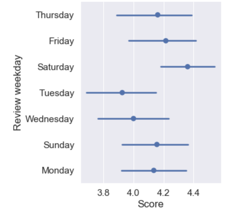
Exemplo de point plot
sns.catplot(x="Pool", y="Score", data=reviews, kind="point") # <--- updated
Bar plot vs. point plot
Bar plot
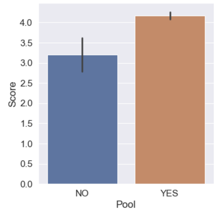
Point plot
Point plot com hue
sns.catplot(x="Spa", y="Score", data=reviews, kind="point",
            hue="Tennis court", dodge=True  # < --- New Parameter!
)
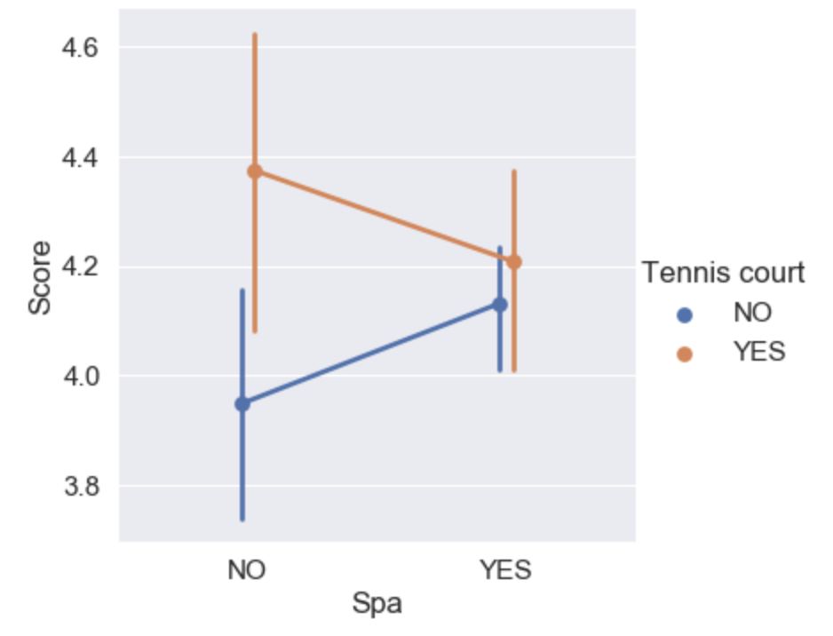
Usando o parâmetro join
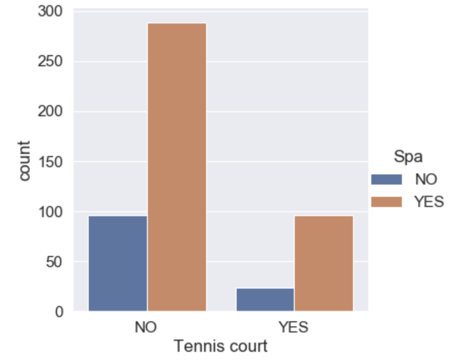
Mais um tipo de catplot
sns.catplot(x="Tennis court", data=reviews, kind="count", hue="Spa")