Summary statistics by category with seaborn
Importing and Managing Financial Data in Python

Stefan Jansen
Instructor
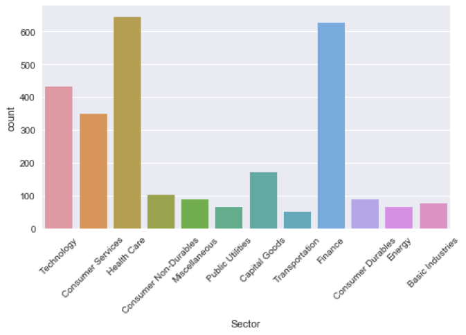
The basics: countplot
sns.countplot(x='Sector', data=nasdaq)
plt.xticks(rotation=45)
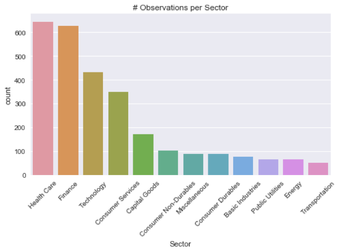
countplot, sorted
sns.countplot(x='Sector', data=nasdaq, order=order)
plt.xticks(rotation=45)
plt.title('# Observations per Sector’)
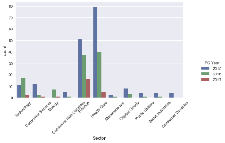
countplot, multiple categories
recent_ipos = nasdaq[nasdaq['IPO Year'] > 2014]
recent_ipos['IPO Year'] = recent_ipos['IPO Year'].astype(int)
sns.countplot(x='Sector', hue='IPO Year', data=recent_ipos)
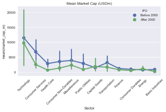
Compare stats with PointPlot
nasdaq['IPO'] = nasdaq['IPO Year'].apply(lambda x: 'After 2000' if x > 2000 else 'Before 2000')
sns.pointplot(x='Sector', y='market_cap_m', hue='IPO', data=nasdaq)
plt.xticks(rotation=45); plt.title('Mean Market Cap')