Anpassung von Streudiagrammen
Einführung in die Datenvisualisierung mit Seaborn

Content Team
DataCamp
Größe von Datenpunkten für Untergruppen

1 Waskom, M. L. (2021). seaborn: statistical data visualization. https://seaborn.pydata.org/
Punktgröße und Farbton

1 Waskom, M. L. (2021). seaborn: statistical data visualization. https://seaborn.pydata.org/
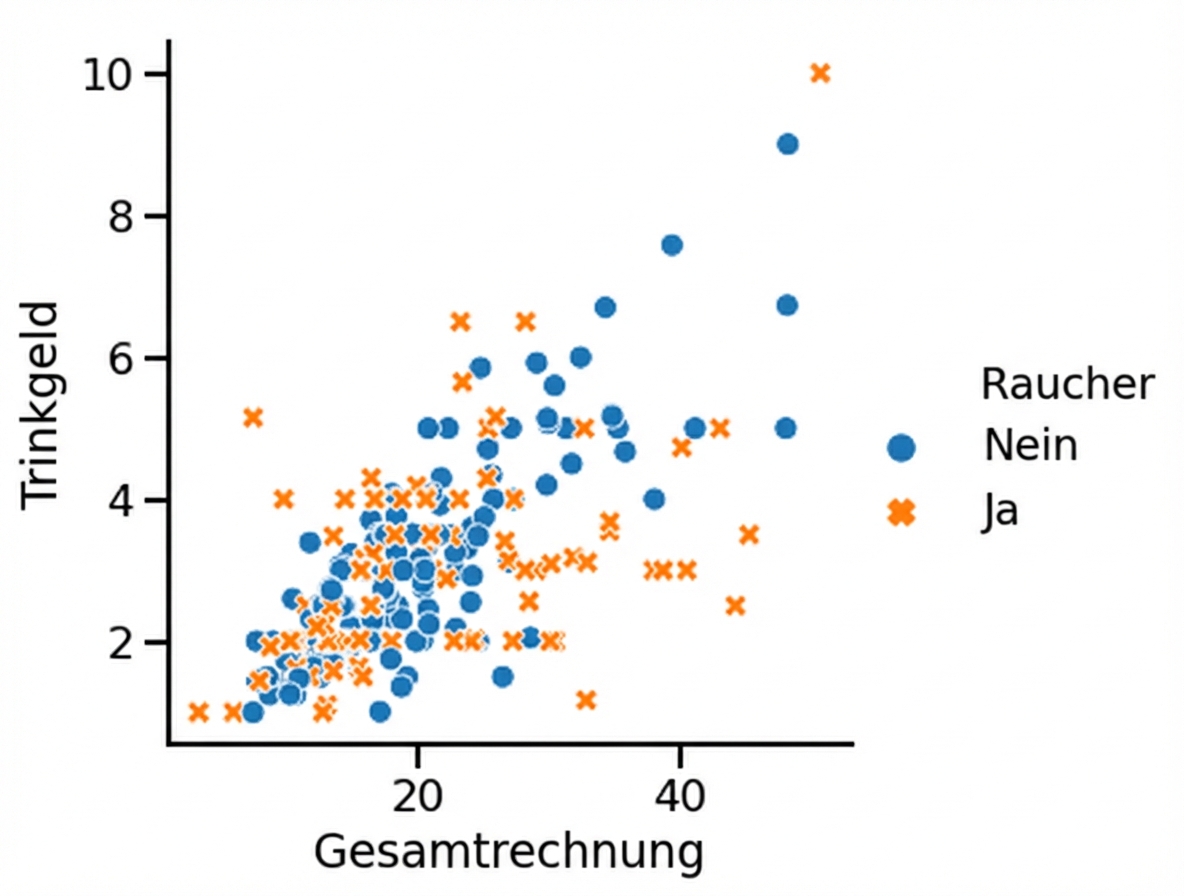
Stil von Datenpunkten für Untergruppen
1 Waskom, M. L. (2021). seaborn: statistical data visualization. https://seaborn.pydata.org/
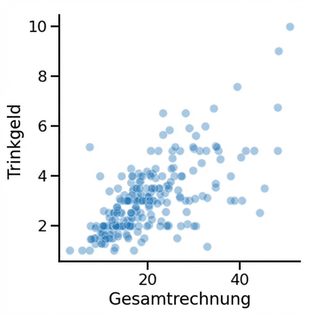
Ändern der Transparenz von Punkten
1 Waskom, M. L. (2021). seaborn: statistical data visualization. https://seaborn.pydata.org/

