Einführung in Relationsdiagramme und Unterdiagramme
Einführung in die Datenvisualisierung mit Seaborn

Content Team
DataCamp
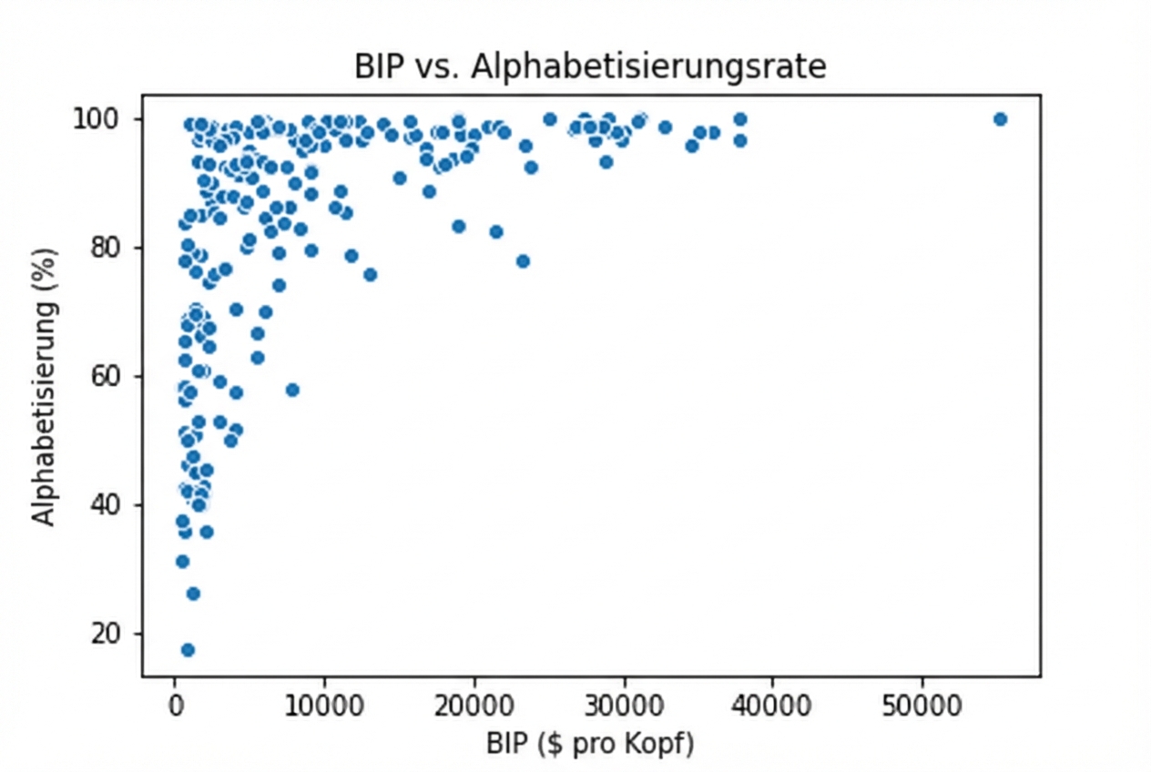
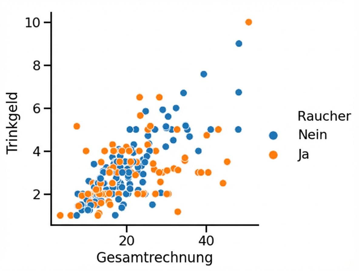
Fragen zu quantitativen Variablen

Fragen zu quantitativen Variablen

Fragen zu quantitativen Variablen
1 Waskom, M. L. (2021). seaborn: statistical data visualization. https://seaborn.pydata.org/
1 Waskom, M. L. (2021). seaborn: statistical data visualization. https://seaborn.pydata.org/
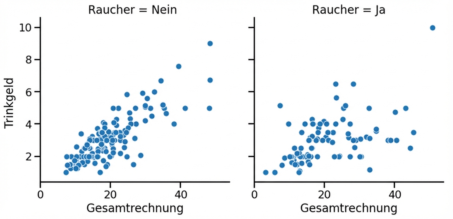
Unterdiagramme in Spalten
1 Waskom, M. L. (2021). seaborn: statistical data visualization. https://seaborn.pydata.org/
Unterdiagramme in Zeilen

1 Waskom, M. L. (2021). seaborn: statistical data visualization. https://seaborn.pydata.org/
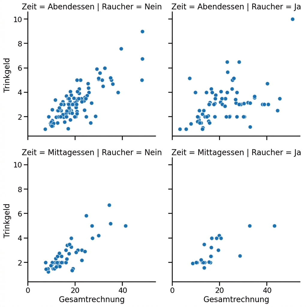
Unterdiagramme in Zeilen und Spalten
1 Waskom, M. L. (2021). seaborn: statistical data visualization. https://seaborn.pydata.org/
Untergruppen für Wochentage

1 Waskom, M. L. (2021). seaborn: statistical data visualization. https://seaborn.pydata.org/
Spaltenumbruch

1 Waskom, M. L. (2021). seaborn: statistical data visualization. https://seaborn.pydata.org/
Spalten ordnen

1 Waskom, M. L. (2021). seaborn: statistical data visualization. https://seaborn.pydata.org/

