Visualisierung in Python
Einführung in Python für den Finanzbereich

Adina Howe
Professor
Matplotlib: Ein Visualisierungspaket
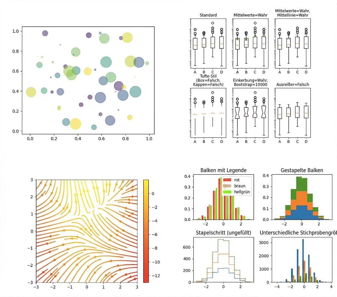
Klicke einfach auf diesen Link, um mehr von der Matplotlib-Galerie zu sehen.
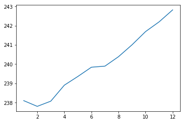
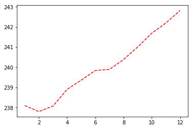
Plot-Ergebnis
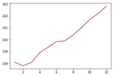
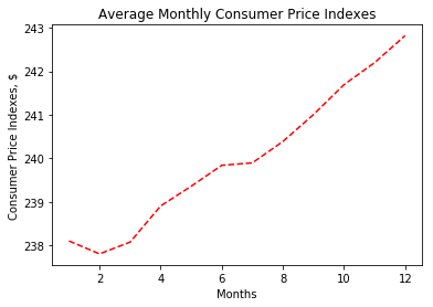
Plot-Ergebnis
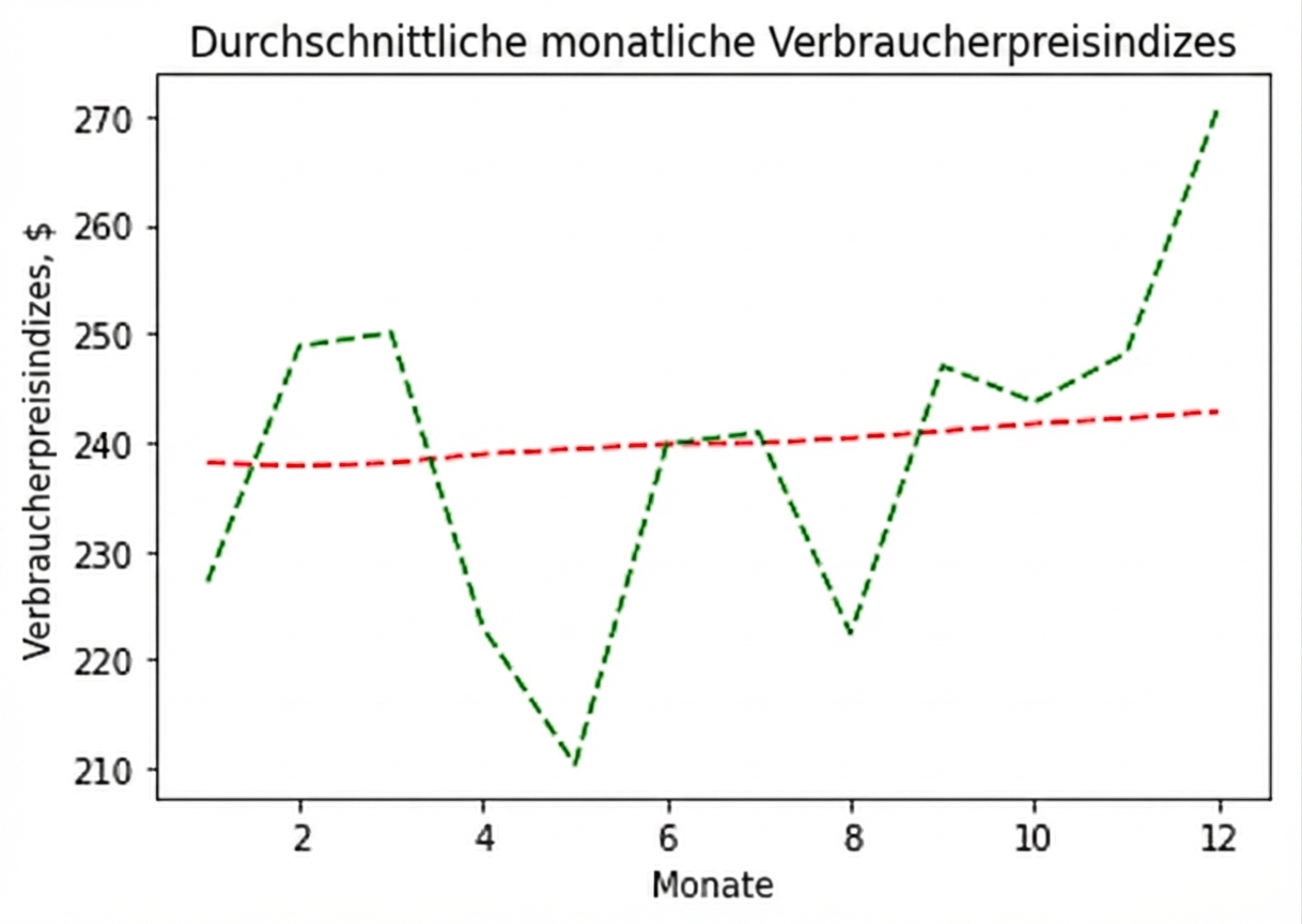
Plot-Ergebnis
Plot-Ergebnis
Plot-Ergebnis
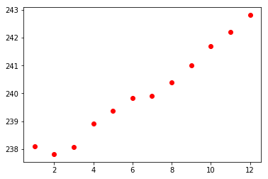
Ergebnis des Streudiagramms