Tracer des séries temporelles avec différentes variables
Introduction à la visualisation de données avec Matplotlib

Ariel Rokem
Data Scientist
Tracer deux séries temporelles ensemble
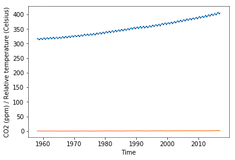
import matplotlib.pyplot as plt fig, ax = plt.subplots() ax.plot(climate_change.index, climate_change["co2"])ax.plot(climate_change.index, climate_change["relative_temp"])ax.set_xlabel('Time') ax.set_ylabel('CO2 (ppm) / Relative temperature') plt.show()
Utilisation de deux axes
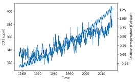
fig, ax = plt.subplots() ax.plot(climate_change.index, climate_change["co2"]) ax.set_xlabel('Time') ax.set_ylabel('CO2 (ppm)')ax2 = ax.twinx()ax2.plot(climate_change.index, climate_change["relative_temp"]) ax2.set_ylabel('Relative temperature (Celsius)') plt.show()
Séparation des variables par couleur
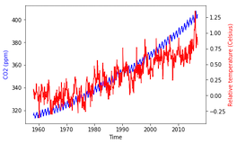
fig, ax = plt.subplots() ax.plot(climate_change.index, climate_change["co2"], color='blue') ax.set_xlabel('Time') ax.set_ylabel('CO2 (ppm)', color='blue')ax2 = ax.twinx() ax2.plot(climate_change.index, climate_change["relative_temp"], color='red') ax2.set_ylabel('Relative temperature (Celsius)', color='red') plt.show()
Colorisation des graduations
Utilisation de notre fonction
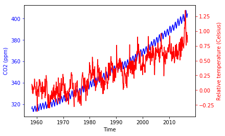
fig, ax = plt.subplots() plot_timeseries(ax, climate_change.index, climate_change['co2'], 'blue', 'Time', 'CO2 (ppm)')ax2 = ax.twinx() plot_timeseries(ax2, climate_change.index, climate_change['relative_temp'], 'red', 'Time', 'Relative temperature (Celsius)')plt.show()


