Introduction à la visualisation de données avec Matplotlib
Introduction à la visualisation de données avec Matplotlib

Ariel Rokem
Data Scientist
Visualisation des données
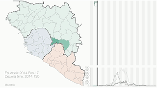
Crédit d’image : Gytis Dudas et Andrew Rambaut
Présentation de l'interface pyplot
![]()
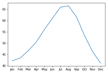
Ajout de données aux axes
ax.plot(seattle_weather["MONTH"], seattle_weather["MLY-TAVG-NORMAL"])
plt.show()
Ajouter davantage de données
ax.plot(austin_weather["MONTH"], austin_weather["MLY-TAVG-NORMAL"])
plt.show()
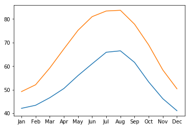
Mise en œuvre de l'ensemble
fig, ax = plt.subplots()
ax.plot(seattle_weather["MONTH"], seattle_weather["MLY-TAVG-NORMAL"])
ax.plot(austin_weather["MONTH"], austin_weather["MLY-TAVG-NORMAL"])
plt.show()

