Introduction aux graphiques en ligne
Introduction à la visualisation de données avec Seaborn

Content Team
DataCamp
Qu'est-ce qu'un graphique en ligne ?
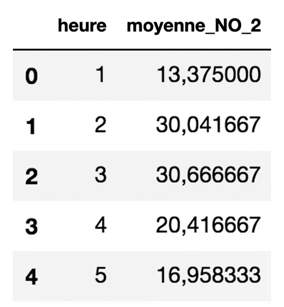
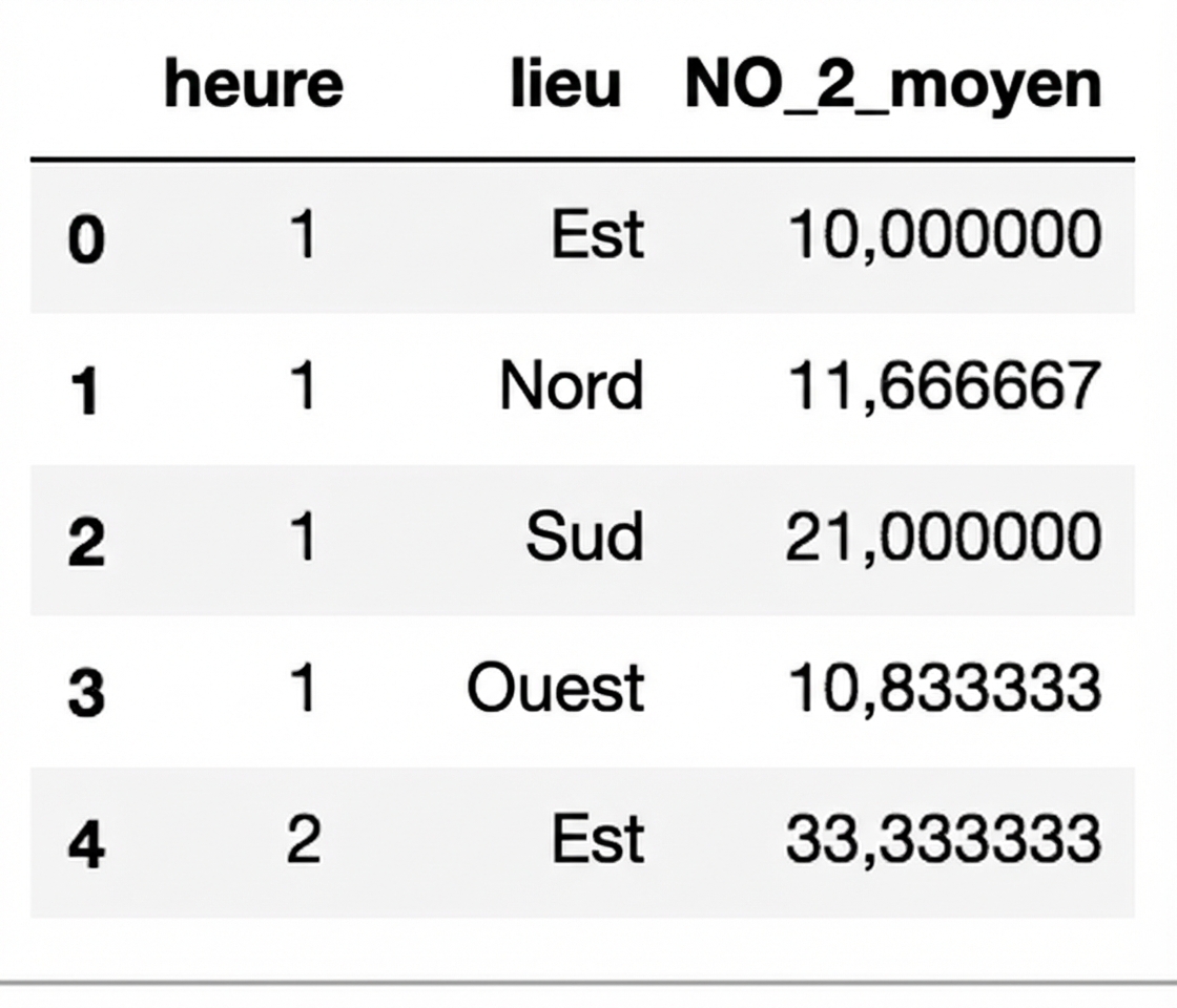
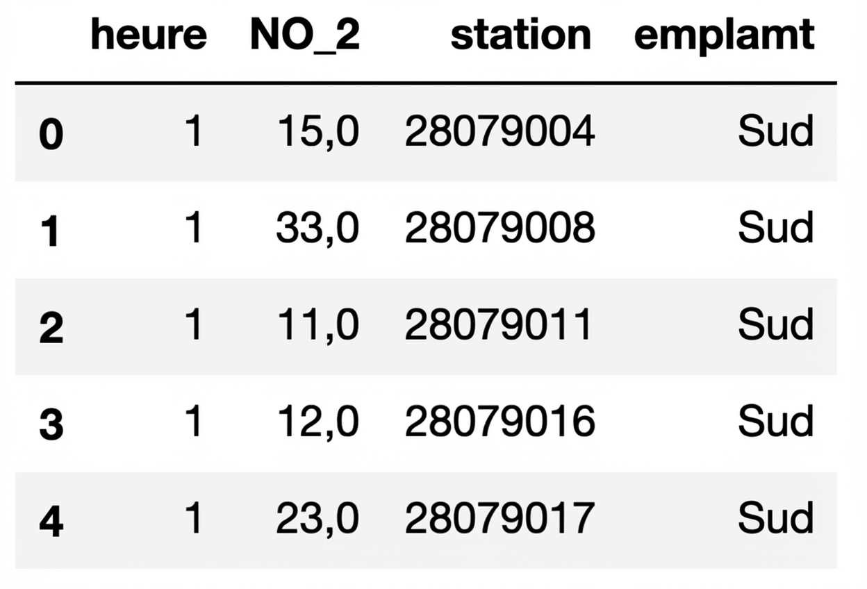
Données sur la pollution de l'air
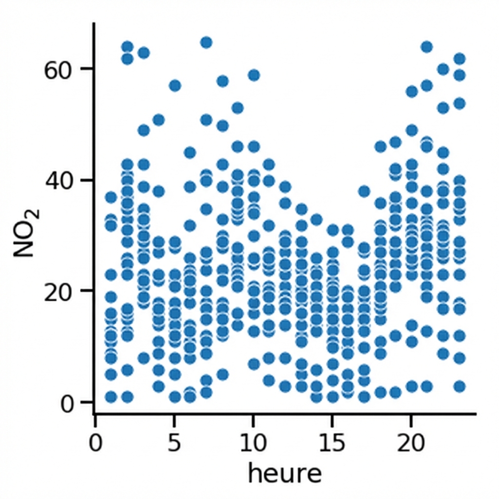
Nuage de points
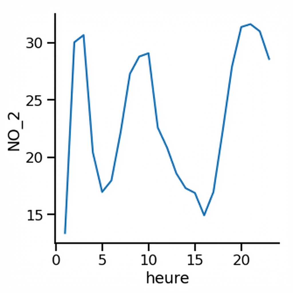
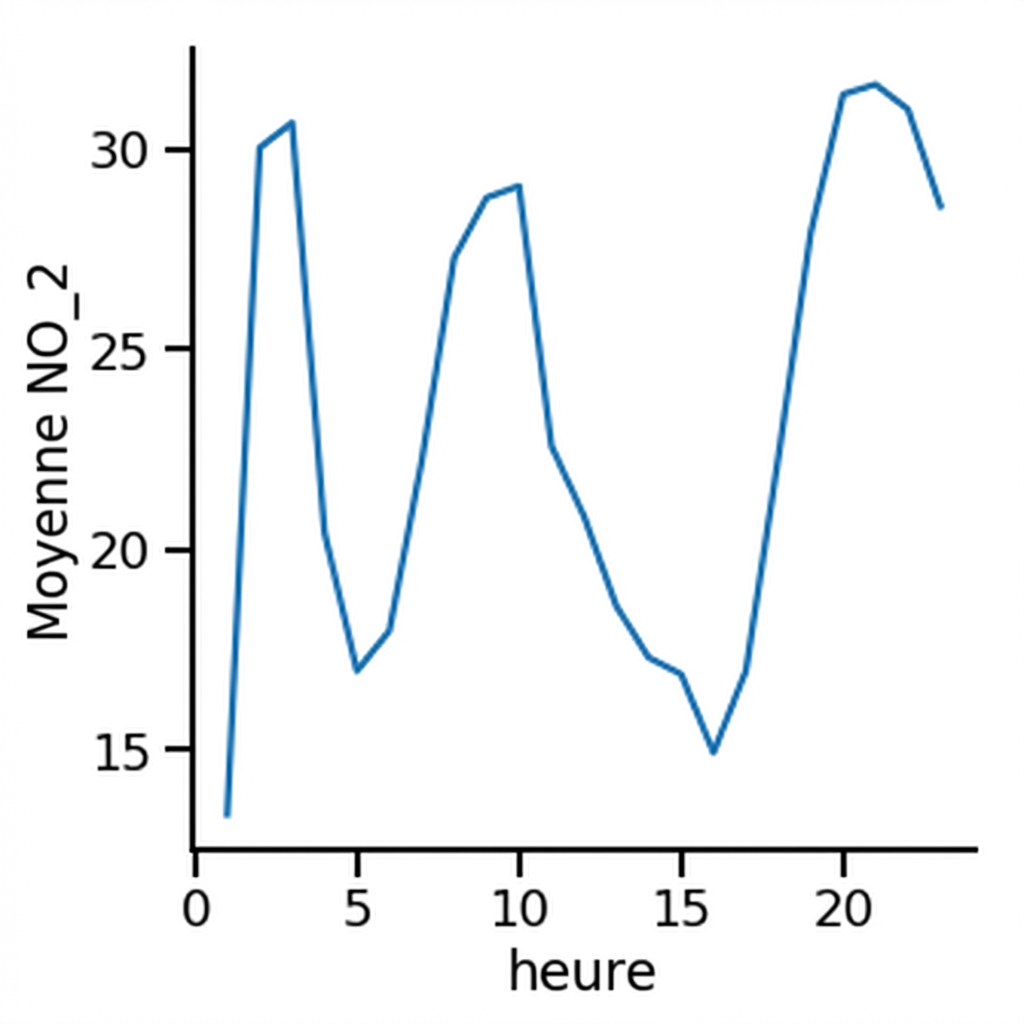
Graphique en ligne
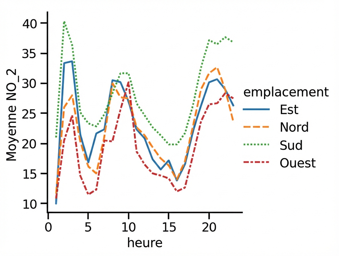
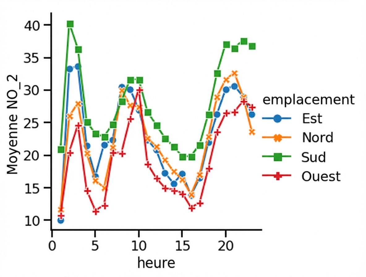
Sous-groupes par emplacement
Sous-groupes par emplacement
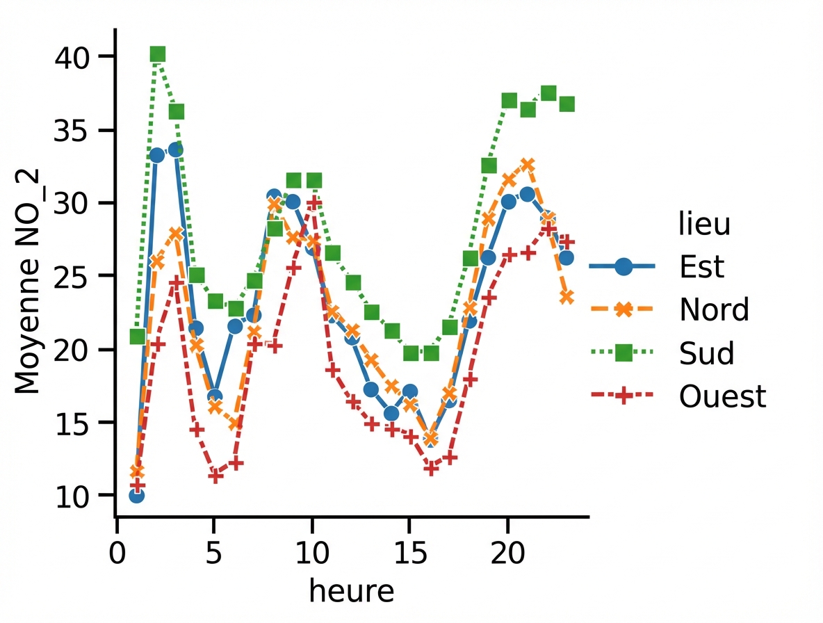
Ajout de marqueurs
Désactiver le style de ligne
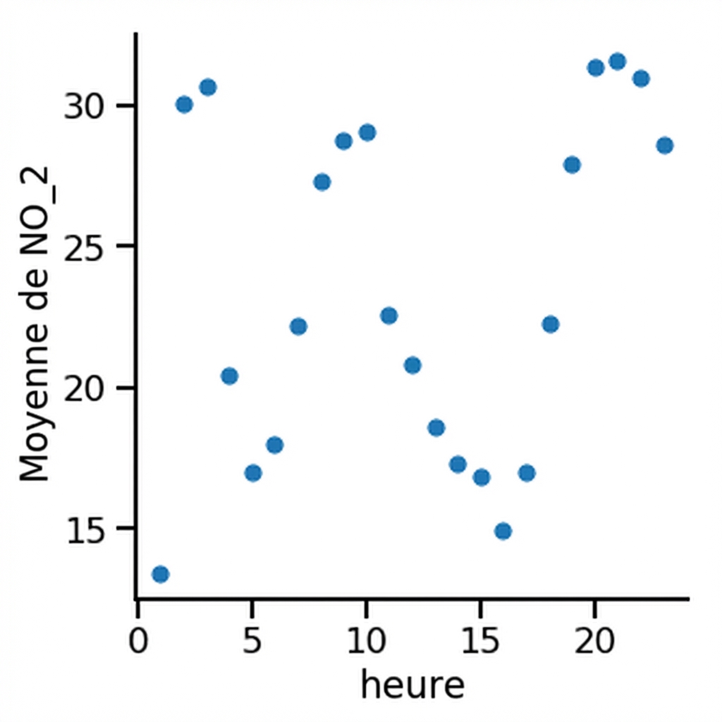
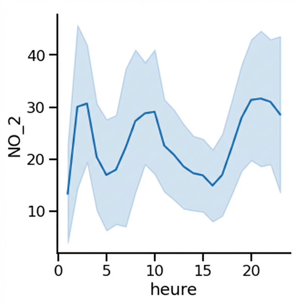
Observations multiples par valeur x
Observations multiples par valeur x
Observations multiples par valeur x
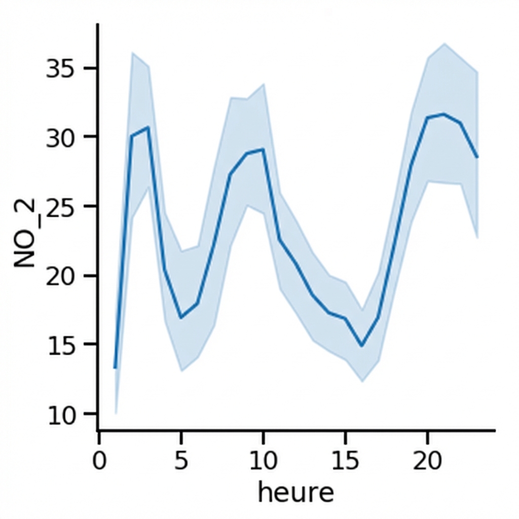
Observations multiples par valeur x
Remplacer l'intervalle de confiance par l'écart-type
Désactiver l'intervalle de confiance