Introduction aux graphiques et sous-graphiques relationnels
Introduction à la visualisation de données avec Seaborn

Content Team
DataCamp
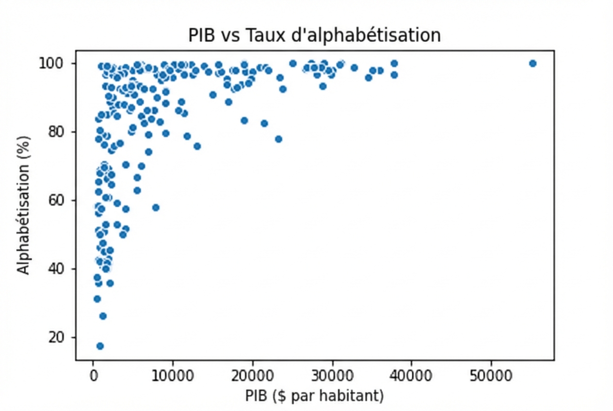
Questions sur les variables quantitatives
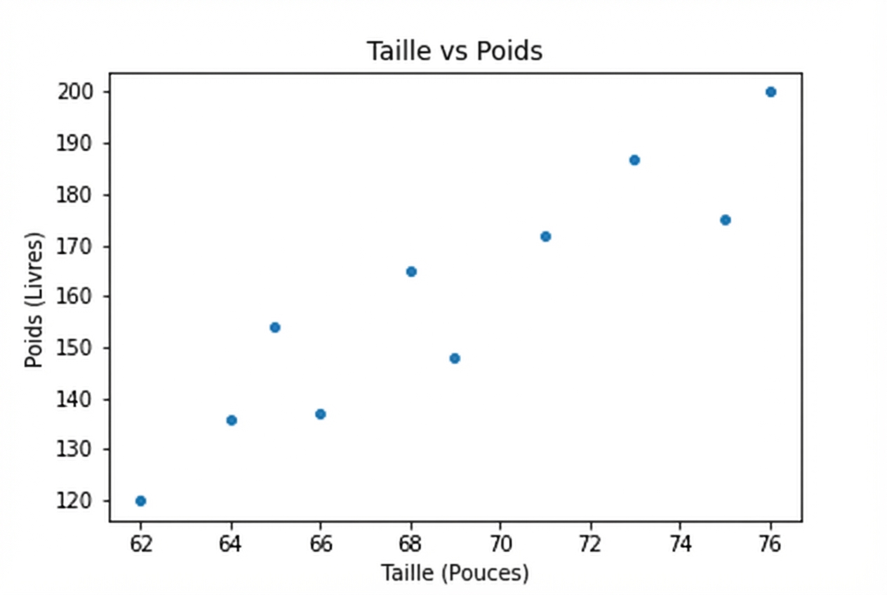
Questions sur les variables quantitatives
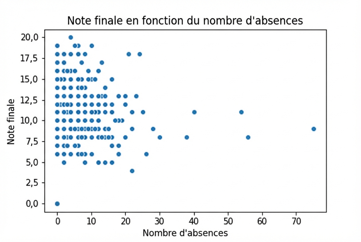
Questions sur les variables quantitatives
1 Waskom, M. L. (2021). seaborn : visualisation de données statistiques. https://seaborn.pydata.org/
1 Waskom, M. L. (2021). seaborn : visualisation de données statistiques. https://seaborn.pydata.org/
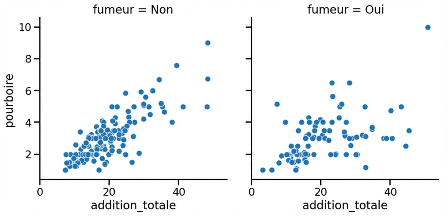
Sous-graphes en colonnes
1 Waskom, M. L. (2021). seaborn : visualisation de données statistiques. https://seaborn.pydata.org/
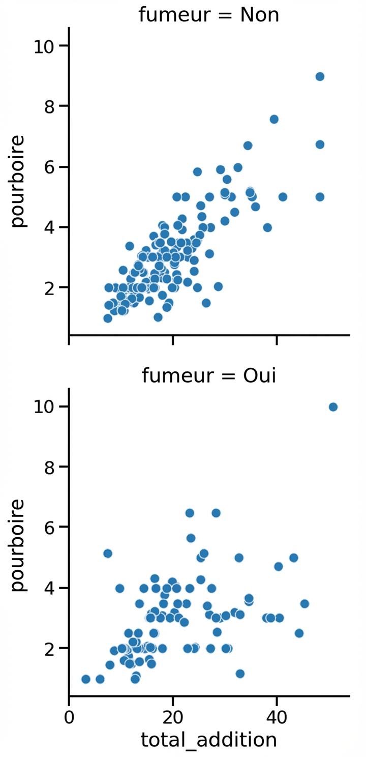
Sous-graphes en lignes
1 Waskom, M. L. (2021). seaborn : visualisation de données statistiques. https://seaborn.pydata.org/
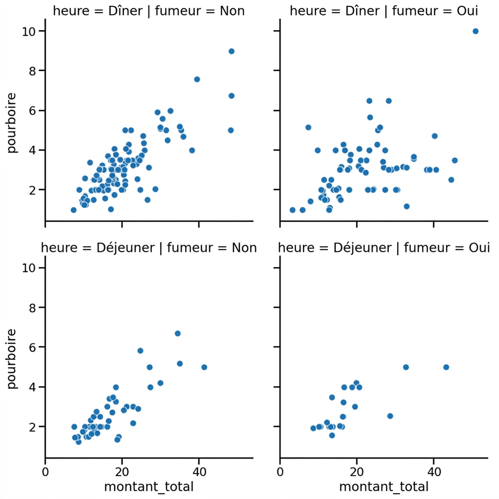
Sous-graphes en lignes et en colonnes
1 Waskom, M. L. (2021). seaborn : visualisation de données statistiques. https://seaborn.pydata.org/
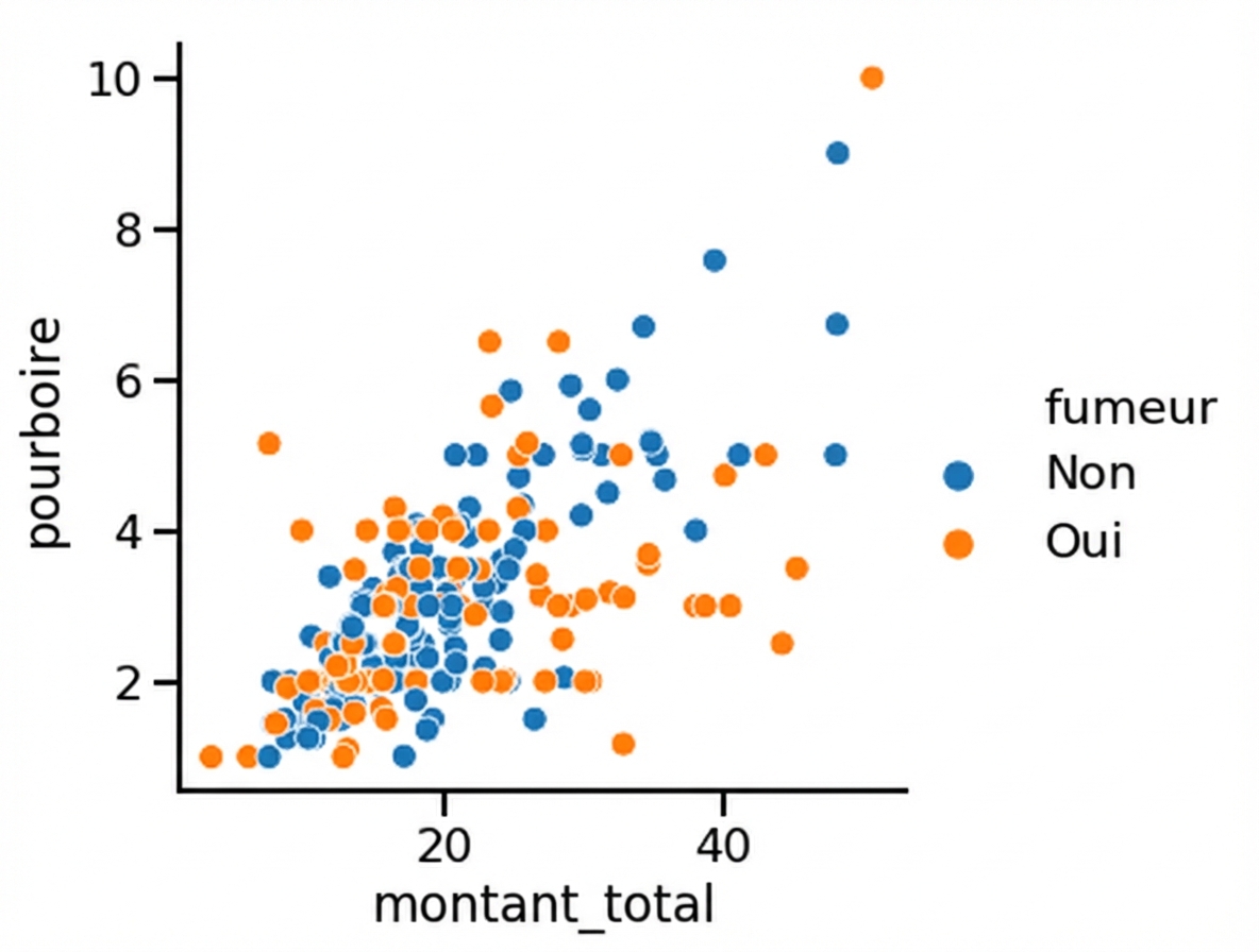
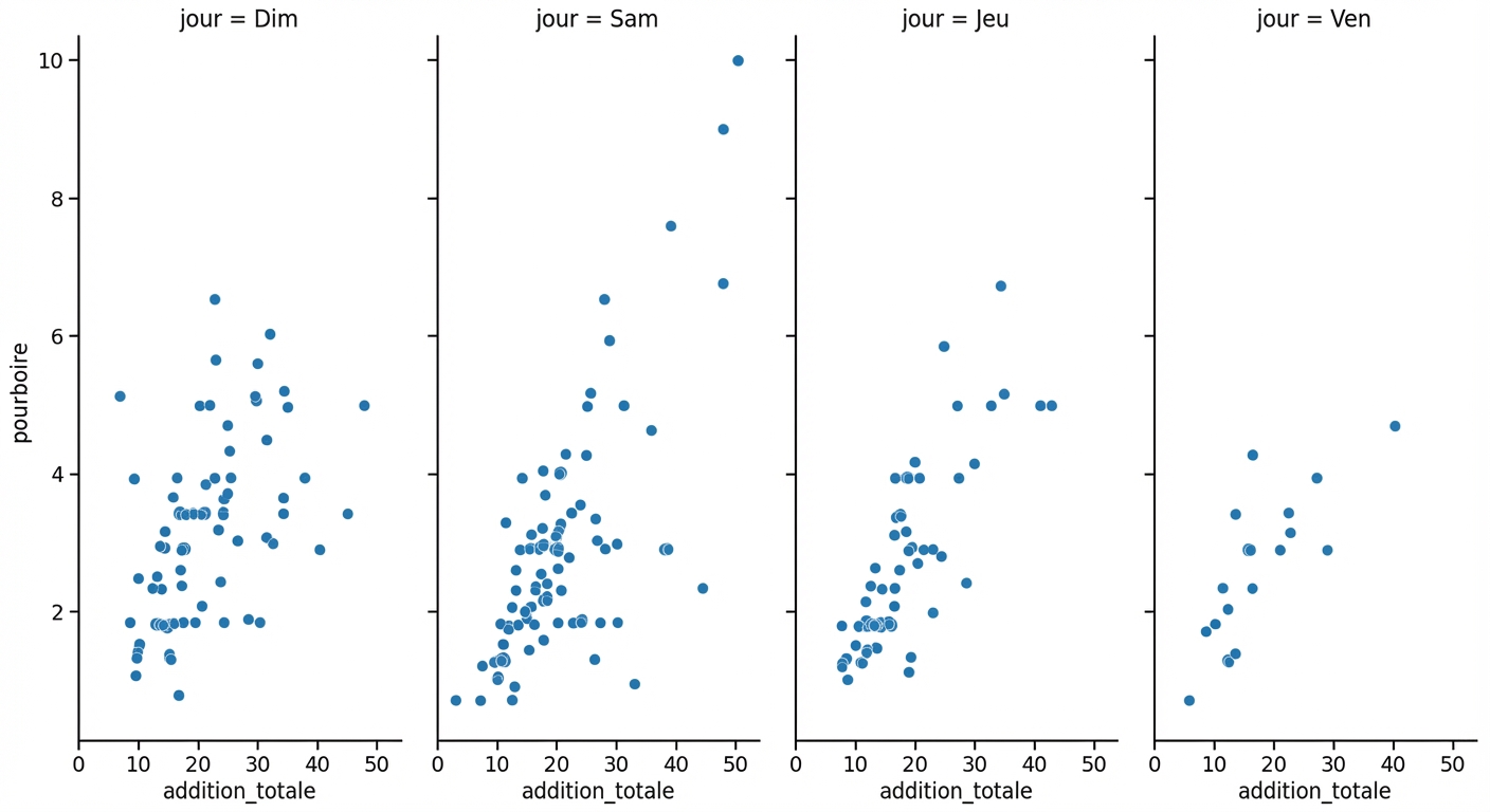
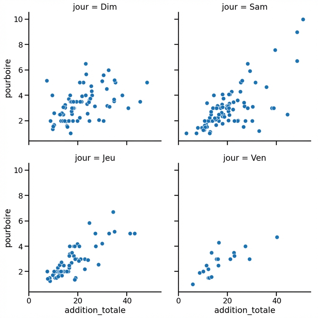
Sous-groupes pour les jours de la semaine
1 Waskom, M. L. (2021). seaborn : visualisation de données statistiques. https://seaborn.pydata.org/
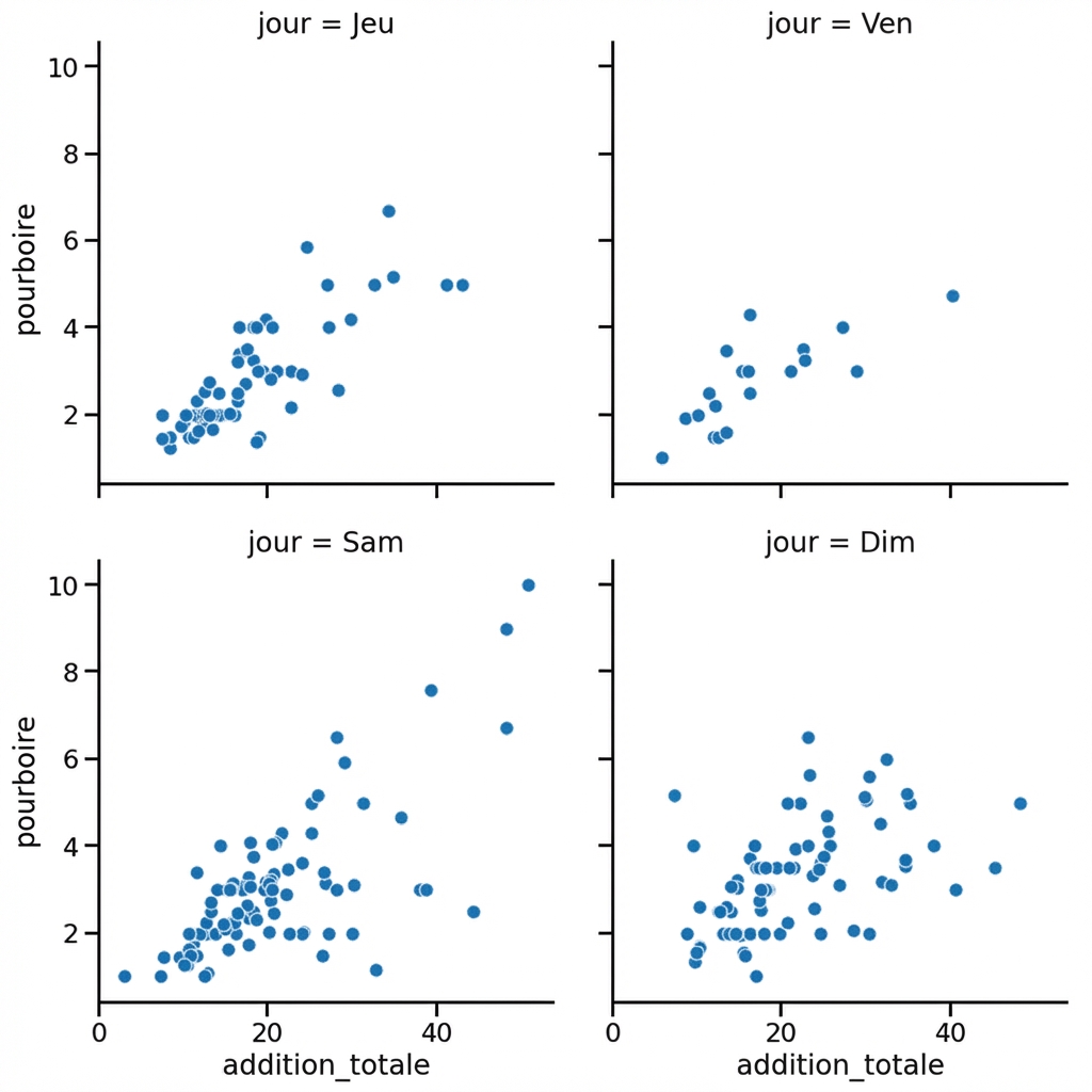
Colonnes enveloppantes
1 Waskom, M. L. (2021). seaborn : visualisation de données statistiques. https://seaborn.pydata.org/
Organisation des colonnes
1 Waskom, M. L. (2021). seaborn : visualisation de données statistiques. https://seaborn.pydata.org/

