Graphiques de comptage et graphiques en barres
Introduction à la visualisation de données avec Seaborn

Content Team
DataCamp
Graphiques catégoriels
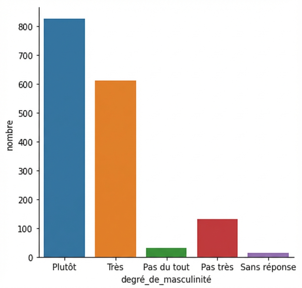
countplot() vs. catplot()
countplot() vs. catplot()
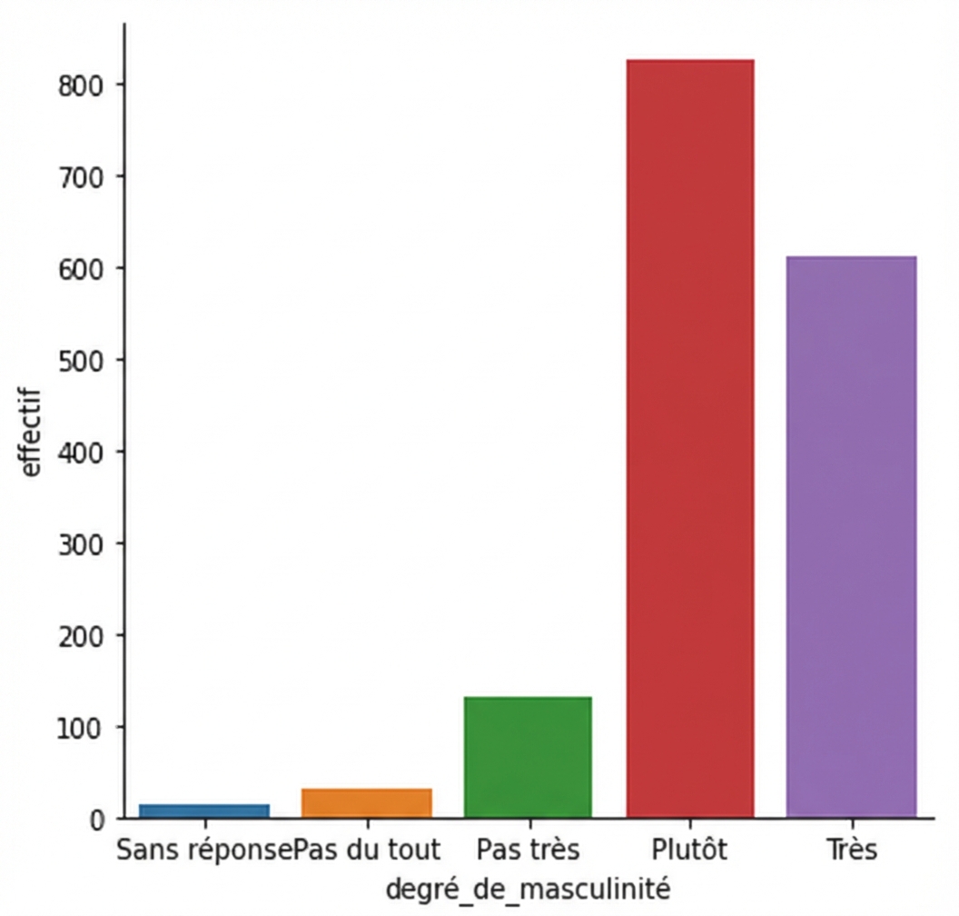
Changer l'ordre
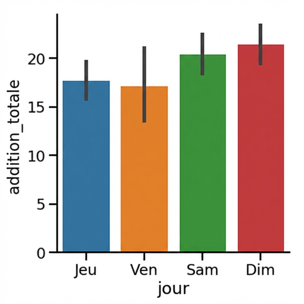
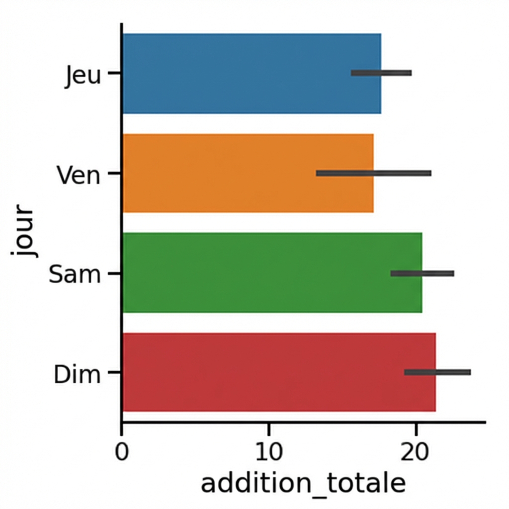
Graphiques en barres
1 Waskom, M. L. (2021). seaborn: statistical data visualization. https://seaborn.pydata.org/
Intervalles de confiance
1 Waskom, M. L. (2021). seaborn: statistical data visualization. https://seaborn.pydata.org/
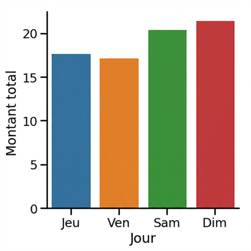
Désactiver les intervalles de confiance
1 Waskom, M. L. (2021). seaborn: statistical data visualization. https://seaborn.pydata.org/
Changer l'orientation
1 Waskom, M. L. (2021). seaborn: statistical data visualization. https://seaborn.pydata.org/

