Histogrammes
Introduction à la visualisation de données avec ggplot2

Rick Scavetta
Founder, Scavetta Academy
Histogrammes
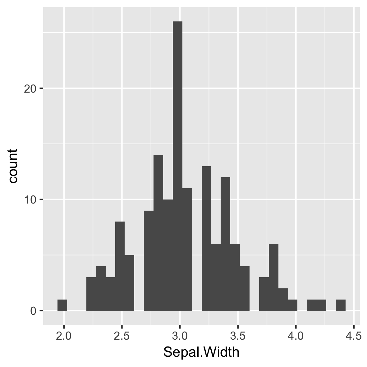
Défaut de 30 classes égales
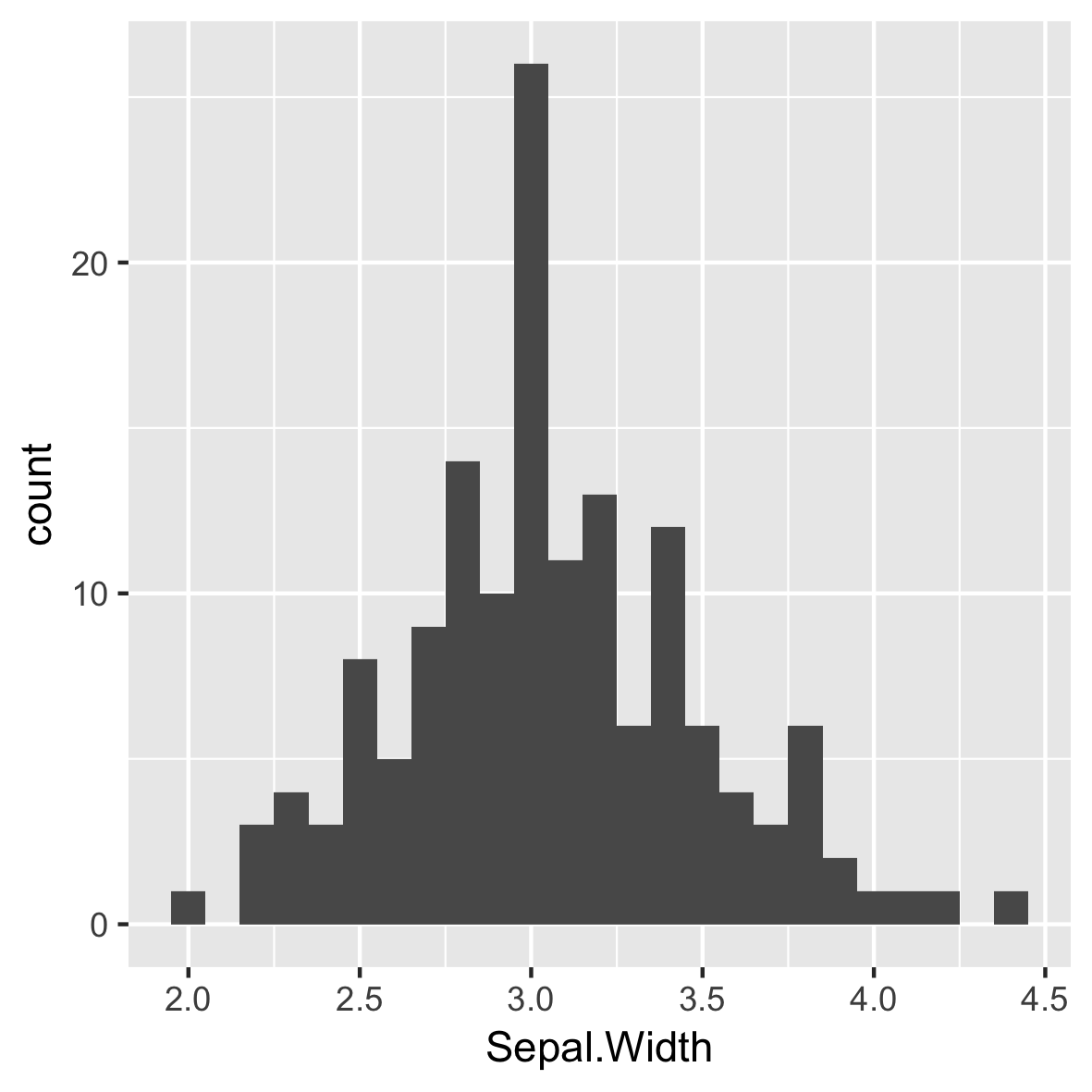
Largeurs de classes intuitives et significatives
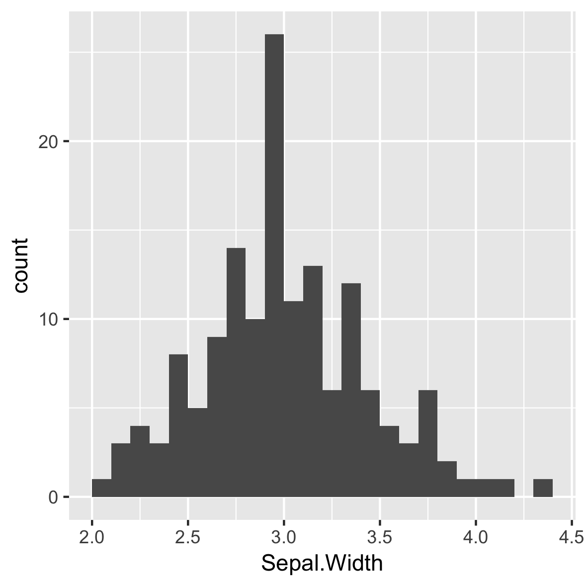
Repositionnement des marques de coche
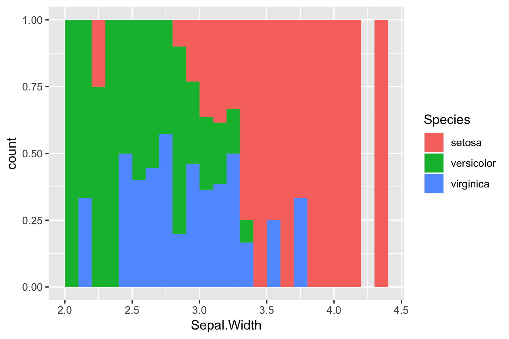
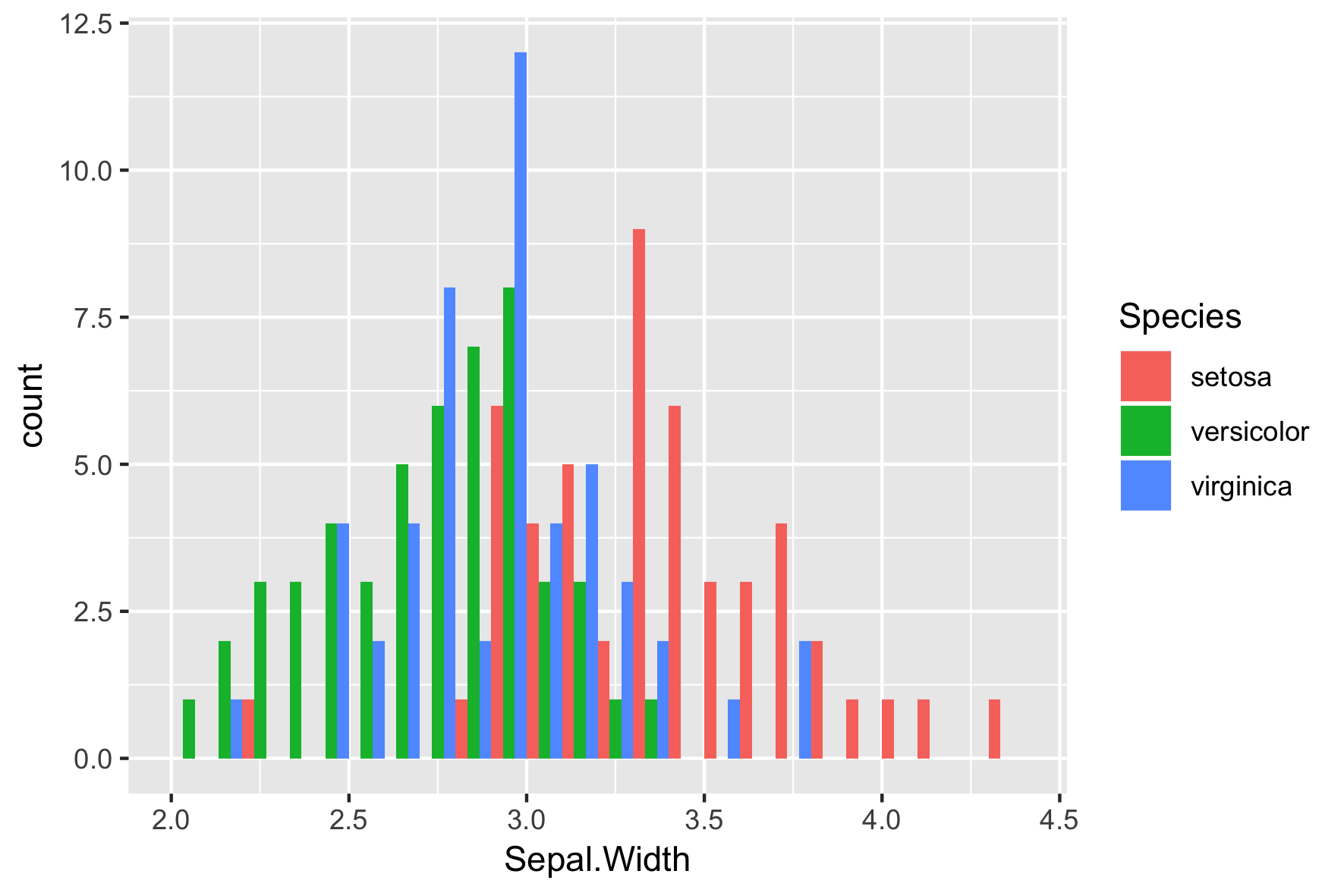
Espèces différentes
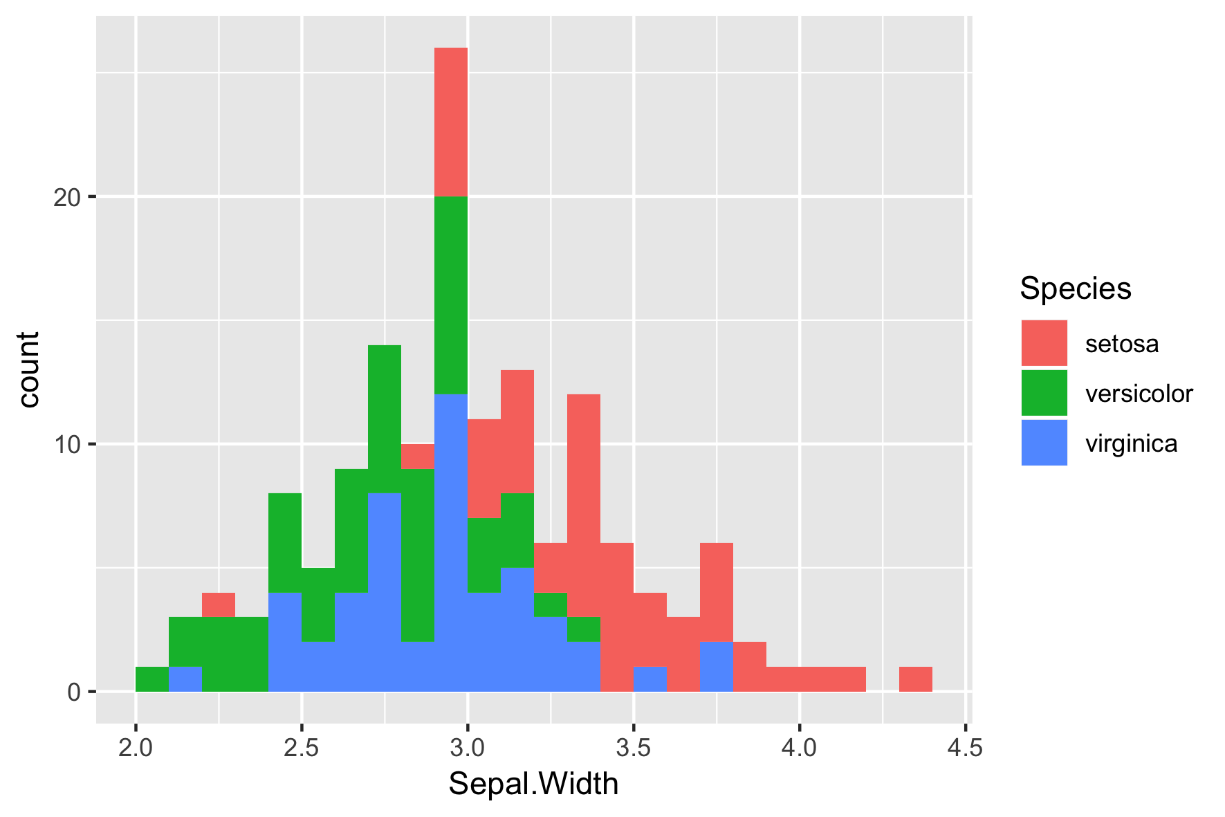
La position par défaut est "stack"
position = "dodge"
position = "fill"