Visualisation en Python
Introduction à Python pour la finance

Adina Howe
Professor
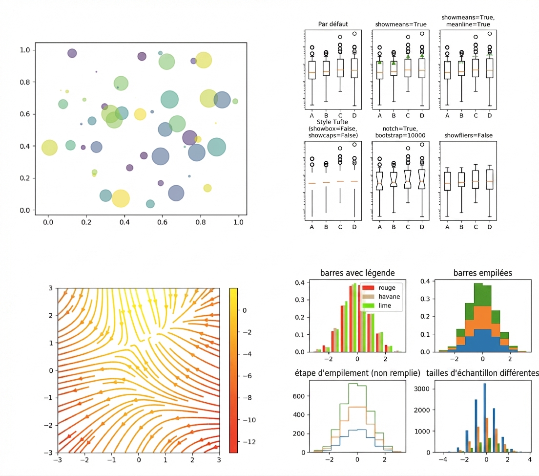
Matplotlib : Un package de visualisation
Pour découvrir davantage la galerie Matplotlib, cliquez sur ce lien.
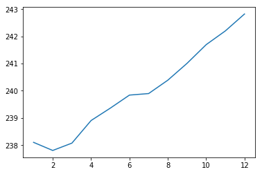
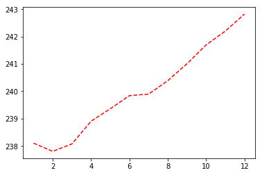
Résultat du graphique
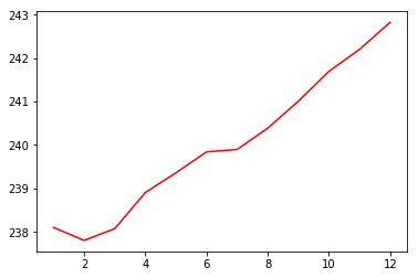
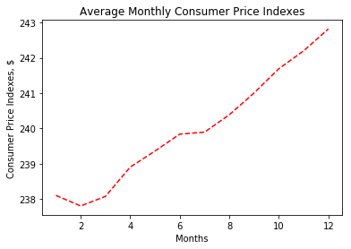
Résultat du graphique
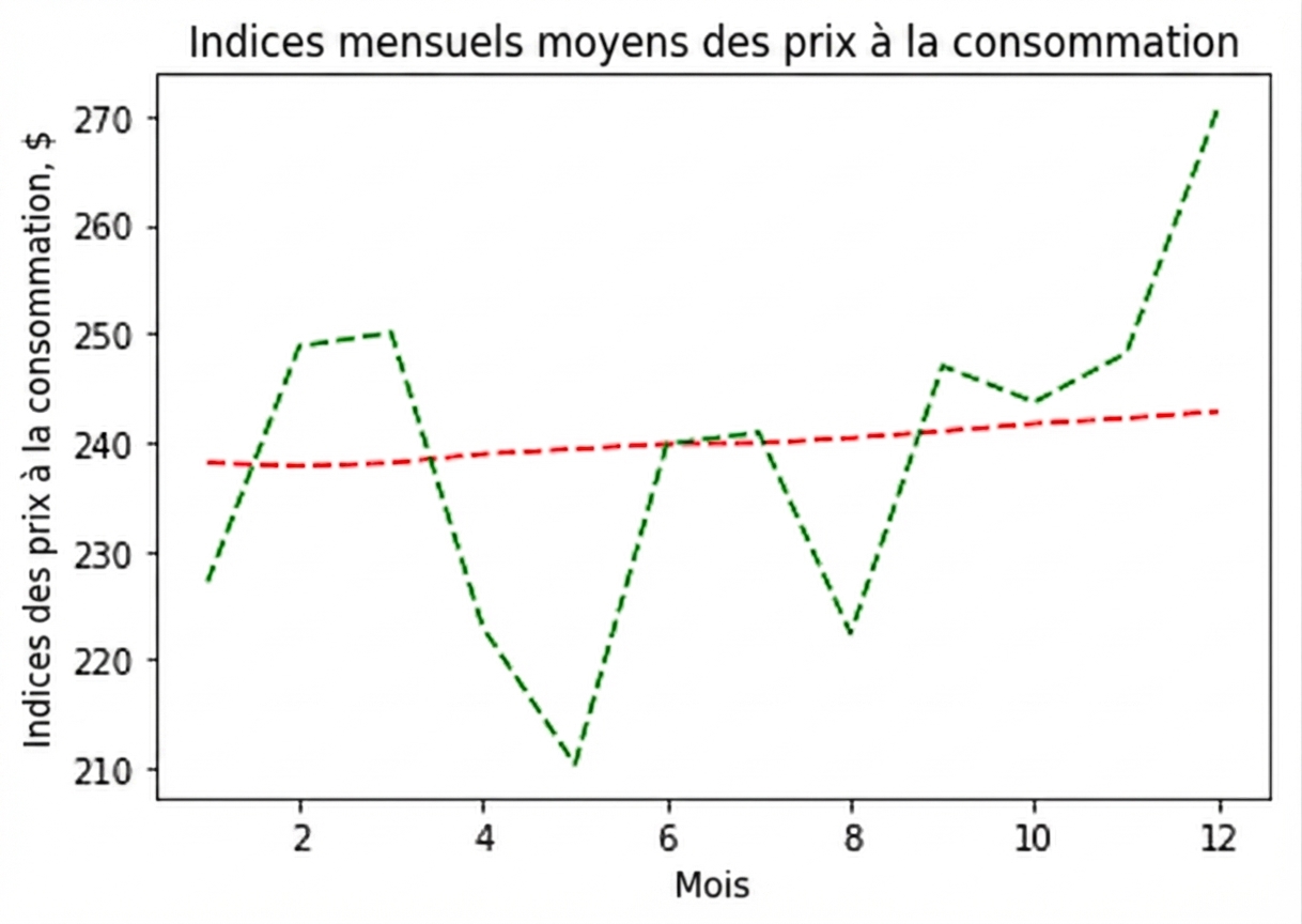
Résultat du graphique
Résultat du graphique
Résultat du graphique
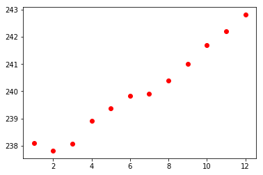
Résultat du diagramme en nuage de points