Synthesizing insights from complex experiments

Experimental Design in Python

James Chapman

Curriculum Manager, DataCamp

Manufacturing yield data

manufacturing_yield
 BatchID  MaterialType  ProductionSpeed  TemperatureSetting  YieldStrength
      39       Polymer           Medium             Optimal          58.83
     195         Metal             High                High          51.29
     462       Polymer             High             Optimal          55.15
     696     Composite           Medium                 Low          50.27
     142     Composite             High                 Low          57.62
  • Multifactorial design: MaterialType, ProductionSpeed, TemperatureSetting
  • Response variable: YieldStrength
Experimental Design in Python

Manufacturing quality data

manufacturing_quality
 BatchID ProductionSpeed  ProductQuality
     149             Low           93.87
     739            High           93.35
     617          Medium           90.45
     131            High           90.26
     684             Low           91.62
  • Design: ProductionSpeed
  • Response variable: ProductQuality
Experimental Design in Python

Merging strategy

merged_manufacturing = pd.merge(manufacturing_yield,
                       manufacturing_quality, 
                       on=['BatchID', 'ProductionSpeed'])
print(merged_manufacturing)
 BatchID  MaterialType  ProductionSpeed  TemperatureSetting  YieldStrength  ProductQuality
       1         Metal              Low                High          57.32           91.19
       5     Composite           Medium             Optimal          51.82           90.20
       7       Polymer              Low                High          56.12           91.66
       8     Composite             High             Optimal          50.91           93.05
      11       Polymer              Low                High          50.13           92.31
Experimental Design in Python

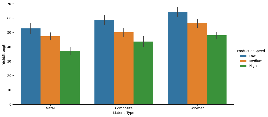
Side-by-side bar graph

import seaborn as sns
sns.catplot(x='MaterialType', y='YieldStrength', hue='ProductionSpeed', kind='bar', 
            data=merged_manufacturing)

catplot.png

Experimental Design in Python

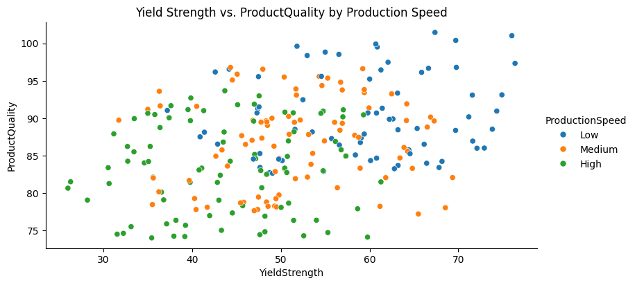
Three variable scatterplot

sns.relplot(x='YieldStrength', y='ProductQuality', hue='ProductionSpeed', 
            kind='scatter', data=merged_manufacturing)
plt.title('Yield Strength vs. Product Quality by Production Speed')

Yield Strength vs. Product Quality by Production Speed

Experimental Design in Python

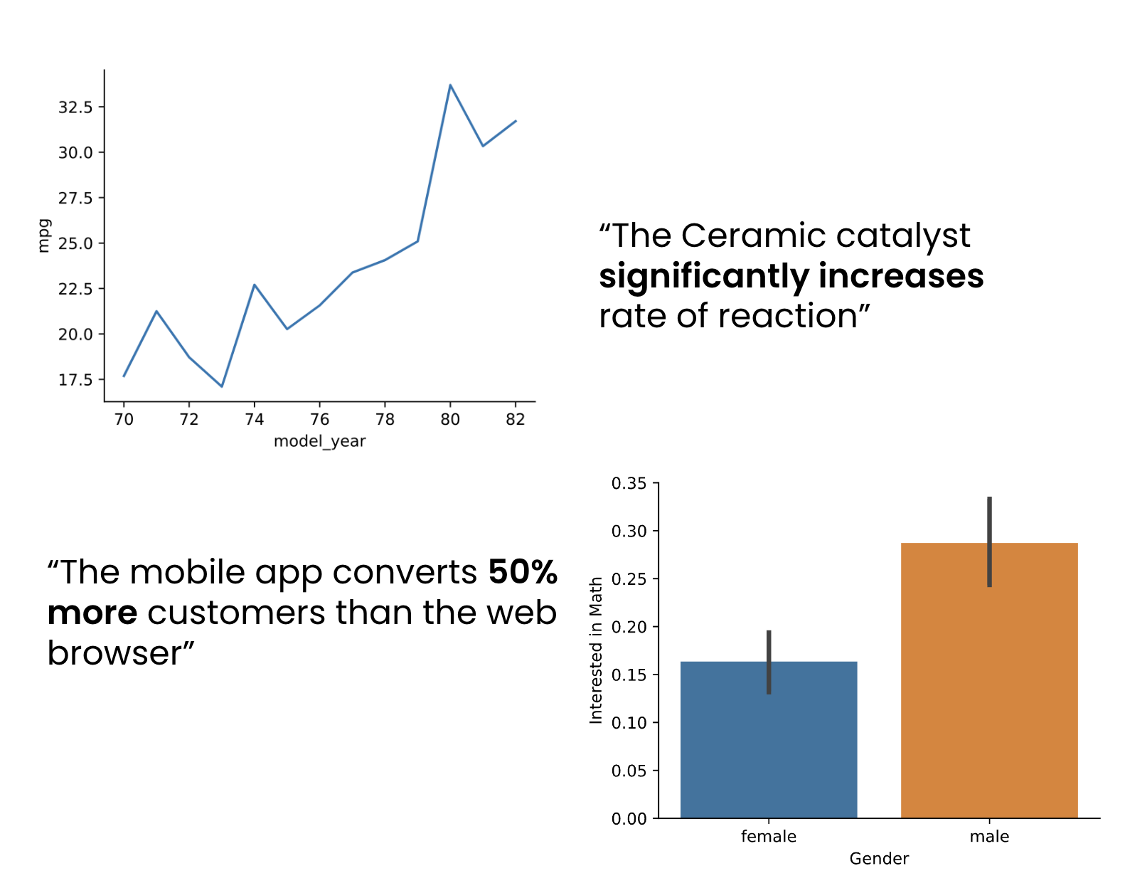
Communicating data to technical audiences


  • Craft data narratives
    • p-values
    • Test statistics
    • Significance levels
  • Visualize complex data
    • Heat maps
    • Scatter plots with multiple colors
    • Projections

Presenting to a technical audience

Experimental Design in Python

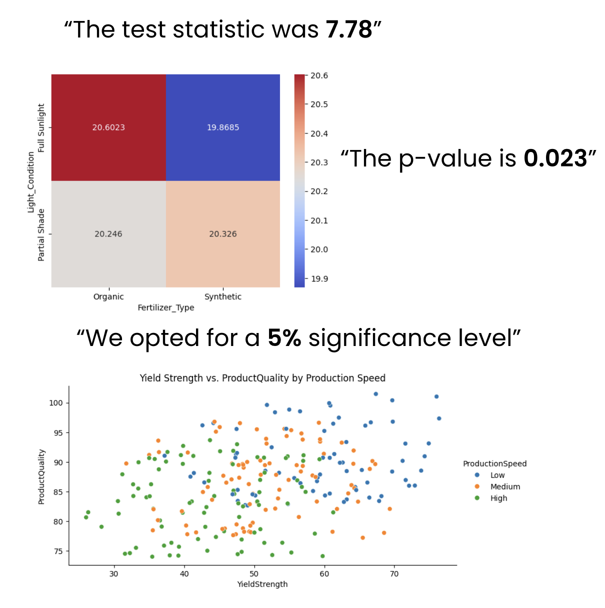
Engaging non-technical audiences with data


  • Simplify data insights
    • Foundational visualizations: bar and line plots
  • Prepare audience-centric presentations
    • Why does the data matter?
    • Connect insights to real-world application

Data storytelling

Experimental Design in Python

Let's practice!

Experimental Design in Python

Preparing Video For Download...