Multiple y-axis and combo charts
Visualizations in Sigma

Mandy Gray
Solutions and Enablement Lead, Aimpoint Digital
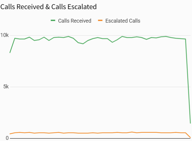
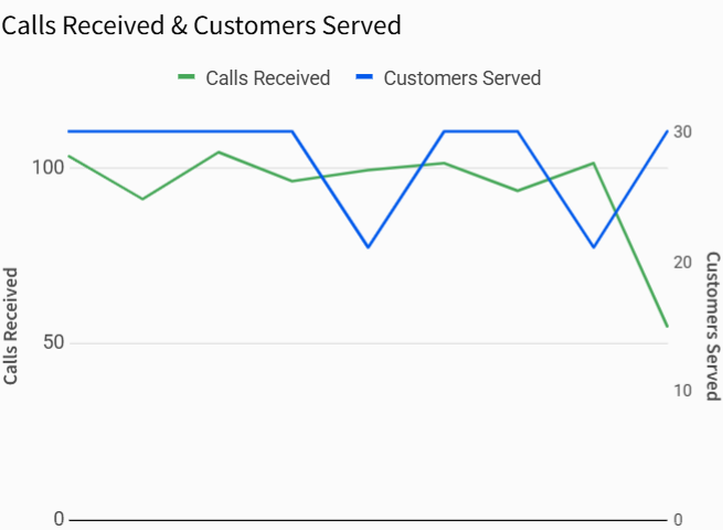
Compare multiple data columns

Compare multiple data columns

Compare multiple data columns

Y-axis needed for interpretation

Format y-axis accordingly
Different scales need separate y-axes
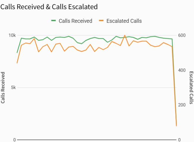
Different units require two y-axes
Combo charts
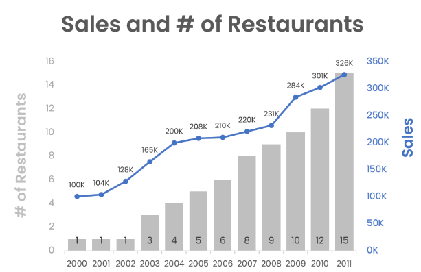
Combo charts

Combo charts