Dash AG Grid introduction

Créer des tableaux de bord avec Dash et Plotly

Alex Scriven

Data Scientist

What is a Dash AG Grid?


  • HTML table tag (available in Dash)
  • html.Table static → limited

$$

  • Dash AG Grid - dynamic and interactive
    • Filtering, hiding, exporting, styling
Créer des tableaux de bord avec Dash et Plotly

The basic table


from dash_ag_grid import AgGrid

column_defs = [ {"field": "Major Category"}, {"field": "Total Sales ($)"}, {"field": "Sales Volume"}, ]


grid = AgGrid(
columnDefs=column_defs,

rowData=major_cat_tb.to_dict("records"))
app.layout = [grid]

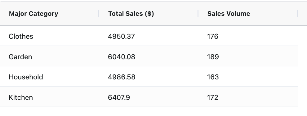
A table with 3 columns and four rows containing data from the familiar e-commerce dataset. The column headers are "Major Category," which contains text in the cells below, "Total Sales ($)" which has values below, and "Sales Volume" which has integer values below

Créer des tableaux de bord avec Dash et Plotly

Format the numbers

  • Problem: Financial number formatting
    • Solution: use valueFormatter
    • JavaScript formatting function
money_fmt = {
"function": (
    """params.value.toLocaleString(
    'en-US', {style: 'currency', currency: 'USD'})"""
)}

column_defs = [ {"field": "Major Category"}, {"field": "Total Sales ($)", "valueFormatter": money_fmt}, {"field": "Sales Volume"} ] # Add to layout as before
Créer des tableaux de bord avec Dash et Plotly

Format numbers output


  • Nicely formatted ✨


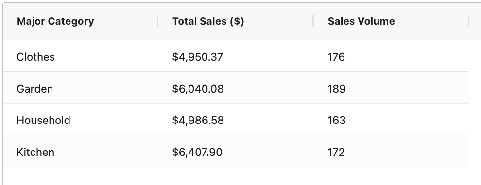
The same table that was on the previous slide. However, the Total Sales column now has values that are formatted with a preceding dollar sign and are rounded to 2 decimal places. The full table is a table with 3 columns and four rows containing data from the familiar e-commerce dataset. The column headers are "Major Category," which contains text in the cells below, "Total Sales ($)" and "Sales Volume" which has integer values below

Créer des tableaux de bord avec Dash et Plotly

Add sorting

  • Sorting enabled by default ⭐
# Turn off globally
grid = AgGrid(
  defaultColDef={"sortable": False}
)

# Specify for a column column_defs = [ {"field": "Major Category" , "sortable": True}, # Turn on {"field": "Sales Volume" , "sortable": False} # Turn off ]

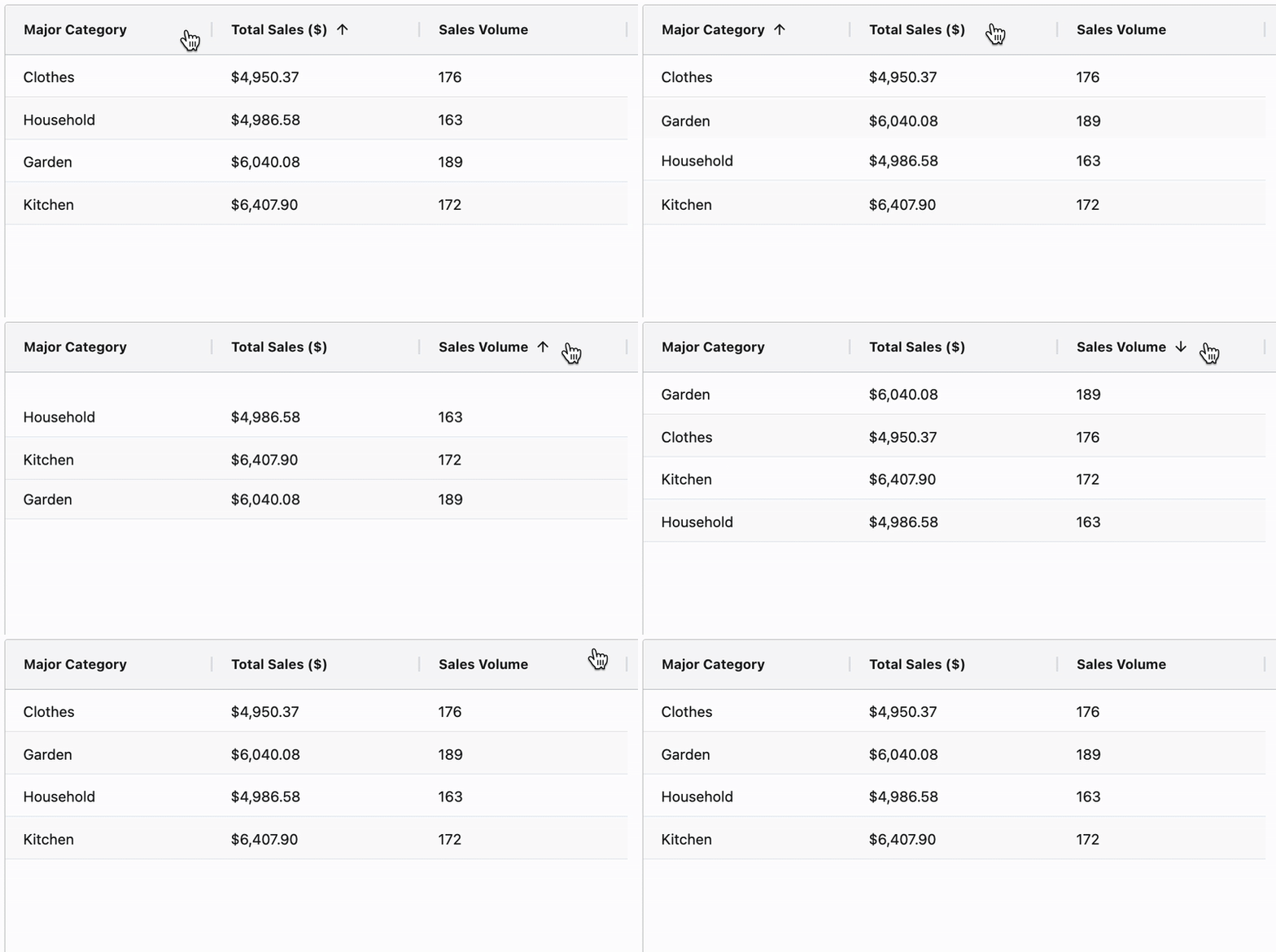
$$ A gif of the basic table from the first slides and when the mouse clicks the headers the rows sort

Créer des tableaux de bord avec Dash et Plotly

Add filtering


grid = AgGrid(
defaultColDef={
  "filter": True
  , "floatingFilter": True}
)

$$

  • Supports value and condition filters

$$

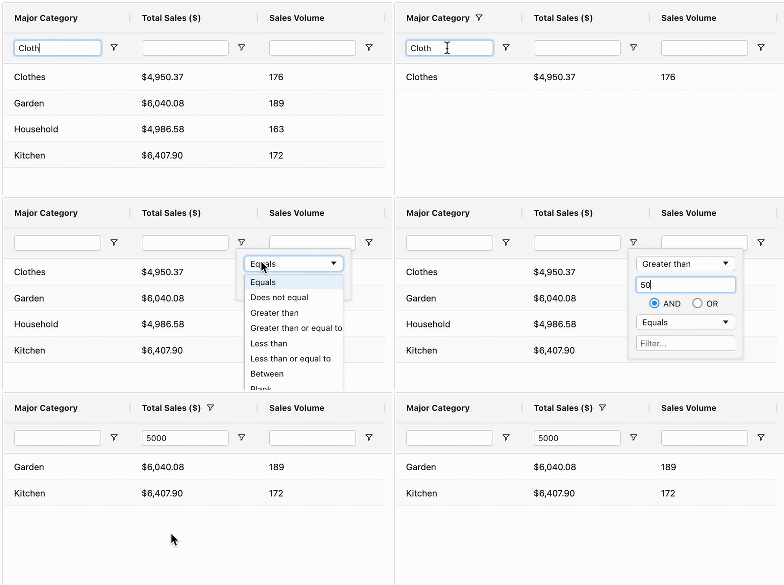
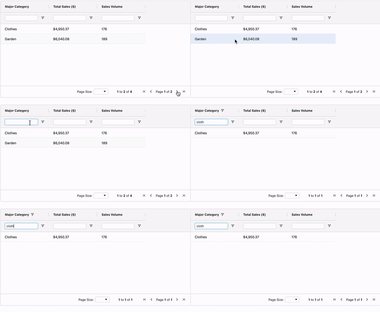
A gif of the basic table from the first slides, instead, now there is a row below the header that contains a blank box. The gif firstly filters the first column on Cloth and then the second using Grater than dropdown, filtering the table.

Créer des tableaux de bord avec Dash et Plotly

Pagination

  • Use pagination for long tables 💡

$$

grid = AgGrid(
    dashGridOptions={
    "pagination": True,        
    "paginationPageSize": 2
    }

$$

A gif of the same basic table from previous slides, however, there are only two rows of data and in the bottom-right of the table is a pagination toggle which has right and left arrows and a counter noting how many pages (2) and the current page.

  • Sort and filter apply table-wide 📌
Créer des tableaux de bord avec Dash et Plotly

Let's practice!

Créer des tableaux de bord avec Dash et Plotly

Preparing Video For Download...