Visualisation de l’analyse de cohortes

Customer Segmentation in Python

Karolis Urbonas

Head of Data Science, Amazon

Carte thermique
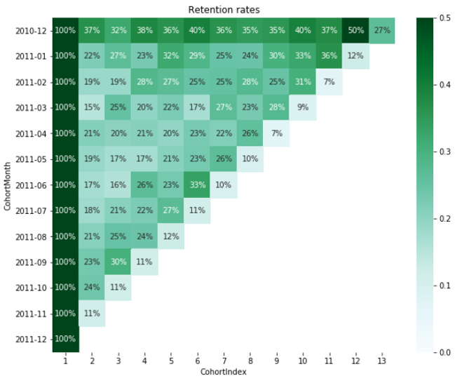
  • Façon la plus simple de visualiser une analyse de cohortes

  • Inclut données et graphiques

  • Quelques lignes de code avec seaborn

carte thermique de cohortes

Customer Segmentation in Python

Charger la table de rétention

retention.round(3)*100
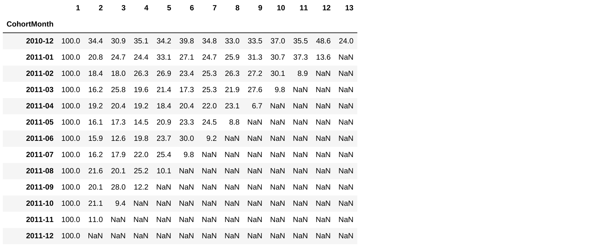
table de rétention

Customer Segmentation in Python

Créer la carte thermique

import seaborn as sns
import matplotlib.pyplot as plt

plt.figure(figsize=(10, 8))
plt.title('Retention rates')
sns.heatmap(data = retention, annot = True, fmt = '.0%', vmin = 0.0, vmax = 0.5, cmap = 'BuGn')
plt.show()
Customer Segmentation in Python

Carte thermique de rétention

carte thermique de rétention

Customer Segmentation in Python

Exercice : visualiser des cohortes

Customer Segmentation in Python

Preparing Video For Download...