Graphiques interactifs avec plotly

Créer des tableaux de bord avec shinydashboard

Png Kee Seng

Researcher

Exemple : annonces Airbnb à Londres

  • Imaginez que vous travaillez dans une agence de voyages à Londres
  • Un partenariat a été noué avec Airbnb
    library(tidyverse)
    listings <- read_csv("../data/listings.csv")
    
...
 $ host_name                     : chr [1:69351] "Susie" "Alina" "Luca" "Simon" ...
 $ neighbourhood_group           : logi [1:69351] NA NA NA NA NA NA ...
 $ neighbourhood                 : chr [1:69351] "Tower Hamlets" "Islington" "Tower Hamlets" "Islington" ...
 $ latitude                      : num [1:69351] 51.5 51.6 51.5 51.5 51.5 ...
 $ longitude                     : num [1:69351] -0.054 -0.1127 -0.0743 -0.1048 -0.2 ...
 $ room_type                     : chr [1:69351] "Private room" "Private room" "Entire home/apt" "Private room" ...
 $ price                         : num [1:69351] 55 50 90 180 297 75 204 379 90 30 ...
 $ minimum_nights                : num [1:69351] 3 1 5 4 14 3 2 4 3 7 ...
 $ number_of_reviews             : num [1:69351] 65 30 42 493 6 89 581 51 104 32 ...
 $ last_review                   : Date[1:69351], format: "2016-06-10" "2022-07-15" "2022-01-04" "2022-09-02" ...
 $ reviews_per_month             : num [1:69351] 0.47 0.2 0.34 3.59 0.05 0.57 4.26 0.36 0.86 0.29 ...
 $ calculated_host_listings_count: num [1:69351] 1 2 1 5 1 1 1 5 1 1 ...
 $ availability_365              : num [1:69351] 74 343 222 236 180 70 193 249 318 251 ...
...
Créer des tableaux de bord avec shinydashboard

Premiers pas avec plotly

  • Importez la bibliothèque plotly

    library(plotly)
    
  • Un objet plotly se crée en plaçant un objet ggplot dans ggplotly()

    ggplotly(<ggplot object>)
    
Créer des tableaux de bord avec shinydashboard

Diagramme à bulles avec ggplot

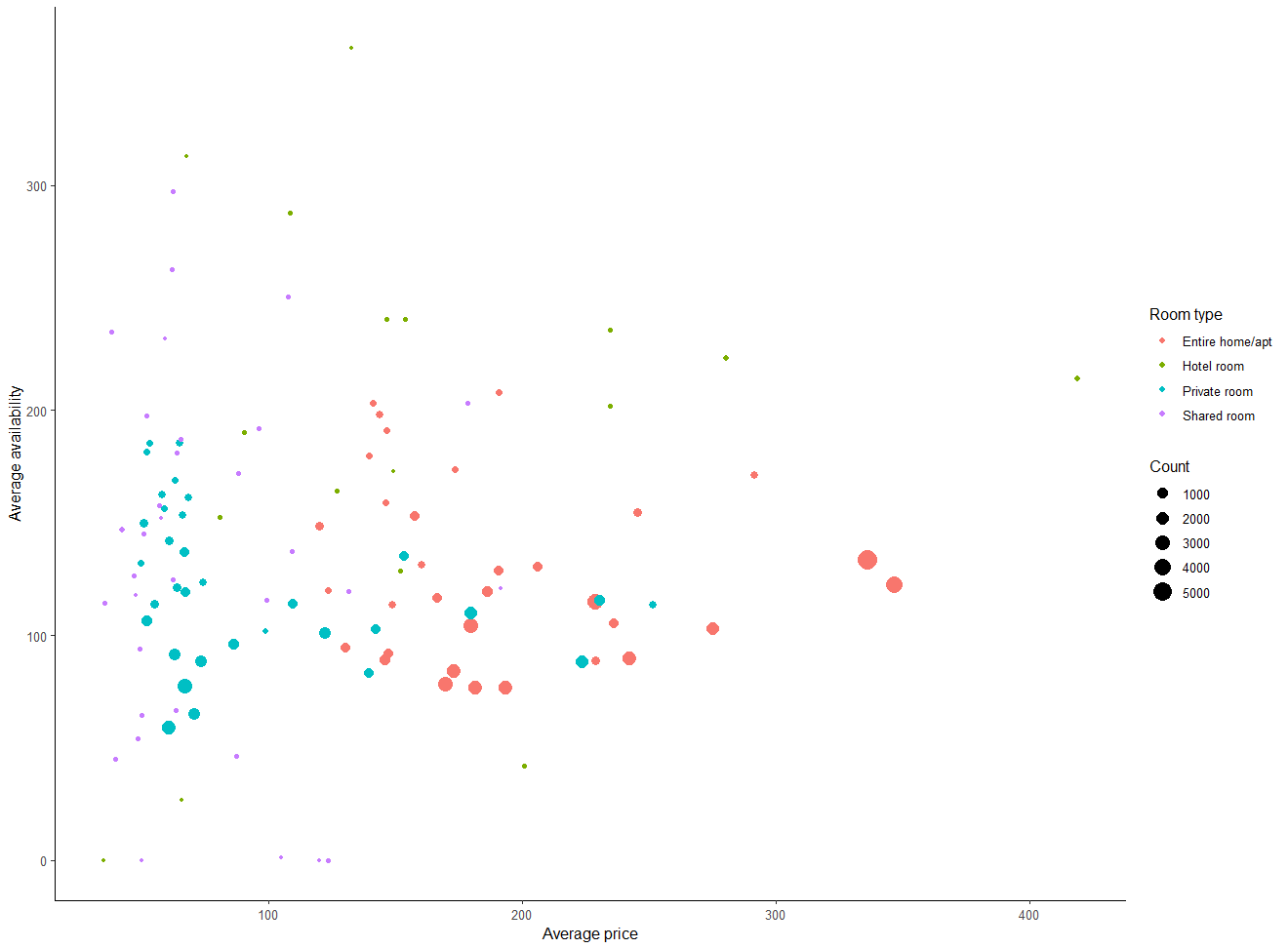
  • Créons un diagramme à bulles et enregistrons-le sous bubble
    • Relation entre price moyen et availability_365
    • Couleur différente pour chaque room_type
    • Taille des bulles proportionnelle au nombre d'annonces
    • Ajoutez des couches pour améliorer le rendu
bubble <- listings %>%

group_by(room_type, neighbourhood) %>% summarise(avg_price = mean(price, na.rm=TRUE), avg_availability = mean(availability_365, na.rm=TRUE),
Count = n(), .groups = "drop") %>%
ggplot(aes(x = avg_price, y = avg_availability,
color = room_type,
size = Count)) +
geom_point() +
labs(x = "Prix moyen", y = "Disponibilité moyenne", color = "Type de logement") + theme_classic()
Créer des tableaux de bord avec shinydashboard

Diagramme à bulles avec ggplot, rendu

Un diagramme à bulles classique créé avec ggplot.

Créer des tableaux de bord avec shinydashboard

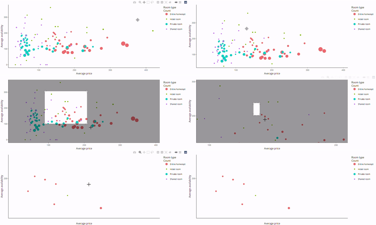
Diagramme à bulles interactif avec plotly

  • Placez bubble dans ggplotly()
ggplotly(bubble)

Un diagramme à bulles plotly interactif.

Créer des tableaux de bord avec shinydashboard

Boîtes à moustaches horizontales avec plotly

  • Certains graphiques ne se convertissent pas correctement

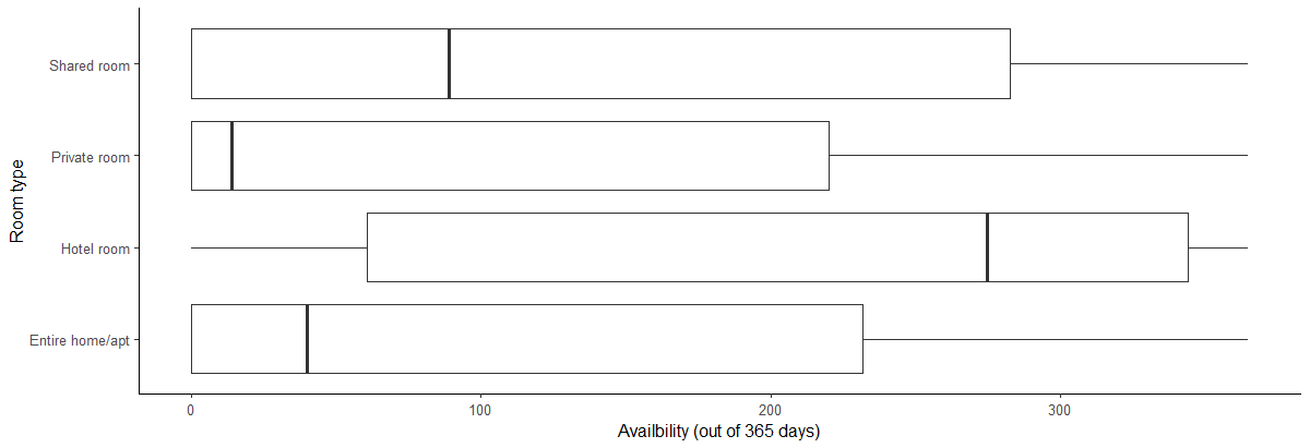
  • Créez une série de boîtes à moustaches horizontales

    • Décrivez la distribution de availability_365 selon room_type
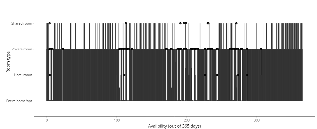
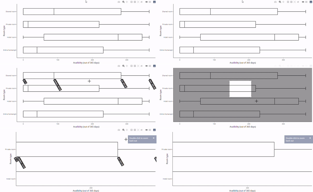
  • La conversion avec ggplotly() ne fonctionne pas
boxH <- listings %>%

ggplot(aes(x = availability_365, y=room_type)) +
geom_boxplot() +
labs(x="Disponibilité (sur 365 jours)", y="Type de logement") + theme_classic()
ggplotly(boxH)

Boîtes à moustaches horizontales créées avec ggplot.

Boîtes à moustaches horizontales converties avec ggplotly.

Créer des tableaux de bord avec shinydashboard

Boîtes à moustaches verticales avec plotly

  • Inversez x et y dans aes()
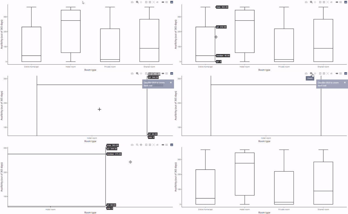
  • La conversion plotly fonctionnera maintenant
boxV <- listings %>%

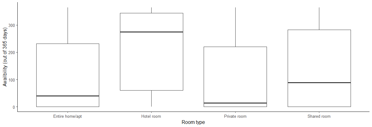
ggplot(aes(y = availability_365, x=room_type)) + geom_boxplot() + labs(y="Disponibilité (sur 365 jours)", x="Type de logement") + theme_classic()
ggplotly(boxV)

Boîtes à moustaches verticales avec ggplot.

Boîtes à moustaches verticales avec ggplotly.

Créer des tableaux de bord avec shinydashboard

Corriger les boîtes horizontales avec plotly

  • Et si vous voulez des boîtes horizontales ?
    • Ajoutez coord_flip()
  • Vous pouvez aussi utiliser facet_wrap()
    • Chaque panneau doit être assez grand
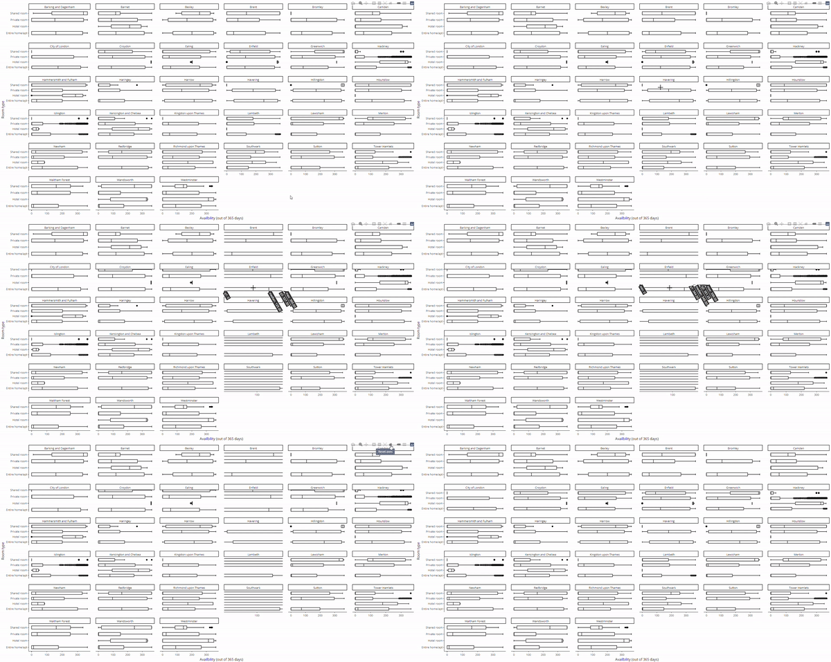
ggplotly(boxV + coord_flip())
ggplotly(boxV + coord_flip() + 
    facet_wrap(~neighbourhood))

Boîtes à moustaches plotly basculées verticalement.

Boîtes à moustaches plotly avec facettes.

Créer des tableaux de bord avec shinydashboard

Passons à la pratique !

Créer des tableaux de bord avec shinydashboard

Preparing Video For Download...