Statistiken außerhalb von Geoms
Fortgeschrittene Datenvisualisierung mit ggplot2

Rick Scavetta
Founder, Scavetta Academy
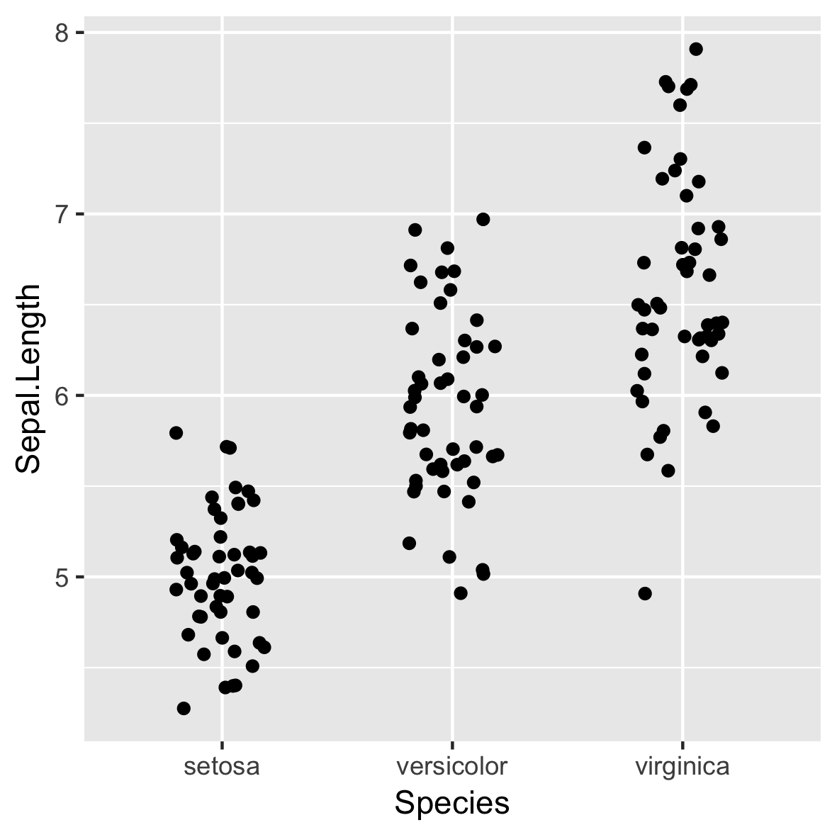
Basis-Plot
stat_summary()
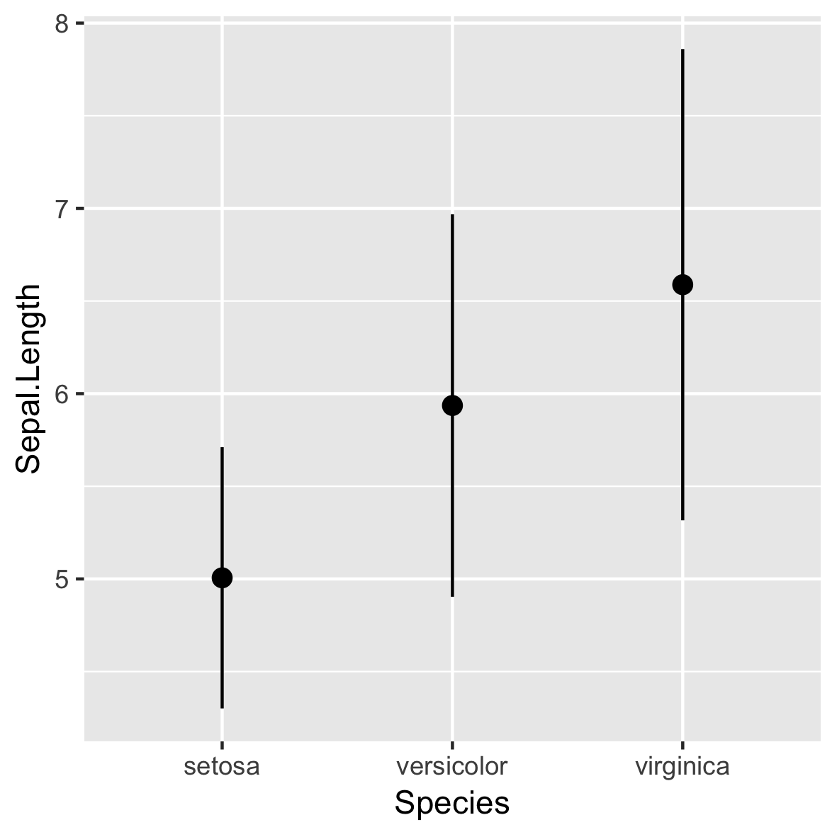
stat_summary()
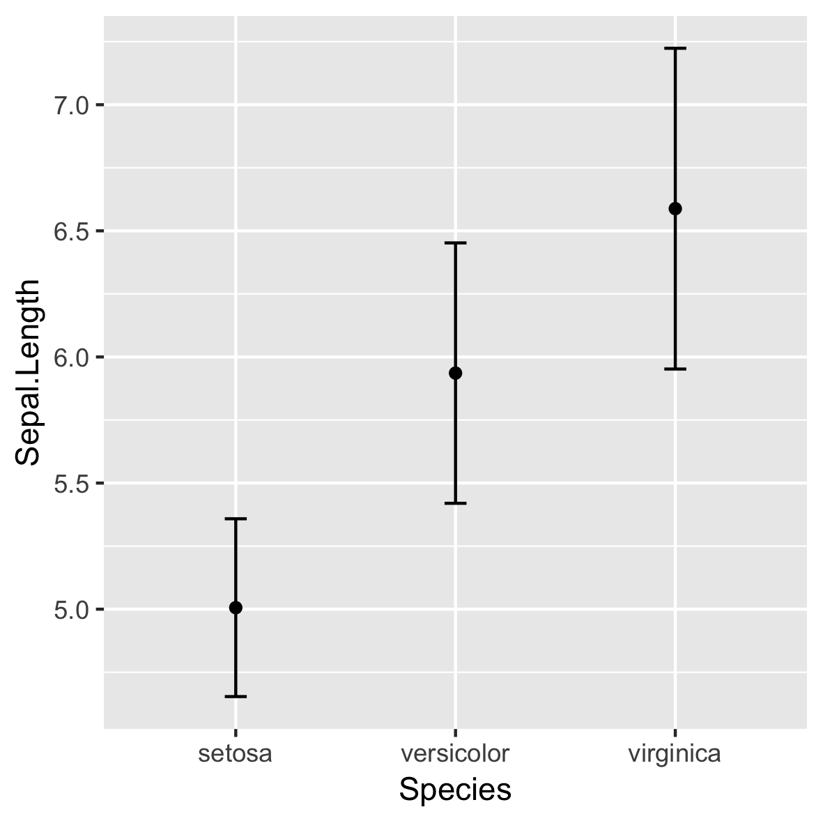
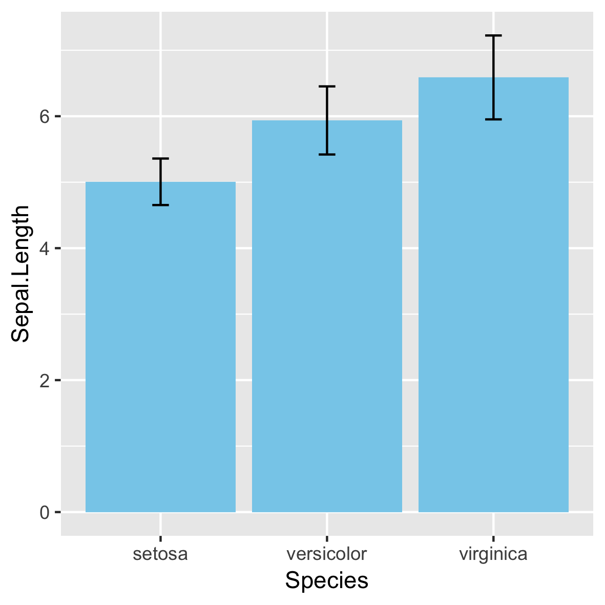
Nicht empfohlen!
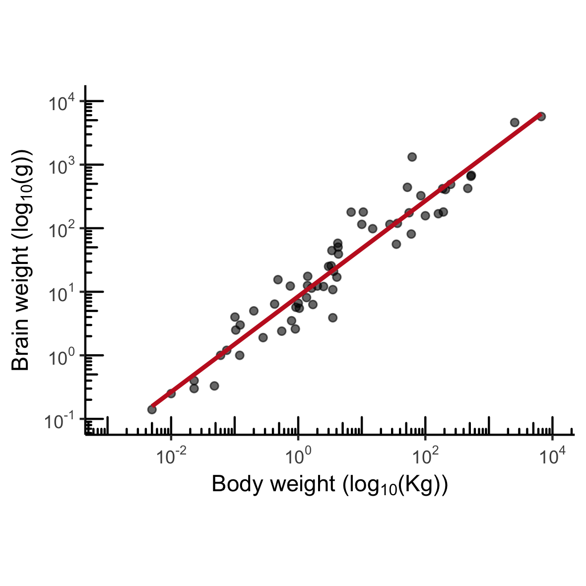
MASS::mammals
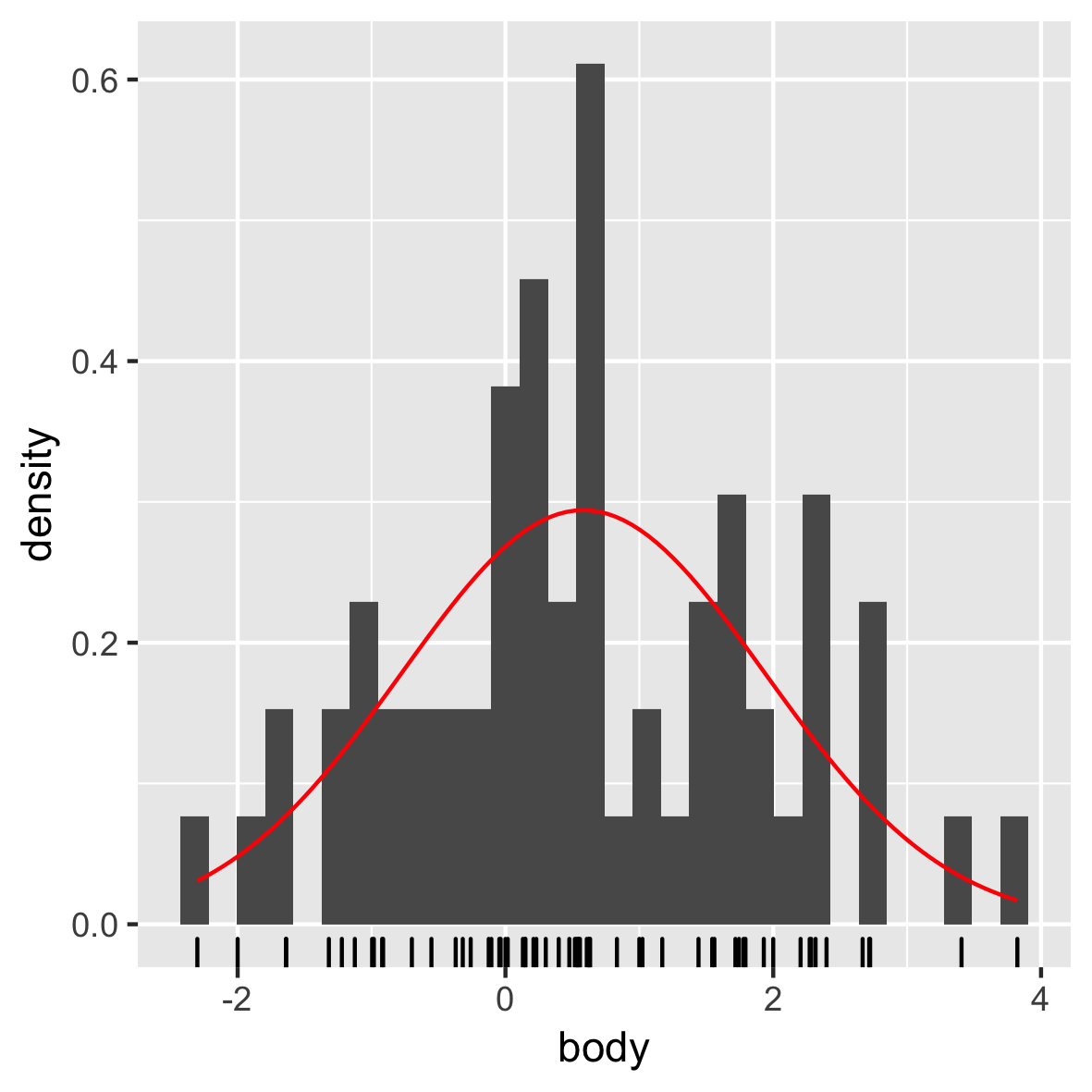
Normalverteilung
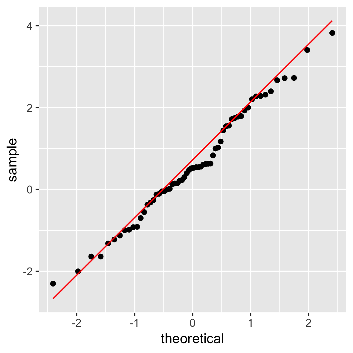
QQ-Plot
Fortgeschrittene Datenvisualisierung mit ggplot2
Rick Scavetta
Founder, Scavetta Academy
Nicht empfohlen!

