Editing plot axes

Einführung in die Datenvisualisierung mit Plotly in Python

Alex Scriven

Data Scientist

Our dataset

$$

  • An aggregate penguins dataset:
spec av_flip_length
Adelie 189.953642
Chinstrap 195.823529
Gentoo 217.186992


  • 🚫 spec and av_flip_length columns
Einführung in die Datenvisualisierung mit Plotly in Python

The default axis titles

$$

fig = px.bar(penguin_flippers, 
            x="spec", 
            y="av_flip_length")
fig.show()


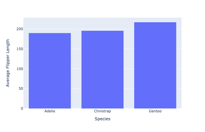
Simple bar chart of penguin flipper size by species

Einführung in die Datenvisualisierung mit Plotly in Python

Editing axis titles

  • plotly 'shortcut' functions:
fig.update_xaxes(title_text="Species")
fig.update_yaxes(title_text="Average Flipper Length")

$$

  • Implementation with update_layout()
fig.update_layout(dict(
    xaxis=dict(title=dict(text="Species")),
    yaxis=dict(title=dict(text="Average Flipper Length"))
))
Einführung in die Datenvisualisierung mit Plotly in Python

Cleaning up our plot

Simple bar chart with updated axes titles

Einführung in die Datenvisualisierung mit Plotly in Python

Which method to use?


  • ⭐ Use 'shortcut' methods for basic updates

$$

  • ⭐⭐ Use the update_layout() method for more control:
    • Can adjust font size, style, color, angle

$$

$$

See more on the Plotly documentation

Einführung in die Datenvisualisierung mit Plotly in Python

Editing axes ranges

Simple bar chart with updated axes titles

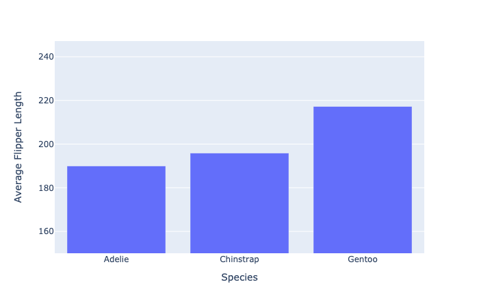
  • Setting the y-axis from 150 to the maximum value (with a small buffer)
fig.update_layout(dict(
    yaxis=dict(range=[150, penguin_flippers["av_flip_length"].max() + 30]
    )))
Einführung in die Datenvisualisierung mit Plotly in Python

Our new axes ranges

Simple bar chart with specific shortened range

Einführung in die Datenvisualisierung mit Plotly in Python

Data scale issues

What happens when some data points are much larger than others?

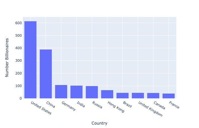
  • Top 10 countries by number of billionaires
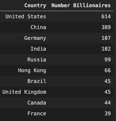
Table of number billionaires by country

Einführung in die Datenvisualisierung mit Plotly in Python

Our scale problem


fig = px.bar(billionaire_data, 
            x="Country", 
            y="Number Billionaires")
fig.show()

Basic bar chart of bar graph of billionaire numbers

Einführung in die Datenvisualisierung mit Plotly in Python

The log scale

  • Used to plot data with large value differences
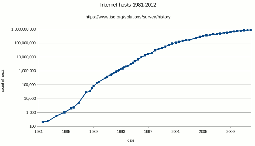
Log plot example

  • Each tick is ten times the previous (10, 100, 1000, etc.)
Einführung in die Datenvisualisierung mit Plotly in Python

Using log with our data

$$

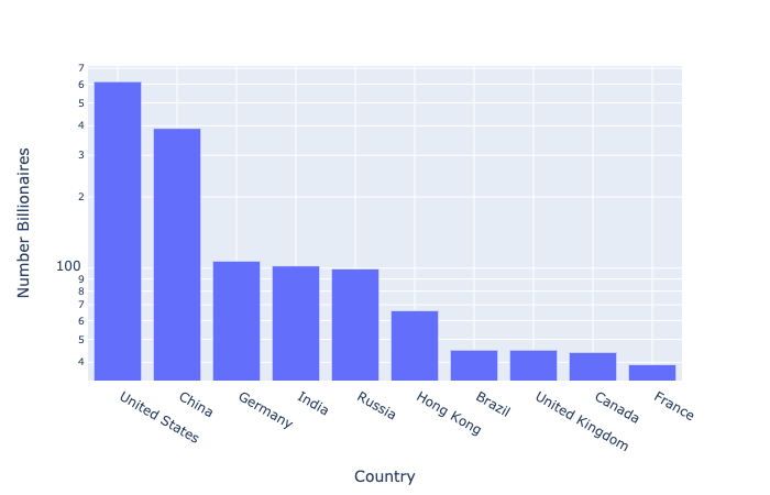
  • Plotly has log_y and log_x arguments
fig = px.bar(billionaire_data, 
            x="Country", 
            y="Number Billionaires",
            log_y=True)

fig.show()

$$

Log scale bar chart of billionaire data

Einführung in die Datenvisualisierung mit Plotly in Python

Log scale: a word of warning

💡 Always consider the audience when choosing how to visualize data

Presenting a graph to the audience

Einführung in die Datenvisualisierung mit Plotly in Python

Let's practice!

Einführung in die Datenvisualisierung mit Plotly in Python

Preparing Video For Download...