Bivariate visualizations

Einführung in die Datenvisualisierung mit Plotly in Python

Alex Scriven

Data Scientist

What are bivariate visualizations?

  • Display a comparison of two variables

$$

$$

  • scatterplots
  • Line charts
  • Correlation plots
Einführung in die Datenvisualisierung mit Plotly in Python

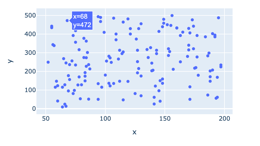
scatterplot

  • A y-axis representing one variable
  • An x-axis representing a different variable
  • Each intersection is a dot, e.g., (68, 472)
scatterplot

Einführung in die Datenvisualisierung mit Plotly in Python

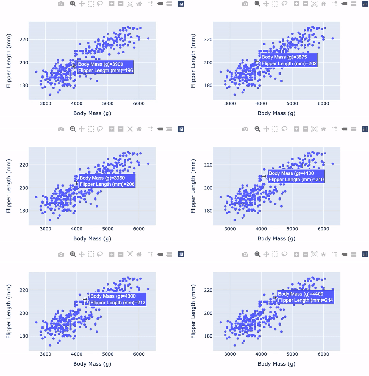
scatterplot with plotly.express


import plotly.express as px

fig = px.scatter( data_frame=penguins, x="Body Mass (g)", y="Flipper Length (mm)") fig.show()

Penguin Scatter

Einführung in die Datenvisualisierung mit Plotly in Python

More plotly.express arguments


Useful plotly.express scatterplot arguments:

  • trendline: Add different types of trend lines
  • symbol: Set different symbols for different categories

$$

$$

$$

Check the documentation for more

Einführung in die Datenvisualisierung mit Plotly in Python

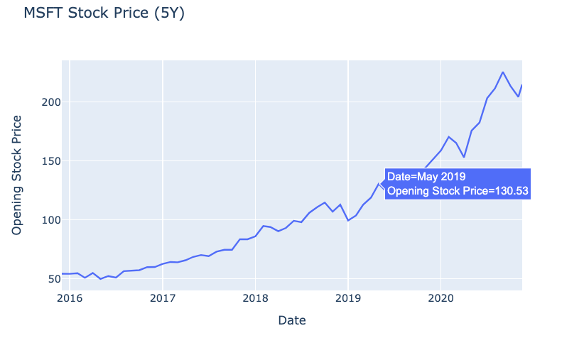
Line charts in plotly.express

  • Used to show how a variable changes over time

$$

fig = px.line(
  data_frame=msft_stock,  
  x="Date", 
  y="Open", 
  title="MSFT Stock Price (5Y)")
fig.show()

$$

Simple line chart of stock prices

Einführung in die Datenvisualisierung mit Plotly in Python

Correlation plot

  • Visualizes the correlation between several variables

$$

The Pearson Correlation Coefficient:

  • Has a value -1 to 1
  • 1 is perfectly positively correlated
  • 0 is no correlation
  • -1 is perfectly negatively correlated
Einführung in die Datenvisualisierung mit Plotly in Python

Correlation plot setup


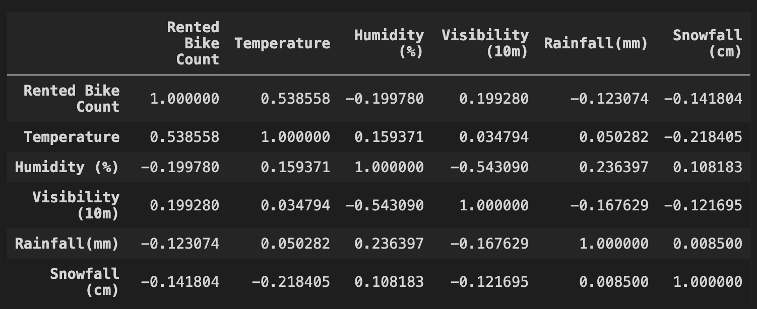
df contains data on bike rental numbers and weather conditions

cr = df.corr(method="pearson")
print(cr)


Correlation table

Einführung in die Datenvisualisierung mit Plotly in Python

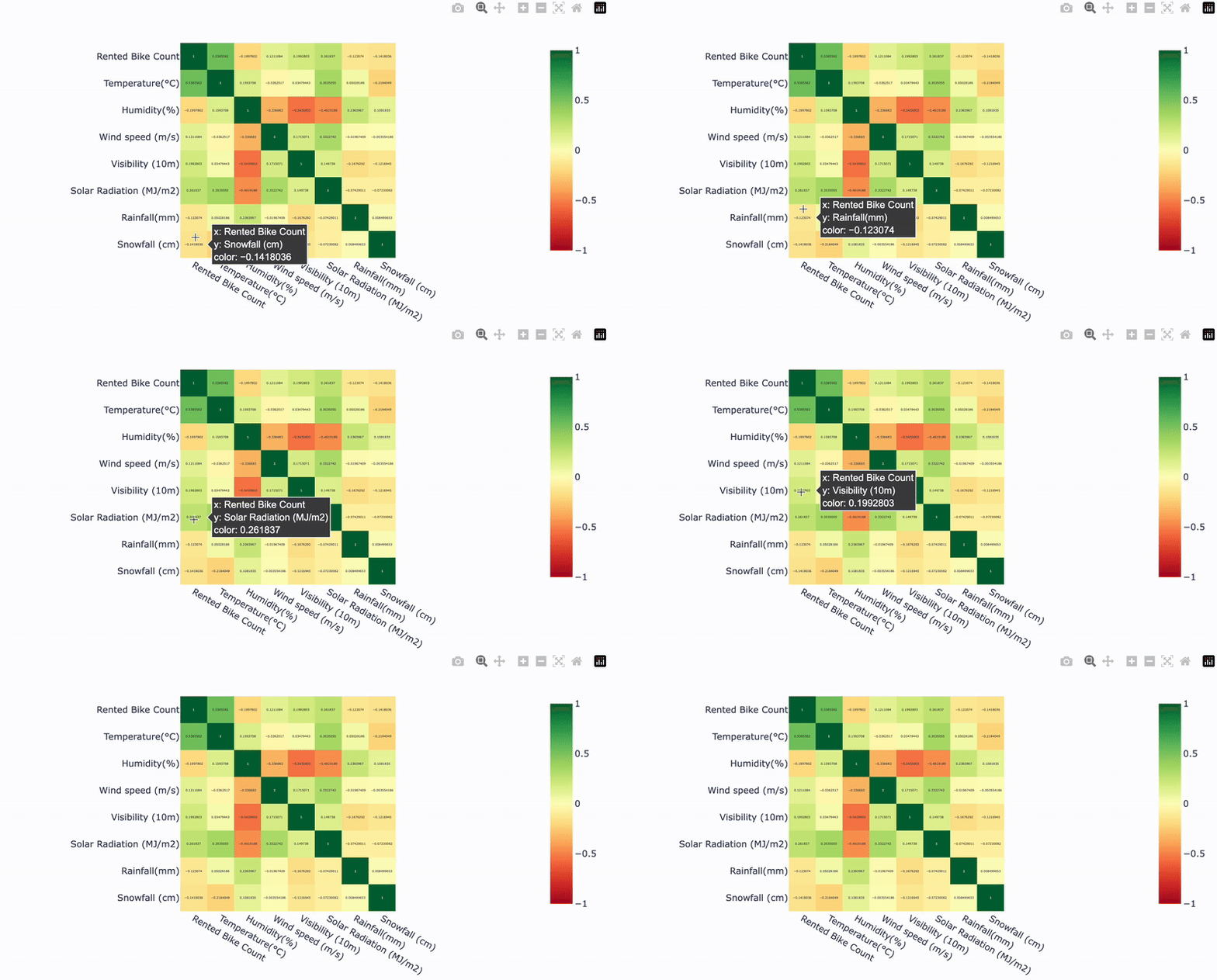
Correlation plot with Plotly

$$

fig = px.imshow(

cr,
text_auto=True,
color_continuous_scale="RdYlGn", zmin=-1, zmax=1)
fig.show()
Einführung in die Datenvisualisierung mit Plotly in Python

Our correlation plot

Heatmap example

Einführung in die Datenvisualisierung mit Plotly in Python

Let's practice!

Einführung in die Datenvisualisierung mit Plotly in Python

Preparing Video For Download...