R für SAS-Anwender:innen
Melinda Higgins, PhD
Research Professor/Senior Biostatistician Emory University

ggplot2 ist ein leistungsstarkes Grafikpaket für Rggplot steht für „grammar of graphics"ggplot2 baut Grafiken schichtweise auf# Create plot for x=sex and y=diameter
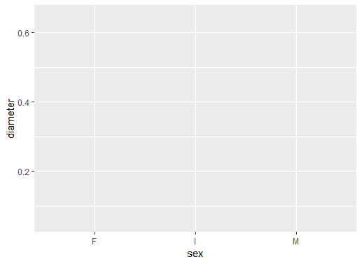
ggplot(data = abalone, aes(sex, diameter))
ggplot() definierendata = abalone setzenaes auf sex und diameter setzen
Noch keine grafischen Objekte
sex bereitdiameter bereit
# Add boxplot geometric object or geom
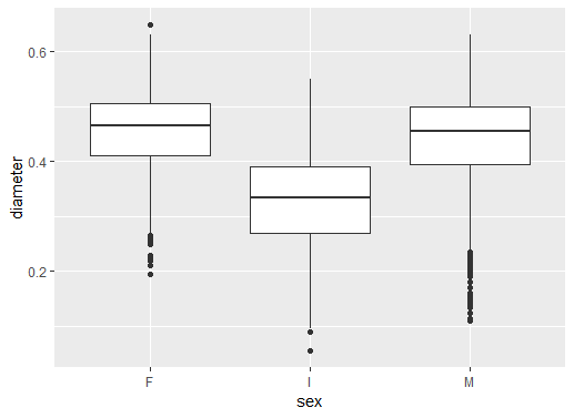
ggplot(data = abalone,
aes(sex, diameter)) +
geom_boxplot()
+ fügt eine Schicht hinzuBoxplot geom_boxplot() hinzugefügt
Ergebnis ist eine Reihe von Boxplots
F Weibchen, I Jungtiere, M Männchen
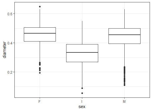
# Add black white theme
ggplot(data = abalone,
aes(sex, diameter)) +
geom_boxplot() +
theme_bw()
theme_bw() hinzufügen
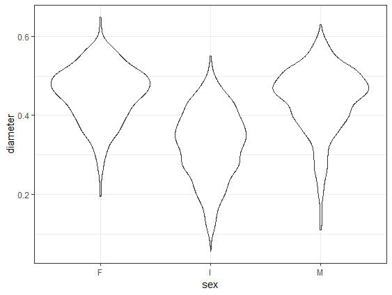
# Change to geom_violin()
ggplot(data = abalone,
aes(sex, diameter)) +
geom_violin() +
theme_bw()
geom_violin ersetzt geom_boxplot
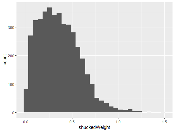
# Make histogram of shuckedWeight
ggplot(abalone, aes(shuckedWeight)) +
geom_histogram()
geom_histogram() hinzufügenaes() auf shuckedWeight setzen
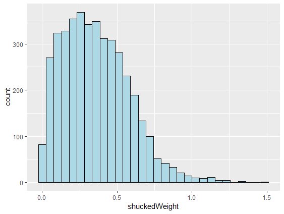
# Make lines black and fill light blue
ggplot(abalone, aes(shuckedWeight)) +
geom_histogram(color = "black",
fill = "lightblue")
color der Klassenlinien setzenfill-Farbe für Balken setzen() setzen
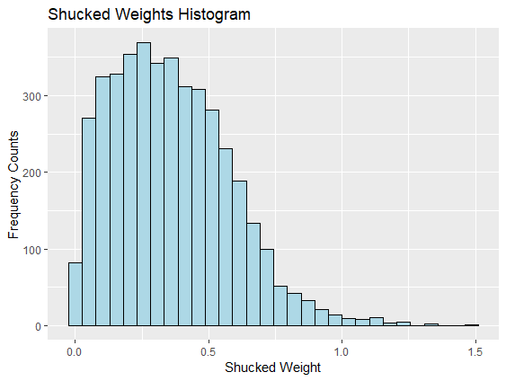
# Add x, y axis labels and title
ggplot(abalone, aes(shuckedWeight)) +
geom_histogram(color = "black",
fill = "lightblue") +
xlab("Shucked Weight") +
ylab("Frequency Counts") +
ggtitle("Shucked Weights Histogram")
xlab() und ylab() nutzenggtitle() nutzen
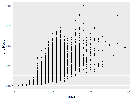
# Make scatterplot with geom_point()
ggplot(abalone,
aes(rings, shellWeight)) +
geom_point()
aes braucht zwei Variablengeom_point() fügt die Punkte hinzu
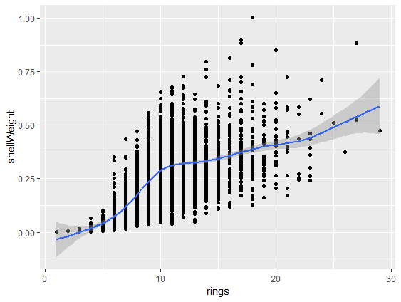
# Add smoothed fit line
ggplot(abalone,
aes(rings, shellWeight)) +
geom_point() +
geom_smooth()
geom_smooth() hinzufügen
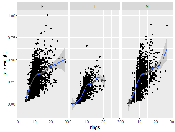
# Add panels using facet_wrap()
ggplot(abalone,
aes(rings, shellWeight)) +
geom_point() +
geom_smooth() +
facet_wrap(vars(sex))
facet_wrap()-Schicht hinzufügenvars(sex) definiert die Panel-Variable
ggplot2-GrafikskillsR für SAS-Anwender:innen