Einführung in Animation

Interaktive Datenvisualisierung mit plotly in R – Fortgeschrittene Themen

Adam Loy

Statistician, Carleton College
CO2-Emissionen und Einkommen

Frage: Hat sich die Beziehung zwischen CO2-Emissionen und Einkommen im Zeitverlauf verändert?

world_indicators
# A tibble: 11,387 x 11
  country  year income     co2 military population  urban life_expectancy four_regions
  <chr>   <dbl>  <dbl>   <dbl>    <dbl>      <dbl>  <dbl>           <dbl> <chr>       
1 Afghan…  1960   1210  0.0461       NA    9000000 7.56e5            38.6 asia        
2 Albania  1960   2790  1.24         NA    1640000 4.94e5            62.7 europe      
3 Algeria  1960   6520  0.554        NA   11100000 3.39e6            52   africa      
4 Andorra  1960  15200 NA            NA      13400 7.84e3            NA   europe      
5 Angola   1960   3860  0.0975       NA    5640000 5.89e5            42.4 africa      
# … with 1.138e+04 more rows, and 2 more variables: eight_regions <chr>, six_regions <chr>
Interaktive Datenvisualisierung mit plotly in R – Fortgeschrittene Themen

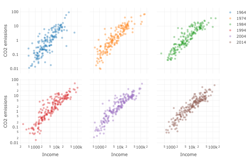
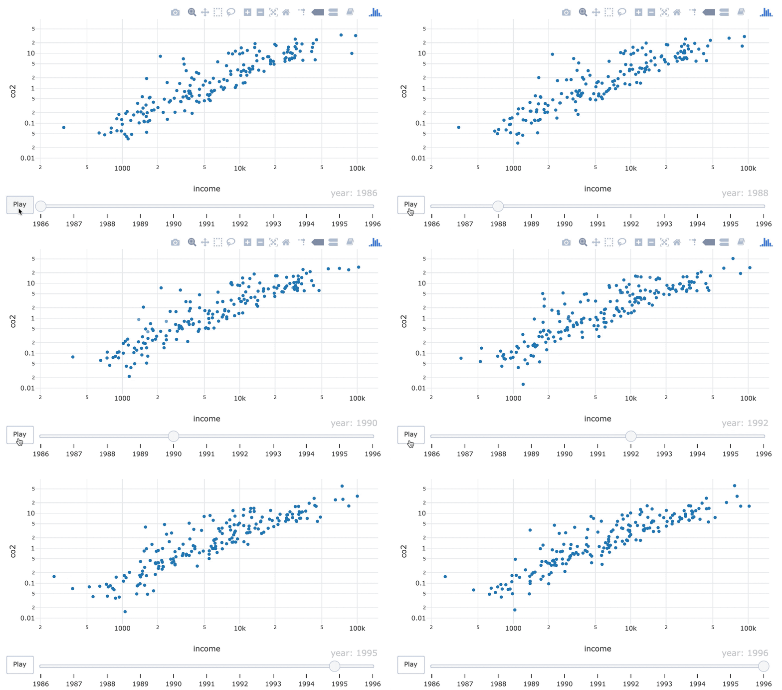
Streudiagramme der CO2-Emissionen im Verhältnis zum BIP pro Kopf   für sechs Jahre.

Interaktive Datenvisualisierung mit plotly in R – Fortgeschrittene Themen

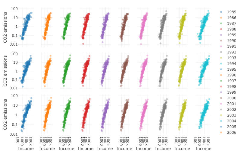
Streudiagramme der CO2-Emissionen im Verhältnis zum BIP pro Kopf   für 1989–2014.

Interaktive Datenvisualisierung mit plotly in R – Fortgeschrittene Themen

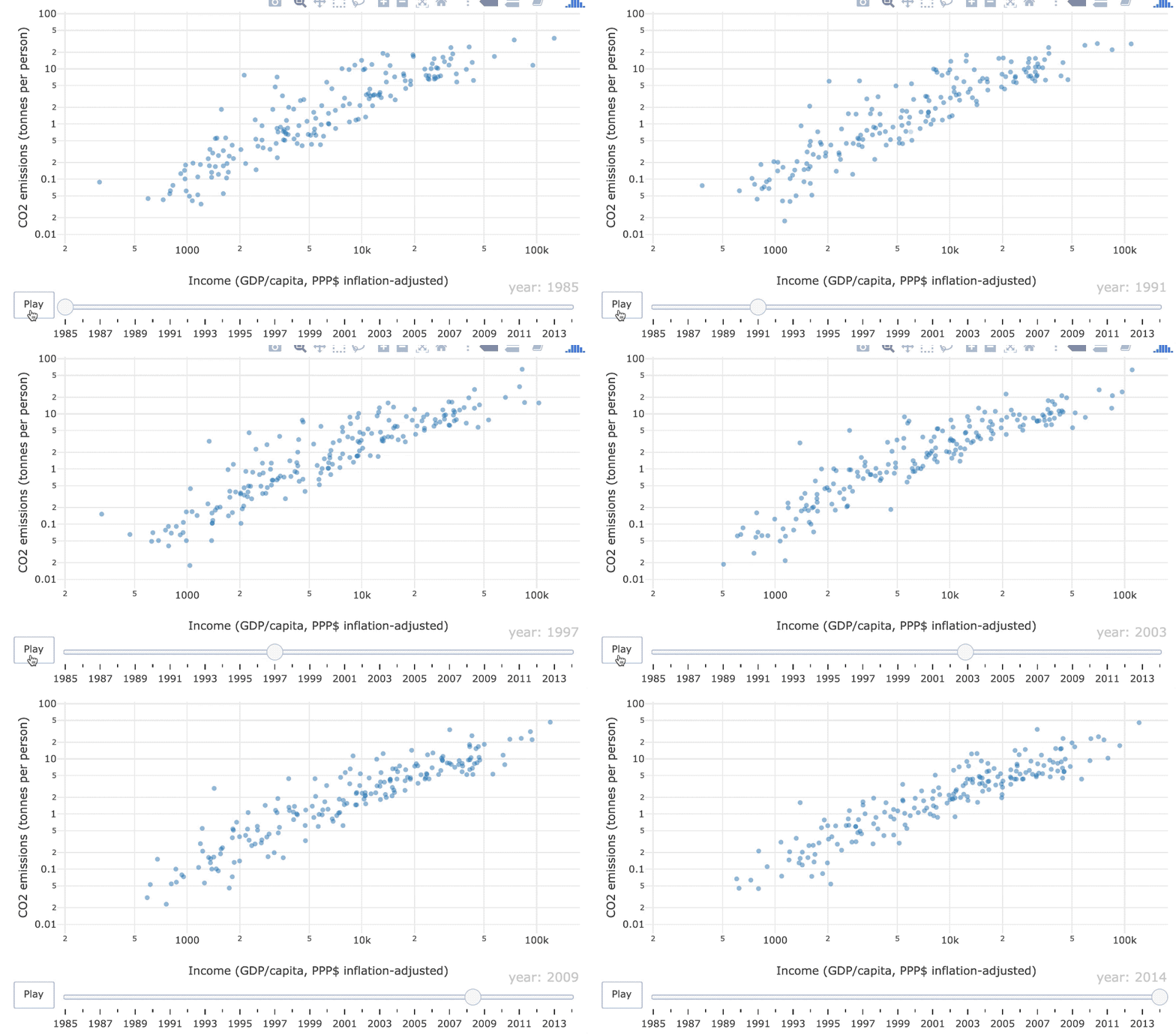
Animiertes Streudiagramm der CO2-Emissionen im Verhältnis zum BIP pro Kopf   für 1985–2014

Interaktive Datenvisualisierung mit plotly in R – Fortgeschrittene Themen

Keyframe-Animation

Frame = Plot zu einem Zeitpunkt

Filmstreifen von Streudiagrammen.

Interaktive Datenvisualisierung mit plotly in R – Fortgeschrittene Themen

Das Frame-Ästhetikmerkmal

world_indicators %>%
  plot_ly(x = ~income, y = ~co2) %>%
  add_markers(frame = ~year, showlegend = FALSE) %>%
  layout(xaxis = list(type = "log"), yaxis = list(type = "log"))
Interaktive Datenvisualisierung mit plotly in R – Fortgeschrittene Themen

Objektkonstanz

Ein grafisches Element (z. B. ein Glyph) sollte einen bestimmten Datenpunkt darstellen (z. B. Belgien)
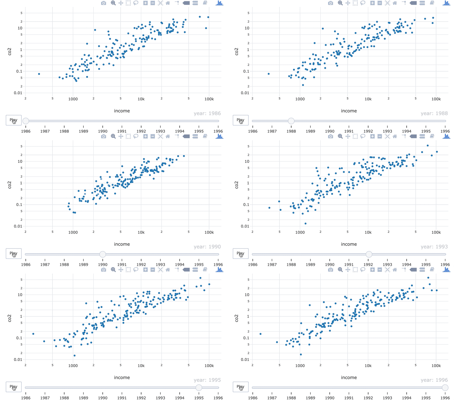
GIF von Punkten, die in den 1990ern die Reihenfolge tauschen.

Interaktive Datenvisualisierung mit plotly in R – Fortgeschrittene Themen

Das ids-Ästhetikmerkmal

world_indicators %>%
  plot_ly(x = ~income, y = ~co2) %>%
  add_markers(frame = ~year, ids = ~country, showlegend = FALSE) %>%
  layout(xaxis = list(type = "log"), yaxis = list(type = "log"))
21-object-constancy-fixed.gif

Interaktive Datenvisualisierung mit plotly in R – Fortgeschrittene Themen

Lass uns üben!

Interaktive Datenvisualisierung mit plotly in R – Fortgeschrittene Themen

Preparing Video For Download...