Editing plot axes

Introducción a la visualización de datos con Plotly en Python

Alex Scriven

Data Scientist

Our dataset

$$

  • An aggregate penguins dataset:
spec av_flip_length
Adelie 189.953642
Chinstrap 195.823529
Gentoo 217.186992


  • 🚫 spec and av_flip_length columns
Introducción a la visualización de datos con Plotly en Python

The default axis titles

$$

fig = px.bar(penguin_flippers, 
            x="spec", 
            y="av_flip_length")
fig.show()


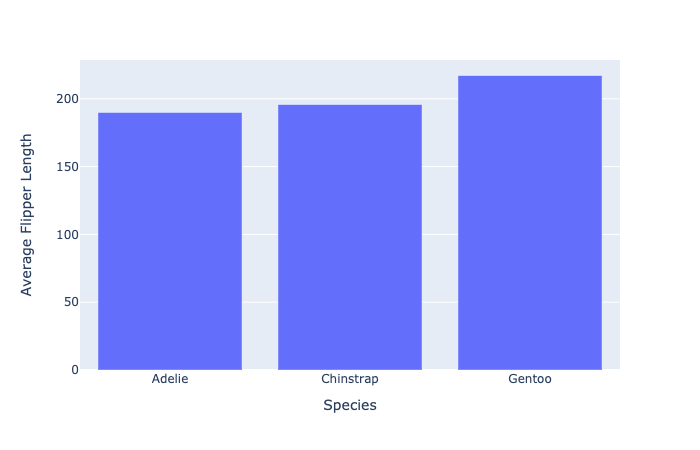
Simple bar chart of penguin flipper size by species

Introducción a la visualización de datos con Plotly en Python

Editing axis titles

  • plotly 'shortcut' functions:
fig.update_xaxes(title_text="Species")
fig.update_yaxes(title_text="Average Flipper Length")

$$

  • Implementation with update_layout()
fig.update_layout(dict(
    xaxis=dict(title=dict(text="Species")),
    yaxis=dict(title=dict(text="Average Flipper Length"))
))
Introducción a la visualización de datos con Plotly en Python

Cleaning up our plot

Simple bar chart with updated axes titles

Introducción a la visualización de datos con Plotly en Python

Which method to use?


  • ⭐ Use 'shortcut' methods for basic updates

$$

  • ⭐⭐ Use the update_layout() method for more control:
    • Can adjust font size, style, color, angle

$$

$$

See more on the Plotly documentation

Introducción a la visualización de datos con Plotly en Python

Editing axes ranges

Simple bar chart with updated axes titles

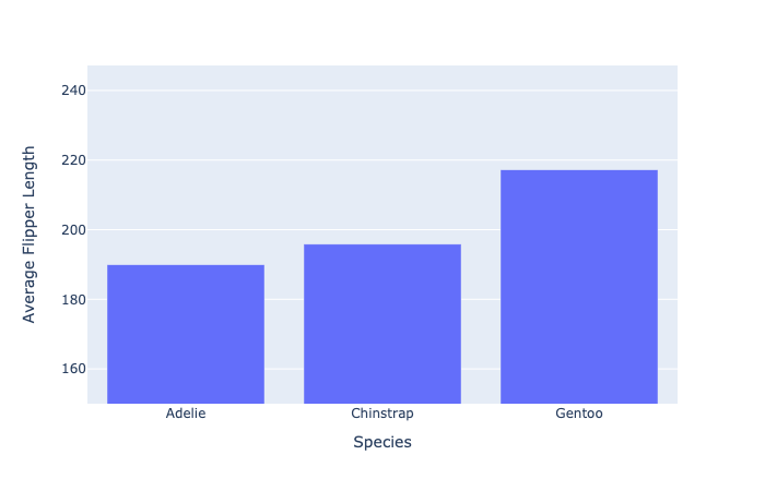
  • Setting the y-axis from 150 to the maximum value (with a small buffer)
fig.update_layout(dict(
    yaxis=dict(range=[150, penguin_flippers["av_flip_length"].max() + 30]
    )))
Introducción a la visualización de datos con Plotly en Python

Our new axes ranges

Simple bar chart with specific shortened range

Introducción a la visualización de datos con Plotly en Python

Data scale issues

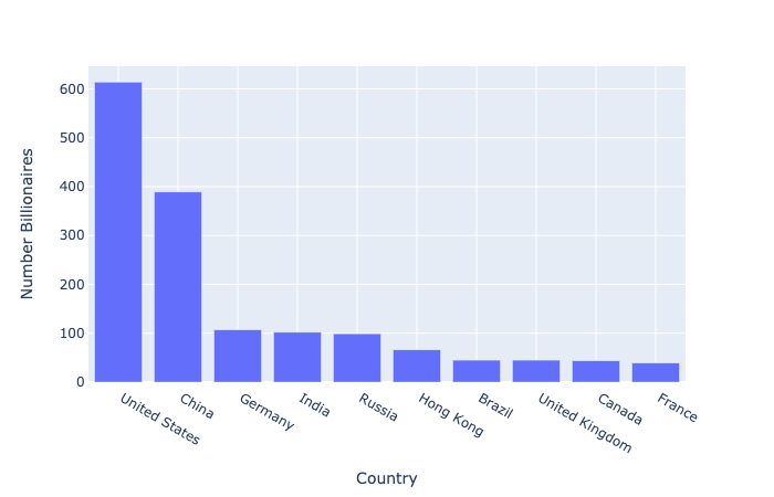
What happens when some data points are much larger than others?

  • Top 10 countries by number of billionaires
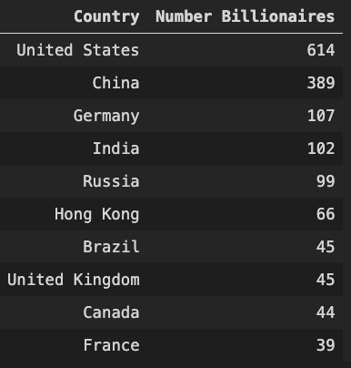
Table of number billionaires by country

Introducción a la visualización de datos con Plotly en Python

Our scale problem


fig = px.bar(billionaire_data, 
            x="Country", 
            y="Number Billionaires")
fig.show()

Basic bar chart of bar graph of billionaire numbers

Introducción a la visualización de datos con Plotly en Python

The log scale

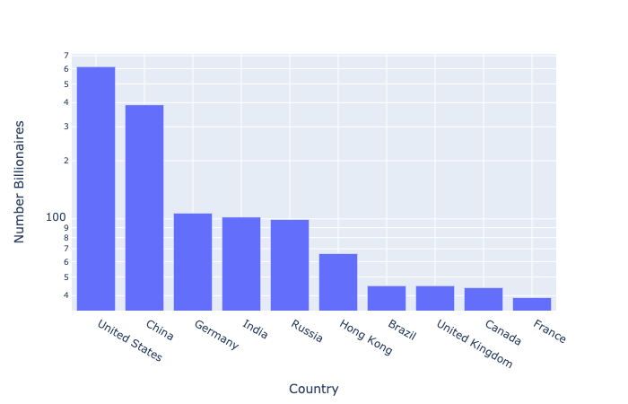
  • Used to plot data with large value differences
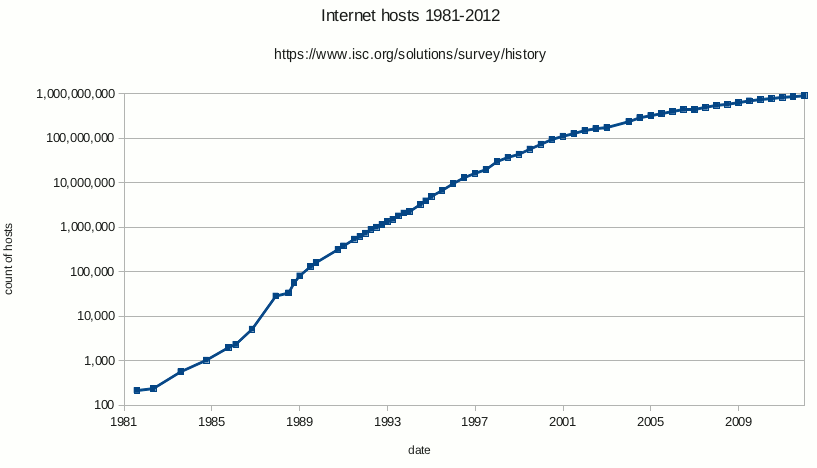
Log plot example

  • Each tick is ten times the previous (10, 100, 1000, etc.)
Introducción a la visualización de datos con Plotly en Python

Using log with our data

$$

  • Plotly has log_y and log_x arguments
fig = px.bar(billionaire_data, 
            x="Country", 
            y="Number Billionaires",
            log_y=True)

fig.show()

$$

Log scale bar chart of billionaire data

Introducción a la visualización de datos con Plotly en Python

Log scale: a word of warning

💡 Always consider the audience when choosing how to visualize data

Presenting a graph to the audience

Introducción a la visualización de datos con Plotly en Python

Let's practice!

Introducción a la visualización de datos con Plotly en Python

Preparing Video For Download...