Plotly and the Plotly Figure

Introducción a la visualización de datos con Plotly en Python

Alex Scriven

Data Scientist

What is Plotly?


  • A JavaScript graphing library
    • Don't worry - no need to know JavaScript!
  • Plotly has a Python wrapper


Plotly logo

Introducción a la visualización de datos con Plotly en Python

Why Plotly?


Plotly has a number of unique advantages:

  • Fast and easy to use
  • Low code/low effort options using plotly.express
  • (If desired) Extremely customizable
  • Built-in interactivity
Introducción a la visualización de datos con Plotly en Python

Creating Plotly Figures


Plotly graphs can be created:

  1. With plotly.express for quick plots (px)
  2. With plotly.graph_objects (go) for more customization

$$

📈 We will spend most of our time on px

Introducción a la visualización de datos con Plotly en Python

The importance of documentation

Save the links to key documentation!

  1. Interactive documentation

  2. Detailed reference page for specific plots

$$

For Scatter plots:

Introducción a la visualización de datos con Plotly en Python

Creating our Figure

  A basic plotly figure:

import plotly.express as px

days = ["Monday", "Tuesday", "Wednesday", "Thursday", "Friday", "Saturday", "Sunday"] temperatures = [28, 27, 25, 31, 32, 35, 36]
fig = px.bar( x=days, y=temperatures, title="Temperatures of the week")
fig.show()
Introducción a la visualización de datos con Plotly en Python

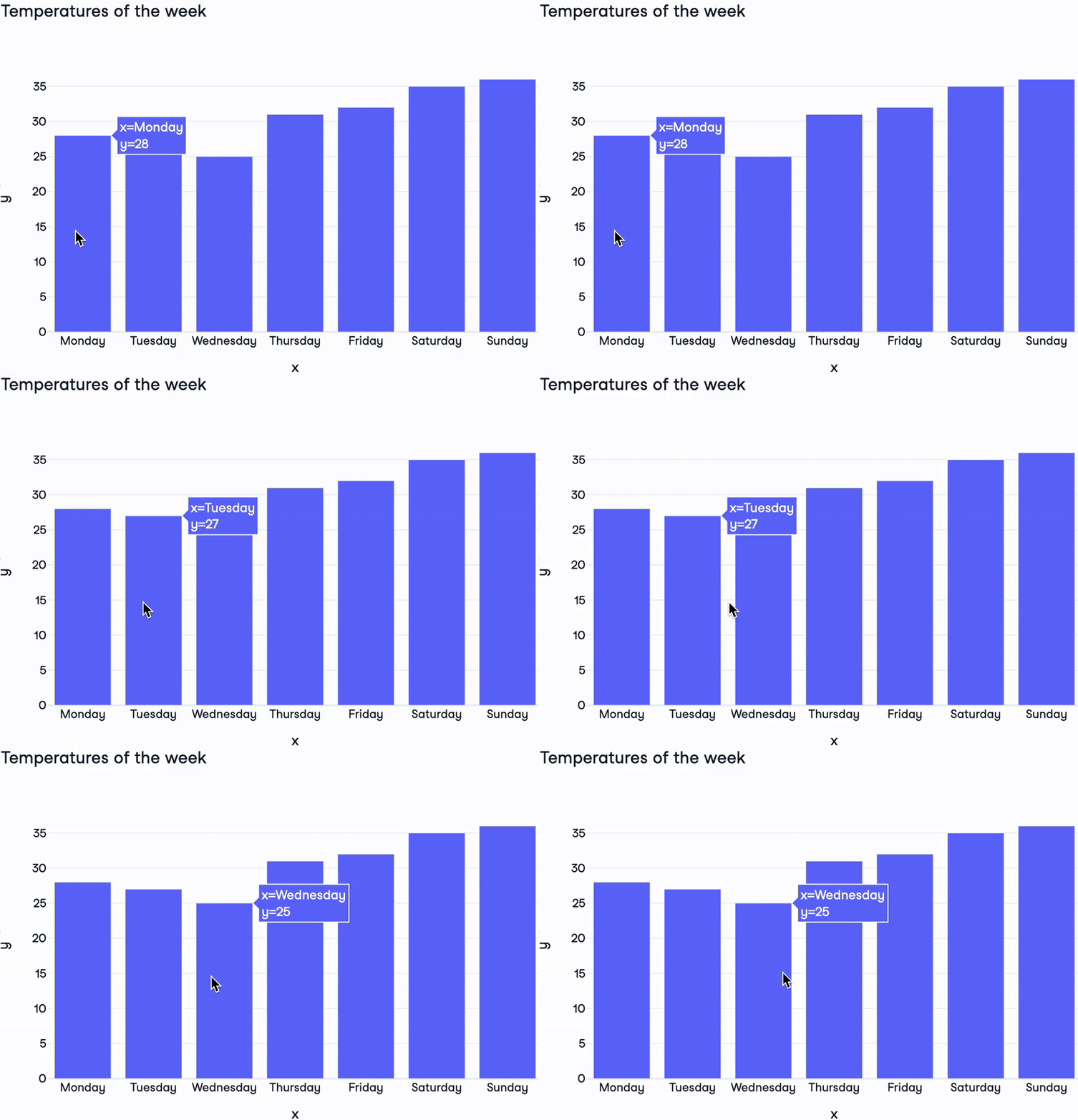
Our Figure revealed

Bar chart of weekly temperatures

Introducción a la visualización de datos con Plotly en Python

The Plotly Figure


Plotly Figure components:

  • layout: Dictionary controlling style of the figure
    • One layout per figure
  • data: List of dictionaries setting graph type and data itself
    • Data + type = a trace. There are over 40 types!
    • Can have multiple traces per graph
  • frames: For animated plots (beyond this course)
Introducción a la visualización de datos con Plotly en Python

Inside a Plotly Figure


print(fig)
Figure({'data': [{'type': 'bar',
              'x': array(['Monday', 'Tuesday', 'Wednesday', 'Thursday', 'Friday'
              , 'Saturday','Sunday'], dtype=object),
              'y': {'bdata': 'HBsZHyAjJA==....'}],
    'layout': {'title': {'text': 'Temperatures of the week'}}})
Introducción a la visualización de datos con Plotly en Python

Plotly's instant interactivity

$$

  • Hover over data points
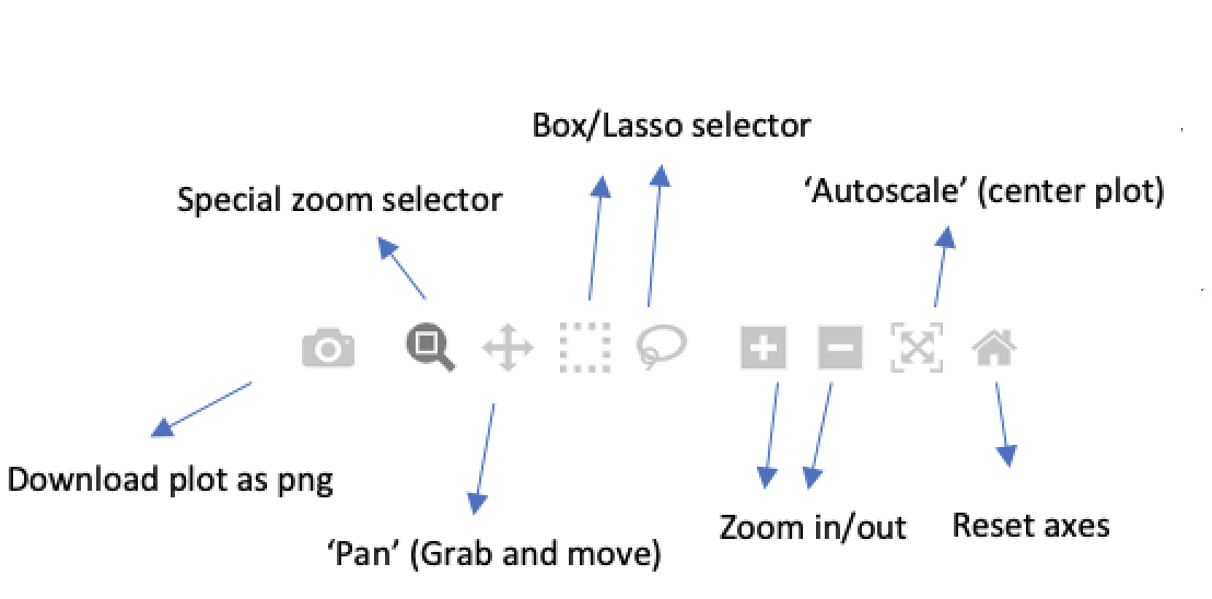
  • Extra interactive buttons

Hover options

Introducción a la visualización de datos con Plotly en Python

Let's practice!

Introducción a la visualización de datos con Plotly en Python

Preparing Video For Download...