Bivariate visualizations

Introducción a la visualización de datos con Plotly en Python

Alex Scriven

Data Scientist

What are bivariate visualizations?

  • Display a comparison of two variables

$$

$$

  • scatterplots
  • Line charts
  • Correlation plots
Introducción a la visualización de datos con Plotly en Python

scatterplot

  • A y-axis representing one variable
  • An x-axis representing a different variable
  • Each intersection is a dot, e.g., (68, 472)
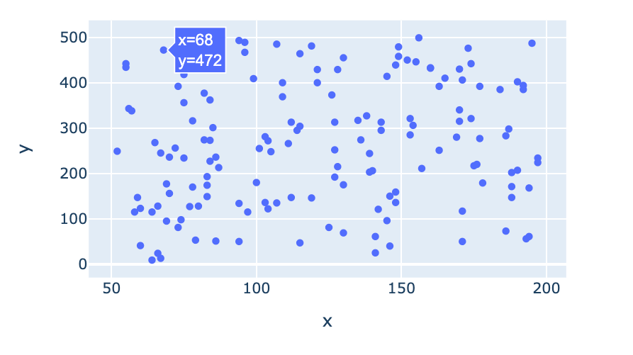
scatterplot

Introducción a la visualización de datos con Plotly en Python

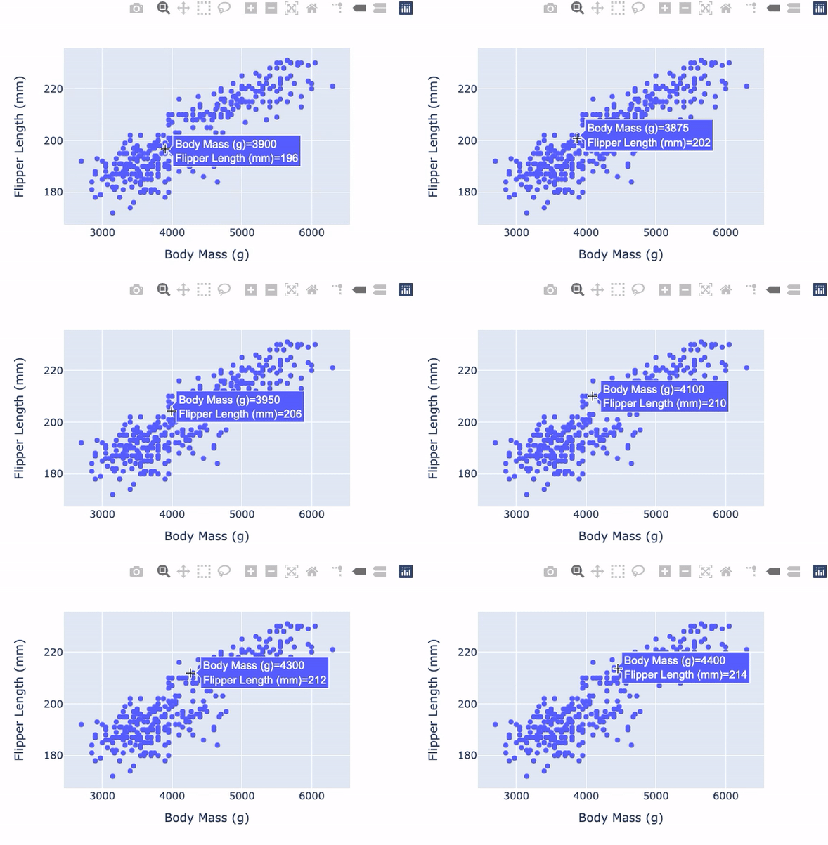
scatterplot with plotly.express


import plotly.express as px

fig = px.scatter( data_frame=penguins, x="Body Mass (g)", y="Flipper Length (mm)") fig.show()

Penguin Scatter

Introducción a la visualización de datos con Plotly en Python

More plotly.express arguments


Useful plotly.express scatterplot arguments:

  • trendline: Add different types of trend lines
  • symbol: Set different symbols for different categories

$$

$$

$$

Check the documentation for more

Introducción a la visualización de datos con Plotly en Python

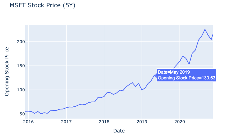
Line charts in plotly.express

  • Used to show how a variable changes over time

$$

fig = px.line(
  data_frame=msft_stock,  
  x="Date", 
  y="Open", 
  title="MSFT Stock Price (5Y)")
fig.show()

$$

Simple line chart of stock prices

Introducción a la visualización de datos con Plotly en Python

Correlation plot

  • Visualizes the correlation between several variables

$$

The Pearson Correlation Coefficient:

  • Has a value -1 to 1
  • 1 is perfectly positively correlated
  • 0 is no correlation
  • -1 is perfectly negatively correlated
Introducción a la visualización de datos con Plotly en Python

Correlation plot setup


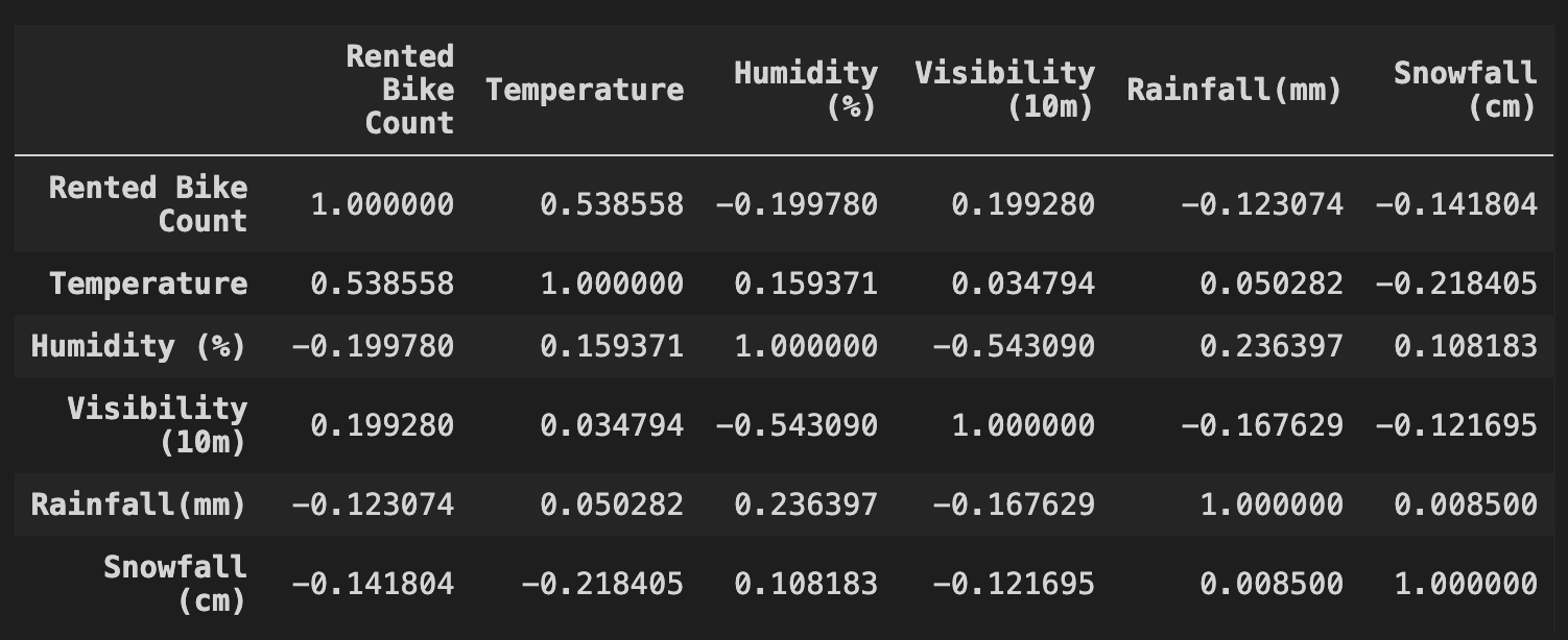
df contains data on bike rental numbers and weather conditions

cr = df.corr(method="pearson")
print(cr)


Correlation table

Introducción a la visualización de datos con Plotly en Python

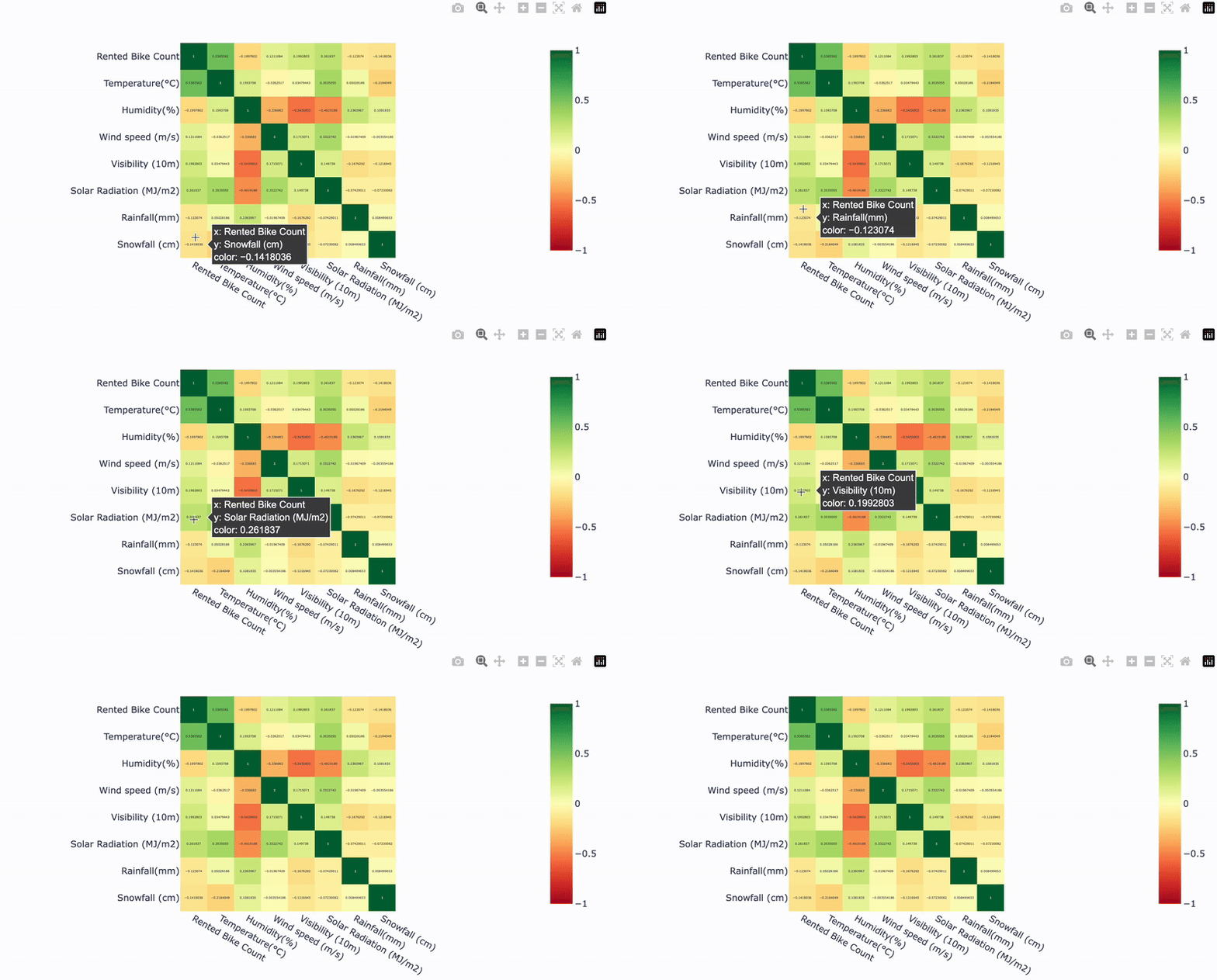
Correlation plot with Plotly

$$

fig = px.imshow(

cr,
text_auto=True,
color_continuous_scale="RdYlGn", zmin=-1, zmax=1)
fig.show()
Introducción a la visualización de datos con Plotly en Python

Our correlation plot

Heatmap example

Introducción a la visualización de datos con Plotly en Python

Let's practice!

Introducción a la visualización de datos con Plotly en Python

Preparing Video For Download...