Subplots

Introducción a la visualización de datos con Plotly en Python

Alex Scriven

Data Scientist

What are subplots?
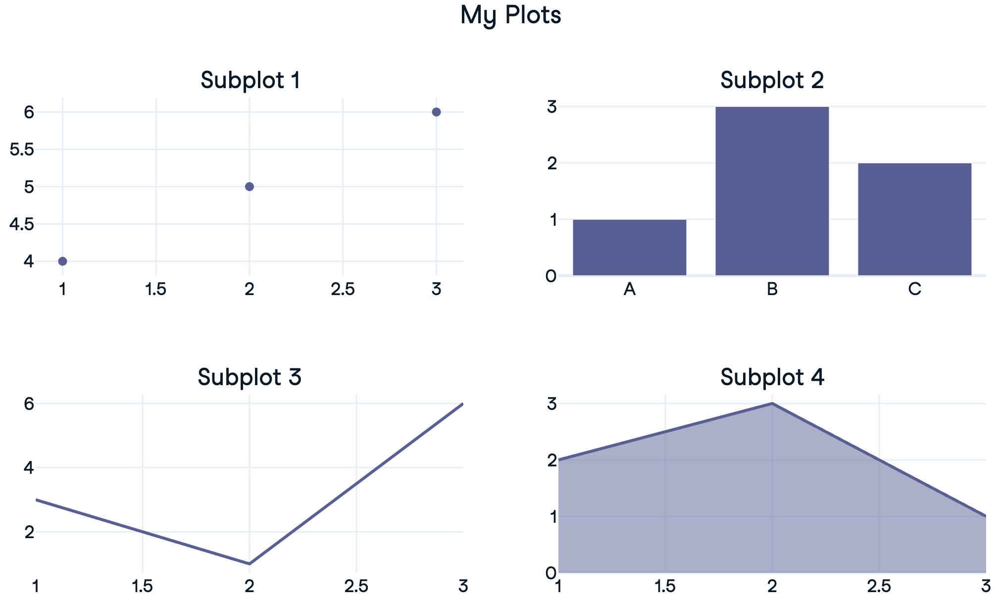
 

  • Subplots: 'mini-plots' positioned in a grid

$$

  • Show different plot types (same data) or different data subsets


Subplots outline

Introducción a la visualización de datos con Plotly en Python

A reminder of traces


  • Plotly figures contain a list of traces - the data and type

  • Accessed using fig.data[0], fig.data[1]

    • Can add to subplots using .add_trace()

$$

px_fig = px.scatter(df...)
print(px_fig)
Figure({'data': [trace1], 'layout': {...}})
Introducción a la visualización de datos con Plotly en Python

Creating a 1x2 subplot

import plotly.express as px
from plotly.subplots import make_subplots

# Create a subplot grid
fig = make_subplots(rows=2, cols=1)

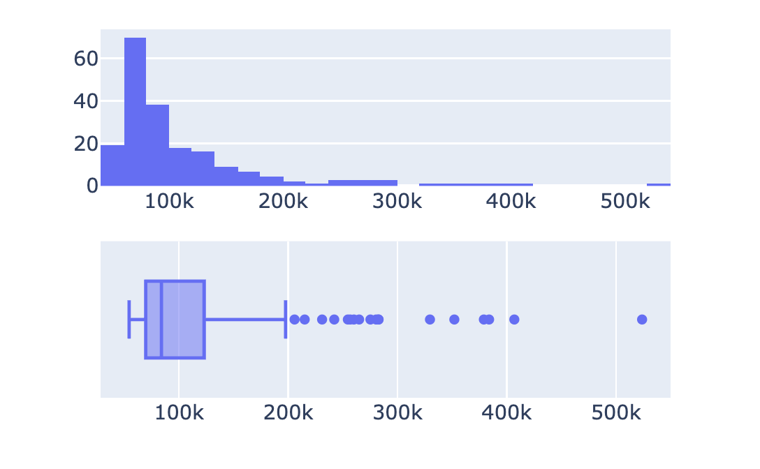
# Create plotly express figures hist = px.histogram(revenues, x='Revenue') box = px.box(revenues, x='Revenue')
# Extract traces and add to subplots fig.add_trace(hist.data[0], row=1, col=1) fig.add_trace(box.data[0], row=2, col=1) fig.show()


A finance subplot

Introducción a la visualización de datos con Plotly en Python

Customizing subplots


  • No overall plot title
  • No subplot titles

$$

$$

$$

  • ✨ Make it presentation-worthy


simple finance subplot

Introducción a la visualización de datos con Plotly en Python

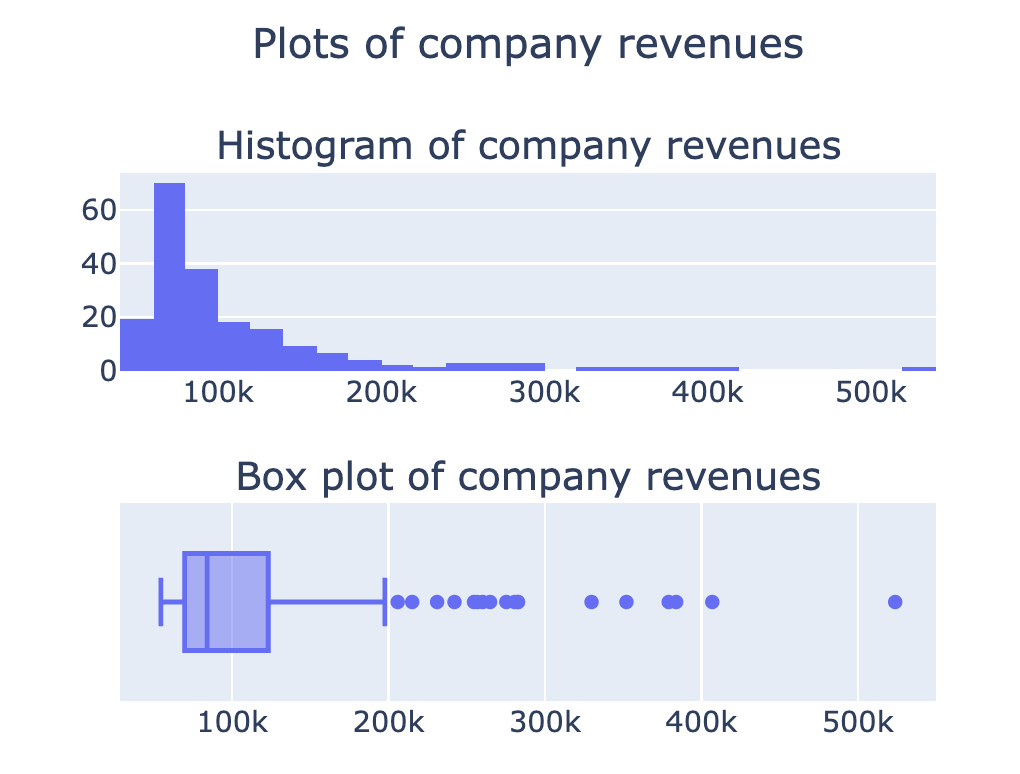
Subplot titles

from plotly.subplots import make_subplots

fig = make_subplots(rows=2, cols=1,
    subplot_titles=[
    'Histogram of company revenues', 
    'Box plot of company revenues'])

## Add in traces (fig.add_trace())
fig.update_layout({'title': {'text': 'Plots of company revenues', 'x': 0.5, 'y': 0.9}}) fig.show()

Subplot titles fixed

More options in the documentation

Introducción a la visualización de datos con Plotly en Python

Stacked subplots

$$

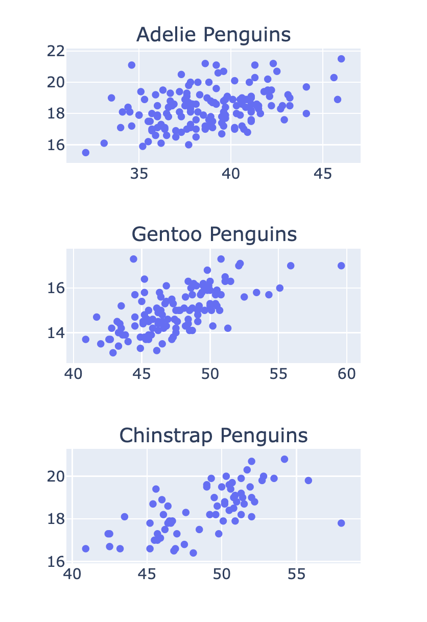
fig = make_subplots(rows=3, cols=1, 
  subplot_titles=['Adelie Penguins'
  , 'Gentoo Penguins', 'Chinstrap Penguins'])

row_num = 1 for species in ['Adelie', 'Gentoo', 'Chinstrap']: # Filter data for this species df = penguins[penguins['Species'] == species]
scatter = px.scatter(df, x='Culmen Length (mm)' , y='Culmen Depth (mm)') # Add the trace to the subplot fig.add_trace(scatter.data[0] , row=row_num, col=1) row_num +=1

Penguins subplots stacked

Introducción a la visualización de datos con Plotly en Python

Subplots with shared axes


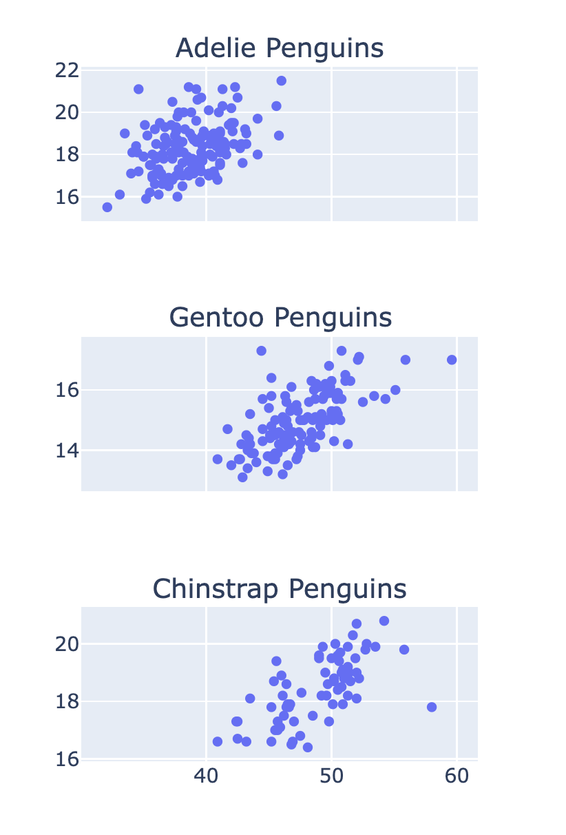
  • Making the x-axis 'shared':
fig = make_subplots(
    rows=3, cols=1
    , shared_xaxes=True)

shared x-axis penguin subplots

Introducción a la visualización de datos con Plotly en Python

Let's practice!

Introducción a la visualización de datos con Plotly en Python

Preparing Video For Download...