Customizing hover information and legends

Introducción a la visualización de datos con Plotly en Python

Alex Scriven

Data Scientist

What do we mean by hover?

Hover information: The text and data that appear when your mouse moves over a data point

$$
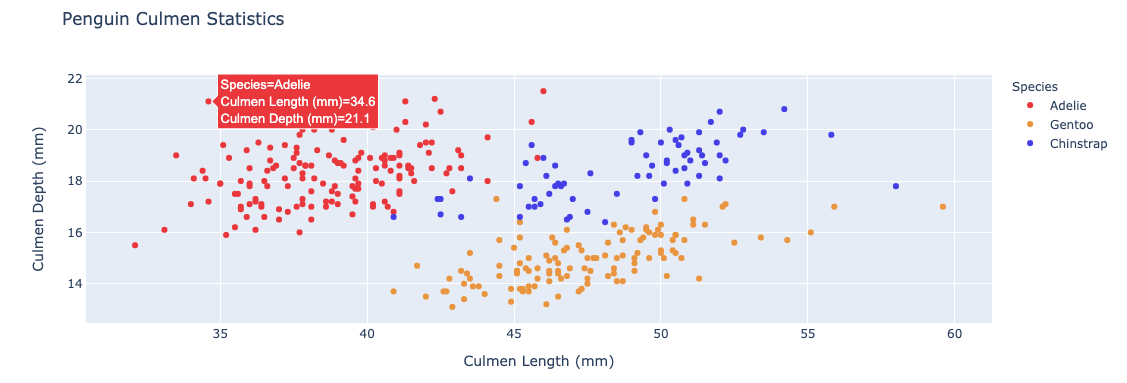
Default hover option

Introducción a la visualización de datos con Plotly en Python

Other default hover information


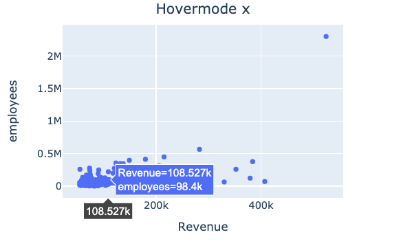
By default hovermode = "closest"

  • "x" or "y": adds a highlight on the x or y axis

$$

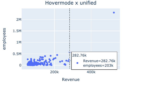
  • "x unified" / "y unified": displays a line and a hover box showing all values on the x or y axis

x hover

X unified hover

Introducción a la visualización de datos con Plotly en Python

Hover information using plotly.express


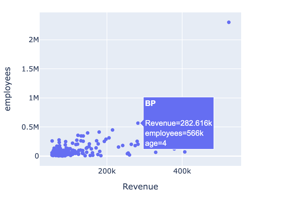
  • hover_name = A specified column that will appear in bold at the top of the hover box

$$

  • hover_data = A list of columns to include or a dictionary to include/exclude columns
    • {column_name: False} (this will exclude column_name)
Introducción a la visualización de datos con Plotly en Python

Variables in hover information

💡 Hover columns don't need to be in the plot

$$

fig = px.scatter(revenues, 
        x="Revenue", 
        y="employees",
        hover_name="Company",
        hover_data=["age"])

fig.show()


Hover over scatterplot

Introducción a la visualización de datos con Plotly en Python

Styling hover information


  • hoverlabel
    • Accepts a dictionary of style properties like font, background color, and alignment

$$

  • hovertemplate
    • HTML-like string to format the text (beyond this course)
Introducción a la visualización de datos con Plotly en Python

What is a legend?

  • A visual guide that helps explain elements in your plot, like color or symbol

$$

  • Usually added automatically when needed
    • For example, when adding colors to our bar chart
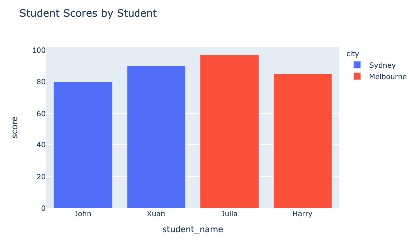
Bar chart with colors

Introducción a la visualización de datos con Plotly en Python

Creating and styling the legend

$$

  • Use update_layout() to control the legend

$$

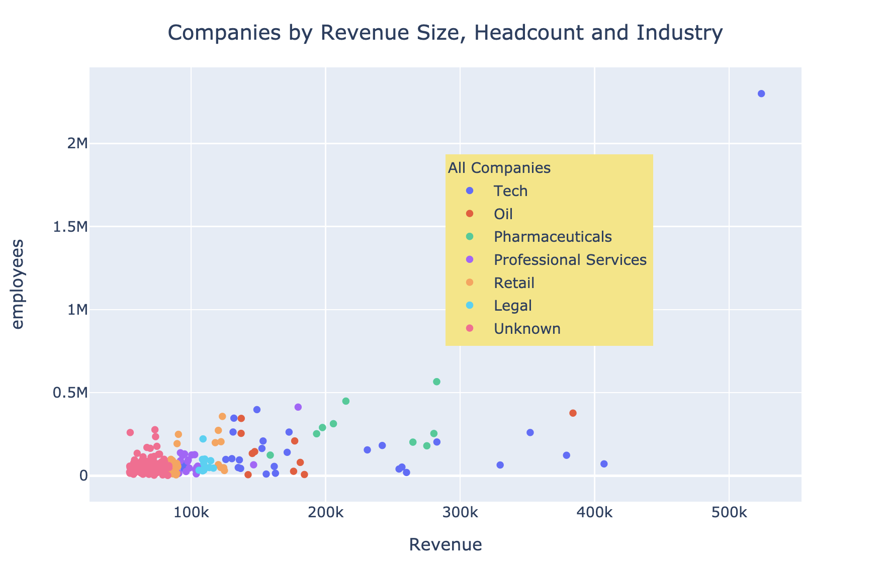
  • showlegend = True displays the default legend
  • legend - takes a dictionary of properties
    • x, y let us position the legend within the plot area (range from 0 to 1)
    • Other stylistic elements such as bgcolor (background color), borderwidth, and font

$$

Check the documentation for more

Introducción a la visualización de datos con Plotly en Python

A styled legend

$$

$$

fig.update_layout(
    "showlegend": True,

legend_title_text="All Companies"
legend=dict( x=0.7, y=0.8, bgcolor="rgb(246,228,129)")) })


A Styled legend

Introducción a la visualización de datos con Plotly en Python

Let's practice!

Introducción a la visualización de datos con Plotly en Python

Preparing Video For Download...