R para usuarios de SAS
Melinda Higgins, PhD
Research Professor/Senior Biostatistician Emory University

ggplot2 es un potente paquete gráfico para Rggplot viene de «grammar of graphics»ggplot2 construye gráficos por capas# Create plot for x=sex and y=diameter
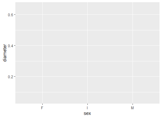
ggplot(data = abalone, aes(sex, diameter))
ggplot()data = abaloneDefine aes con sex y diameter
Aún no hay objetos gráficos
sexdiameter
# Add boxplot geometric object or geom
ggplot(data = abalone,
aes(sex, diameter)) +
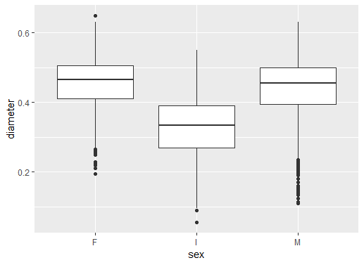
geom_boxplot()
+ añade una capaSe añade el boxplot con geom_boxplot()
El resultado es una serie de boxplots
F hembras, I juveniles y M machos
# Add black white theme
ggplot(data = abalone,
aes(sex, diameter)) +
geom_boxplot() +
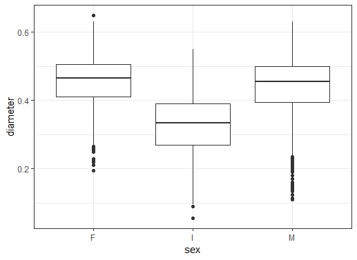
theme_bw()
theme_bw()
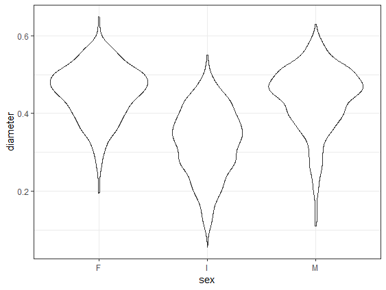
# Change to geom_violin()
ggplot(data = abalone,
aes(sex, diameter)) +
geom_violin() +
theme_bw()
geom_violin sustituye a geom_boxplot
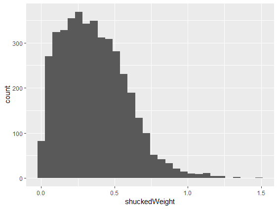
# Make histogram of shuckedWeight
ggplot(abalone, aes(shuckedWeight)) +
geom_histogram()
geom_histogram()aes() como shuckedWeight
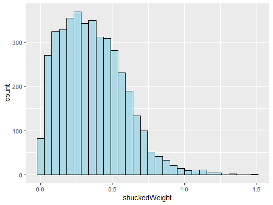
# Make lines black and fill light blue
ggplot(abalone, aes(shuckedWeight)) +
geom_histogram(color = "black",
fill = "lightblue")
color de los bordes de las barrasfill para el relleno()
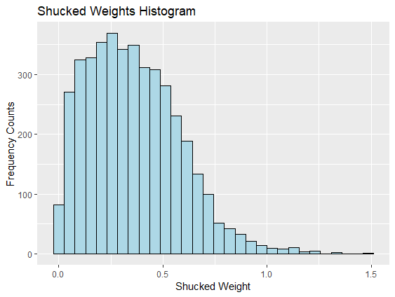
# Add x, y axis labels and title
ggplot(abalone, aes(shuckedWeight)) +
geom_histogram(color = "black",
fill = "lightblue") +
xlab("Shucked Weight") +
ylab("Frequency Counts") +
ggtitle("Shucked Weights Histogram")
xlab() y ylab() para los ejesggtitle() para el título
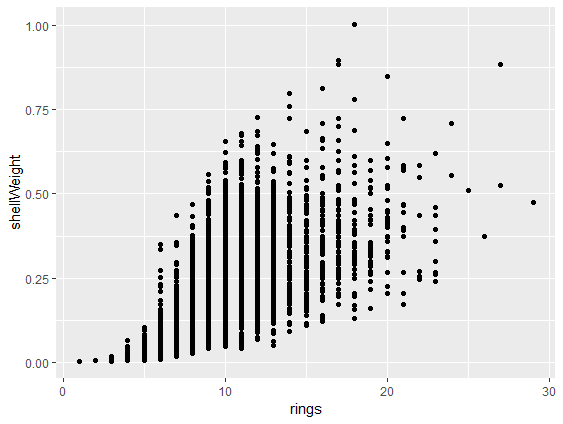
# Make scatterplot with geom_point()
ggplot(abalone,
aes(rings, shellWeight)) +
geom_point()
aes necesita dos variablesgeom_point() añade los puntosshellWeight por rings
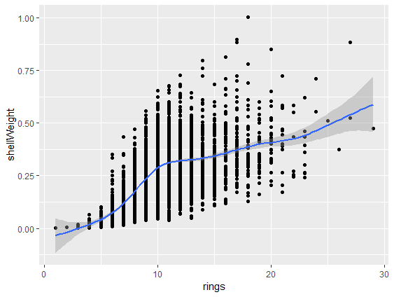
# Add smoothed fit line
ggplot(abalone,
aes(rings, shellWeight)) +
geom_point() +
geom_smooth()
geom_smooth() al diagrama de dispersión
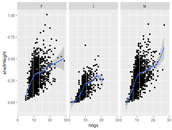
# Add panels using facet_wrap()
ggplot(abalone,
aes(rings, shellWeight)) +
geom_point() +
geom_smooth() +
facet_wrap(vars(sex))
facet_wrap()vars(sex) define la variable de los paneles
ggplot2R para usuarios de SAS