Tracer un histogramme

Réflexion statistique en Python (Partie 1)

Justin Bois

Teaching Professor at the California Institute of Technology

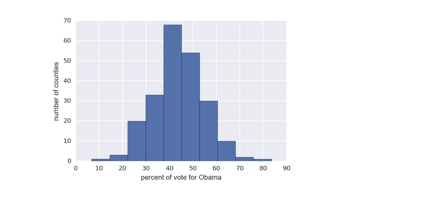
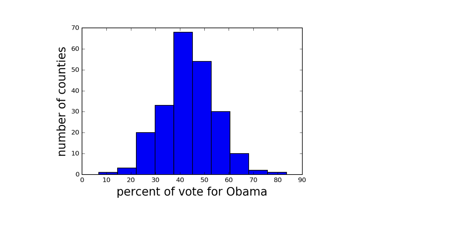
Résultats 2008 des swing states américains

Données récupérées sur Data.gov (https://www.data.gov/)
ch1-2.003.png

Réflexion statistique en Python (Partie 1)

Générer un histogramme

import matplotlib.pyplot as plt
_ = plt.hist(df_swing['dem_share'])
_ = plt.xlabel('pourcentage de voix pour Obama')
_ = plt.ylabel('nombre de comtés')
plt.show()
Réflexion statistique en Python (Partie 1)

Toujours étiqueter les axes

Réflexion statistique en Python (Partie 1)

Résultats 2008 des swing states américains

Données récupérées sur Data.gov (https://www.data.gov/)
ch1-2.013.png

Réflexion statistique en Python (Partie 1)

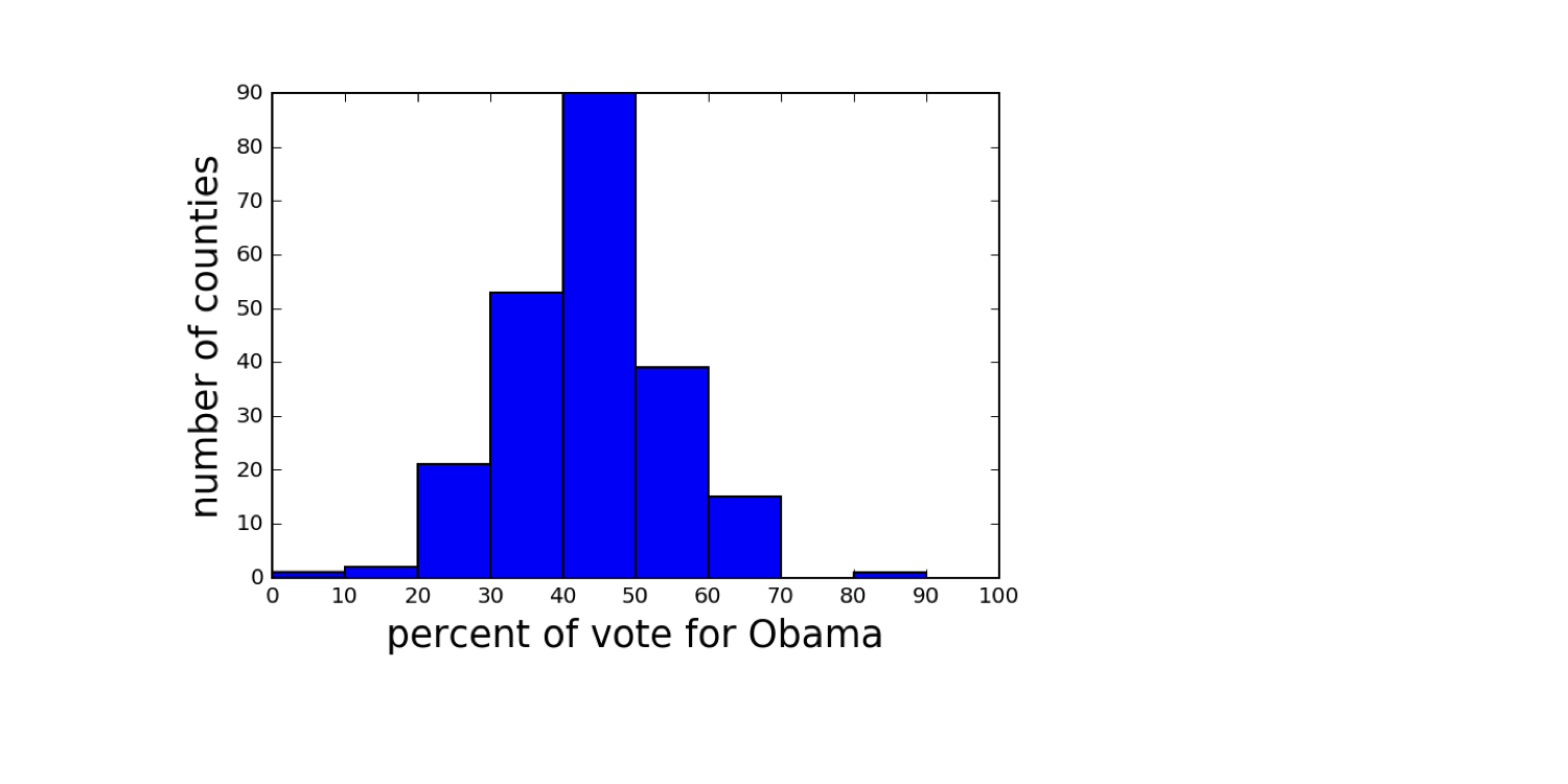
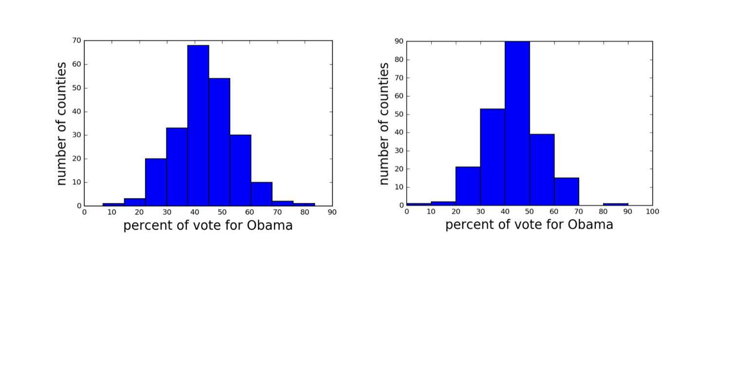
Histograms avec des regroupements différents

Données récupérées sur Data.gov (https://www.data.gov/)
ch1-2.015.png

Réflexion statistique en Python (Partie 1)

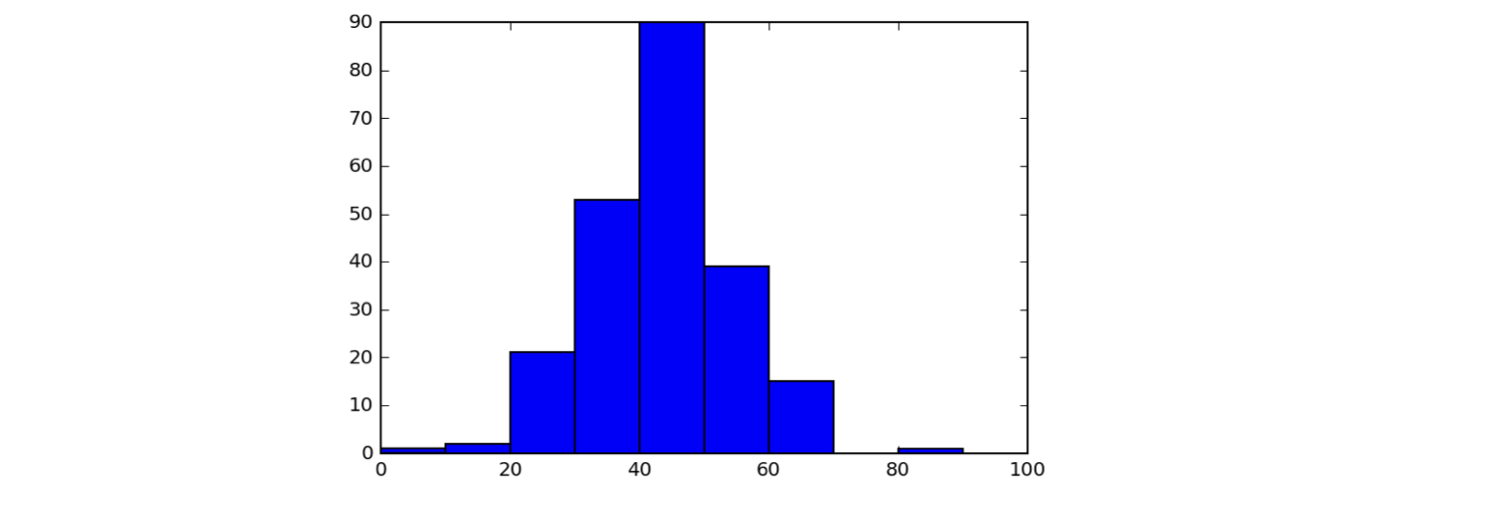
Définir les classes d’un histogramme

bin_edges = [0, 10, 20, 30, 40, 50,
                60, 70, 80, 90, 100]
_ = plt.hist(df_swing['dem_share'], bins=bin_edges)
plt.show()
ch1-2.022.png

Réflexion statistique en Python (Partie 1)

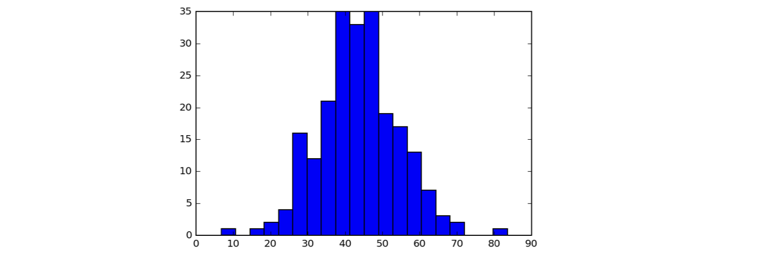
Définir les classes d’un histogramme

_ = plt.hist(df_swing['dem_share'], bins=20)
plt.show()
ch1-2.027.png

Réflexion statistique en Python (Partie 1)

Seaborn

  • Excellent package de visualisation statistique basé sur Matplotlib, écrit par Michael Waskom
Réflexion statistique en Python (Partie 1)

Appliquer le style Seaborn

import seaborn as sns
sns.set()
_ = plt.hist(df_swing['dem_share'])
_ = plt.xlabel('pourcentage de voix pour Obama')
_ = plt.ylabel('nombre de comtés')
plt.show()
Réflexion statistique en Python (Partie 1)

Un histogramme au style Seaborn

ch1-2.038.png

1 Données récupérées sur Data.gov (https://www.data.gov/)
Réflexion statistique en Python (Partie 1)

Passons à la pratique !

Réflexion statistique en Python (Partie 1)

Preparing Video For Download...