Farklı değişkenlerle zaman serisi çizimi
Matplotlib ile Veri Görselleştirmeye Giriş

Ariel Rokem
Data Scientist
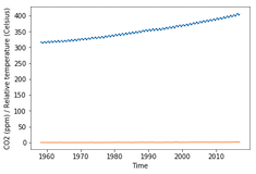
İki zaman serisini birlikte çizmek
import matplotlib.pyplot as plt fig, ax = plt.subplots() ax.plot(climate_change.index, climate_change["co2"])ax.plot(climate_change.index, climate_change["relative_temp"])ax.set_xlabel('Time') ax.set_ylabel('CO2 (ppm) / Bağıl sıcaklık') plt.show()
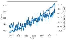
İkiz eksenler kullanma
fig, ax = plt.subplots() ax.plot(climate_change.index, climate_change["co2"]) ax.set_xlabel('Time') ax.set_ylabel('CO2 (ppm)')ax2 = ax.twinx()ax2.plot(climate_change.index, climate_change["relative_temp"]) ax2.set_ylabel('Bağıl sıcaklık (Santigrat)') plt.show()
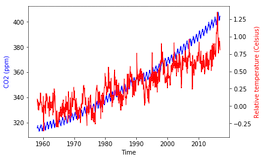
Değişkenleri renkle ayırma
fig, ax = plt.subplots() ax.plot(climate_change.index, climate_change["co2"], color='blue') ax.set_xlabel('Time') ax.set_ylabel('CO2 (ppm)', color='blue')ax2 = ax.twinx() ax2.plot(climate_change.index, climate_change["relative_temp"], color='red') ax2.set_ylabel('Bağıl sıcaklık (Santigrat)', color='red') plt.show()
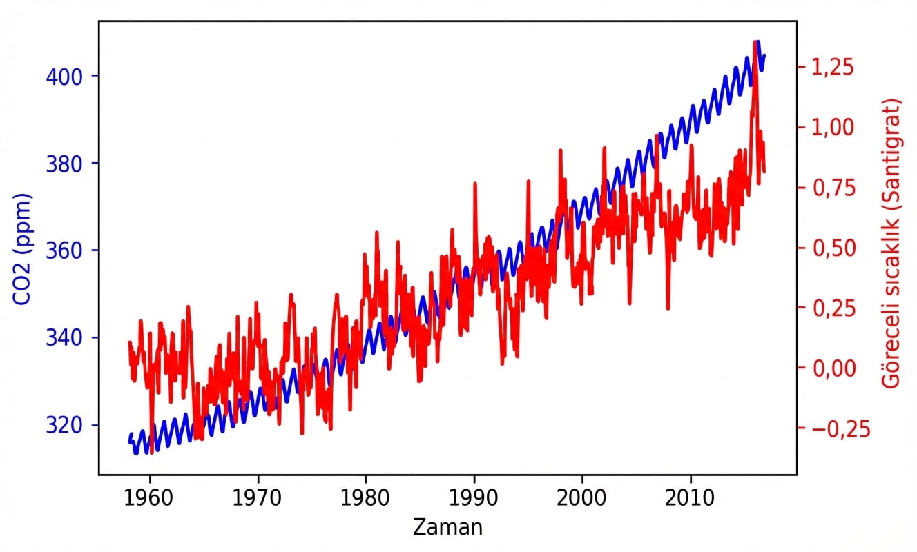
İşaretleri renklendirme
Fonksiyonumuzu kullanma
fig, ax = plt.subplots() plot_timeseries(ax, climate_change.index, climate_change['co2'], 'blue', 'Time', 'CO2 (ppm)')ax2 = ax.twinx() plot_timeseries(ax2, climate_change.index, climate_change['relative_temp'], 'red', 'Time', 'Bağıl sıcaklık (Santigrat)')plt.show()


