Grafikleri özelleştirme
Matplotlib ile Veri Görselleştirmeye Giriş

Ariel Rokem
Data Scientist
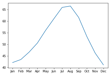
Veri görünümünü özelleştirme
ax.plot(seattle_weather["MONTH"],
        seattle_weather["MLY-PRCP-NORMAL"])
plt.show()
İşaretçi ekleme
ax.plot(seattle_weather["MONTH"],
        seattle_weather["MLY-PRCP-NORMAL"],
        marker="o")
plt.show()

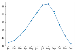
İşaretçi seçimi
ax.plot(seattle_weather["MONTH"],
        seattle_weather["MLY-PRCP-NORMAL"],
        marker="v")
plt.show()
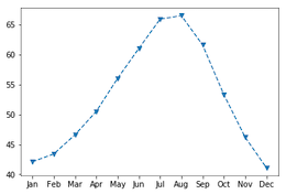
Çizgi stilini ayarlama
fig, ax = plt.subplots()
ax.plot(seattle_weather["MONTH"],
        seattle_weather["MLY-TAVG-NORMAL"],
        marker="v", linestyle="--")
plt.show()

Çizgileri linestyle ile kaldırma
fig, ax = plt.subplots()
ax.plot(seattle_weather["MONTH"],
        seattle_weather["MLY-TAVG-NORMAL"],
        marker="v", linestyle="None")
plt.show()
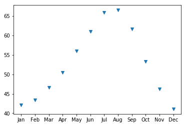
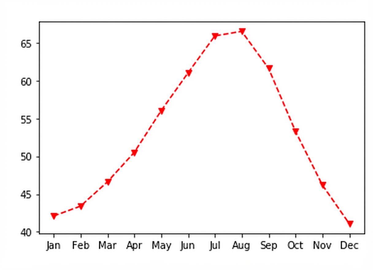
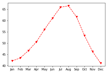
Renk seçimi
fig, ax = plt.subplots()
ax.plot(seattle_weather["MONTH"],
        seattle_weather["MLY-TAVG-NORMAL"],
        marker="v", linestyle="--", color="r")
plt.show()
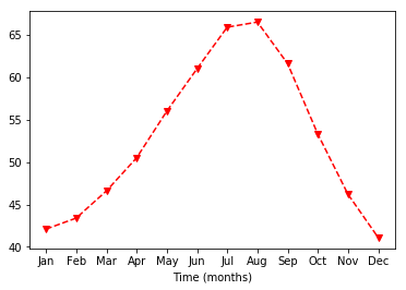
Eksen etiketlerini özelleştirme
ax.set_xlabel("Zaman (ay)")
plt.show()
Y ekseni etiketini ayarlama
ax.set_xlabel("Zaman (ay)")
ax.set_ylabel("Ortalama sıcaklık (Fahrenheit)")
plt.show()

Başlık ekleme
ax.set_title("Seattle'da hava durumu")
plt.show()