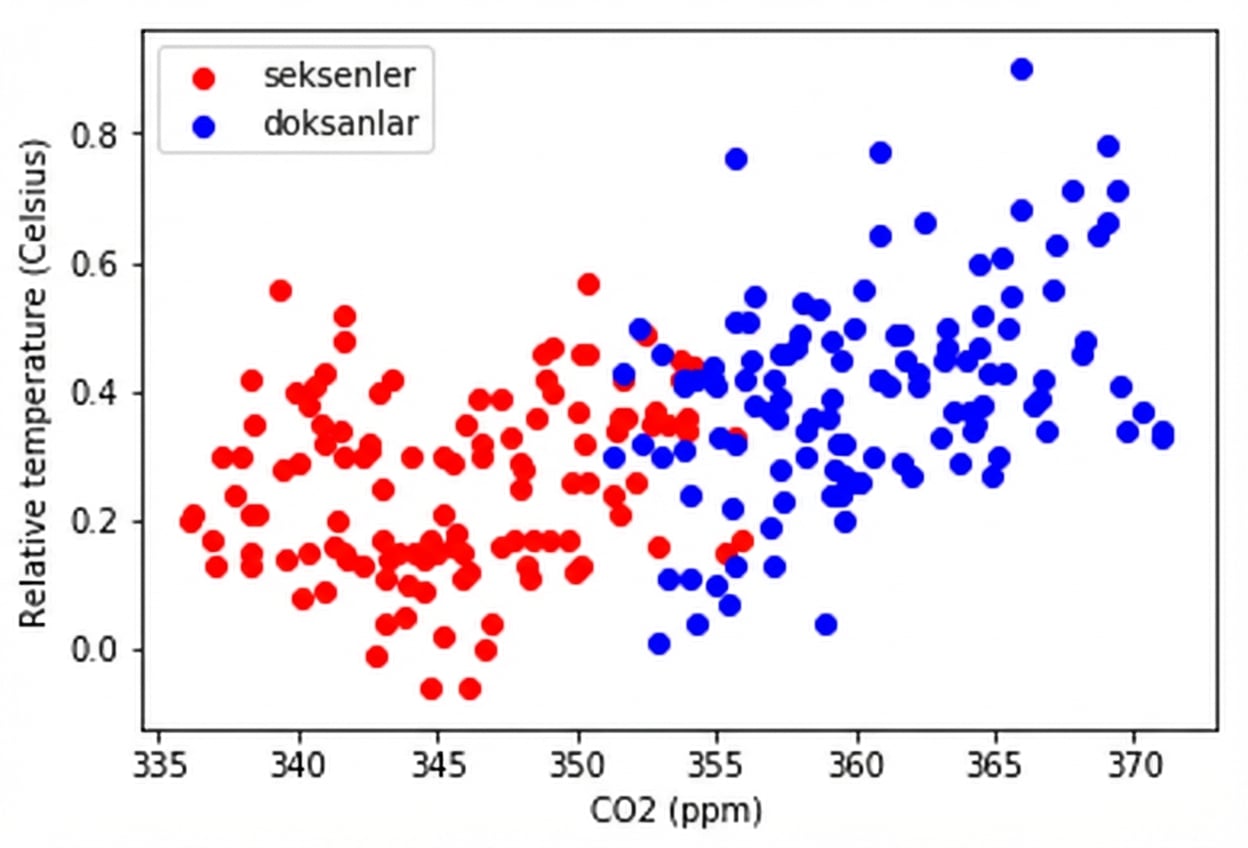
Nicel karşılaştırmalar: saçılım grafikleri

Matplotlib ile Veri Görselleştirmeye Giriş

Ariel Rokem

Data Scientist

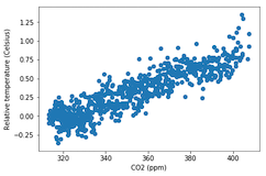
Saçılım grafiklerine giriş

fig, ax = plt.subplots()

ax.scatter(climate_change["co2"], climate_change["relative_temp"])
ax.set_xlabel("CO2 (ppm)") ax.set_ylabel("Bağıl sıcaklık (Santigrat)") plt.show()

Matplotlib ile Veri Görselleştirmeye Giriş

Saçılım grafiklerini özelleştirme

eighties = climate_change["1980-01-01":"1989-12-31"]
nineties = climate_change["1990-01-01":"1999-12-31"]

fig, ax = plt.subplots()
ax.scatter(eighties["co2"], eighties["relative_temp"], color="red", label="eighties")
ax.scatter(nineties["co2"], nineties["relative_temp"], color="blue", label="nineties")
ax.legend() ax.set_xlabel("CO2 (ppm)") ax.set_ylabel("Bağıl sıcaklık (Santigrat)") plt.show()
Matplotlib ile Veri Görselleştirmeye Giriş

Renkle karşılaştırma kodlama

Matplotlib ile Veri Görselleştirmeye Giriş

Üçüncü değişkeni renk ile kodlama

fig, ax = plt.subplots()

ax.scatter(climate_change["co2"], climate_change["relative_temp"], c=climate_change.index)
ax.set_xlabel("CO2 (ppm)") ax.set_ylabel("Bağıl sıcaklık (Santigrat)") plt.show()
Matplotlib ile Veri Görselleştirmeye Giriş

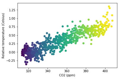
Zamanı renkle kodlama

Matplotlib ile Veri Görselleştirmeye Giriş

Kendi saçılım grafiklerinizi çizmeyi pratiğe dökün!

Matplotlib ile Veri Görselleştirmeye Giriş

Preparing Video For Download...