Saçılım grafiklerini özelleştirme
Seaborn ile Veri Görselleştirmeye Giriş

Content Team
DataCamp
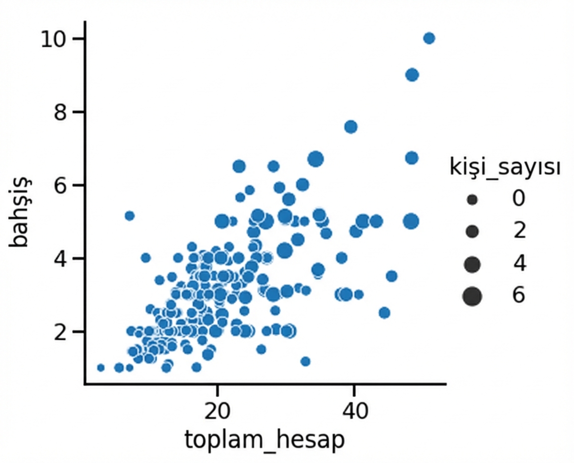
Nokta boyutuyla alt gruplar
1 Waskom, M. L. (2021). seaborn: statistical data visualization. https://seaborn.pydata.org/
Nokta boyutu ve renk tonu

1 Waskom, M. L. (2021). seaborn: statistical data visualization. https://seaborn.pydata.org/
Noktaların stiliyle alt gruplar

1 Waskom, M. L. (2021). seaborn: statistical data visualization. https://seaborn.pydata.org/
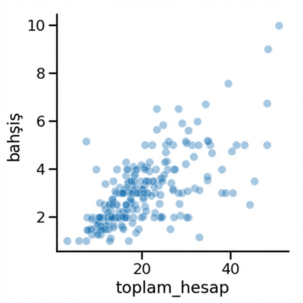
Nokta saydamlığını değiştirme
1 Waskom, M. L. (2021). seaborn: statistical data visualization. https://seaborn.pydata.org/

