İlişkisel grafiklere ve alt grafiklere giriş
Seaborn ile Veri Görselleştirmeye Giriş

Content Team
DataCamp
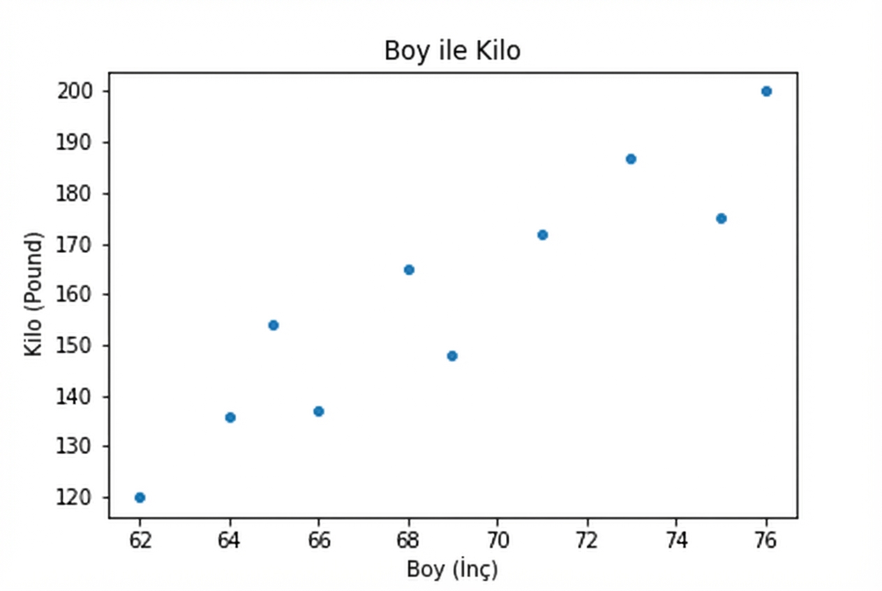
Nicel değişkenlerle ilgili sorular
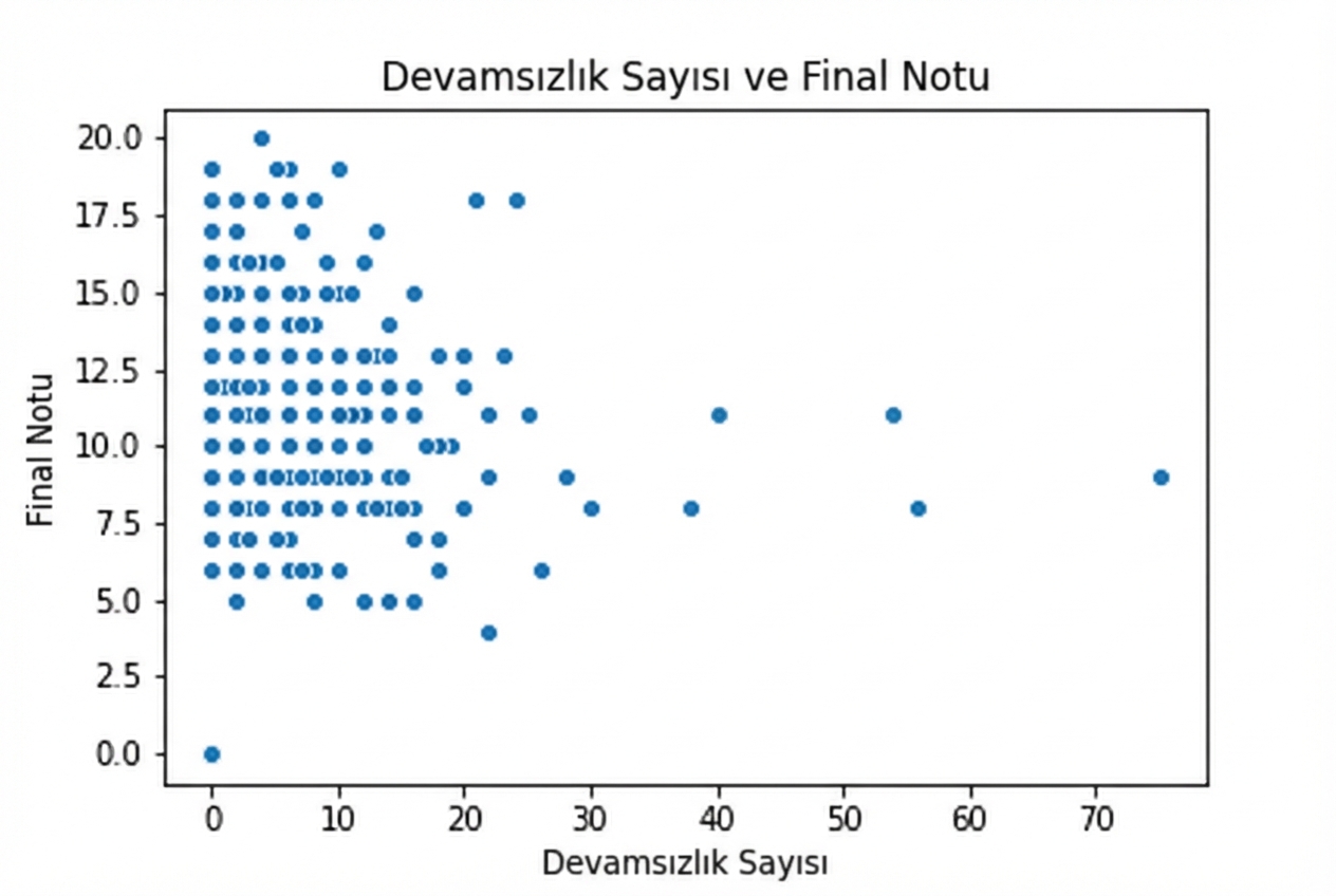
Nicel değişkenlerle ilgili sorular
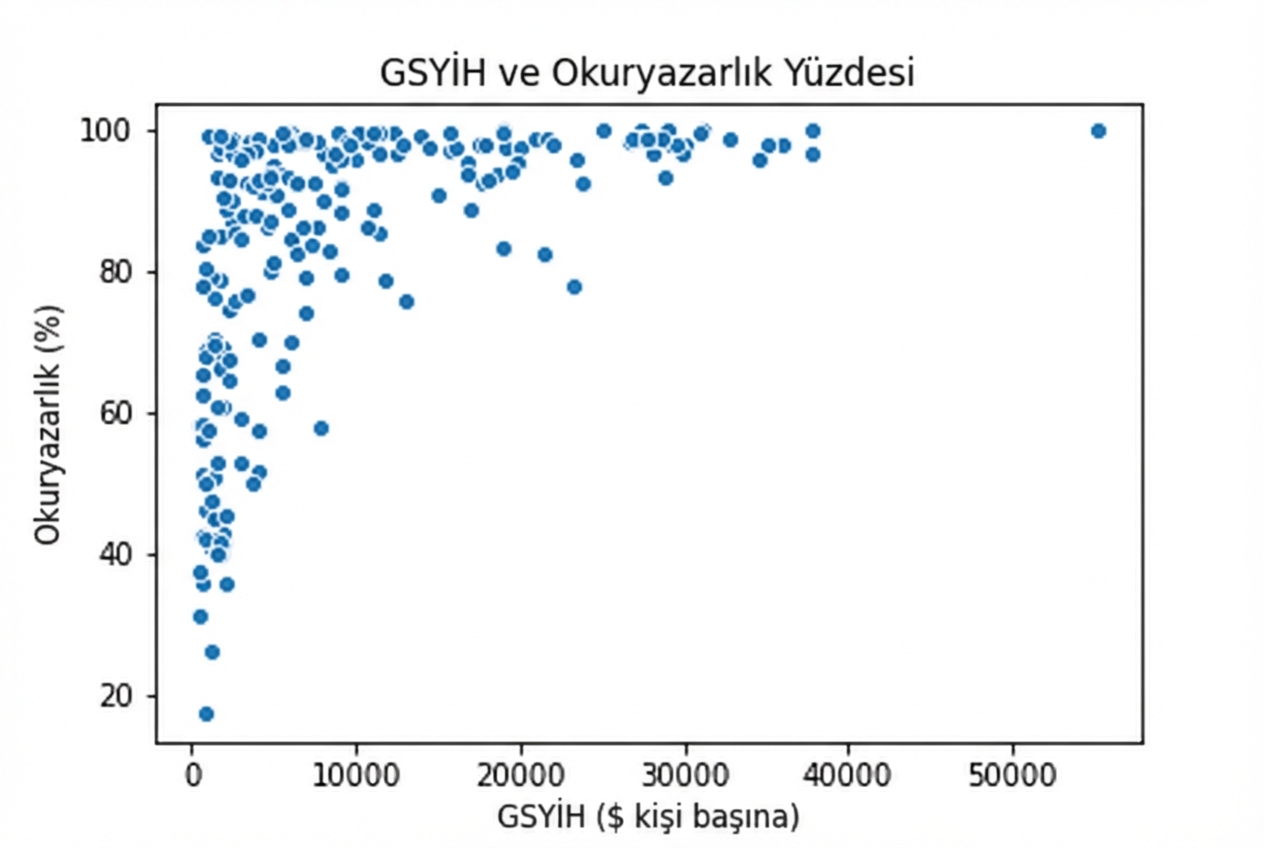
Nicel değişkenlerle ilgili sorular
1 Waskom, M. L. (2021). seaborn: statistical data visualization. https://seaborn.pydata.org/
1 Waskom, M. L. (2021). seaborn: statistical data visualization. https://seaborn.pydata.org/
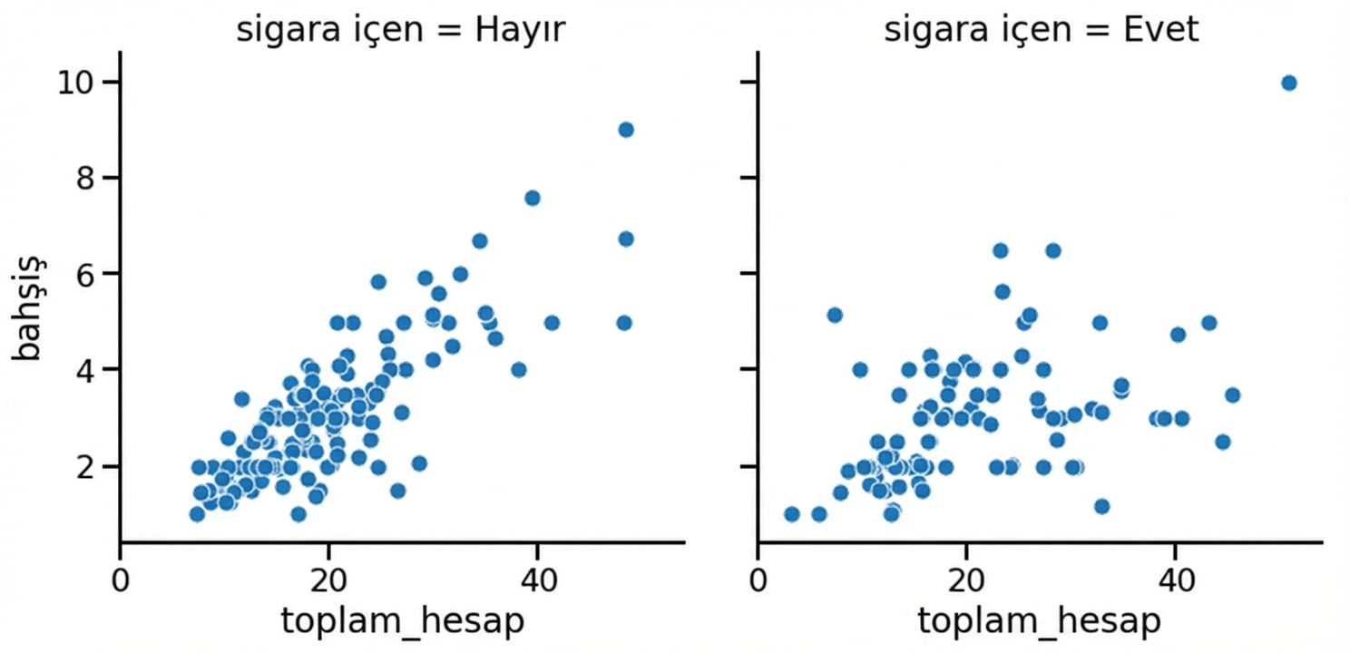
Sütunlarda alt grafikler
1 Waskom, M. L. (2021). seaborn: statistical data visualization. https://seaborn.pydata.org/
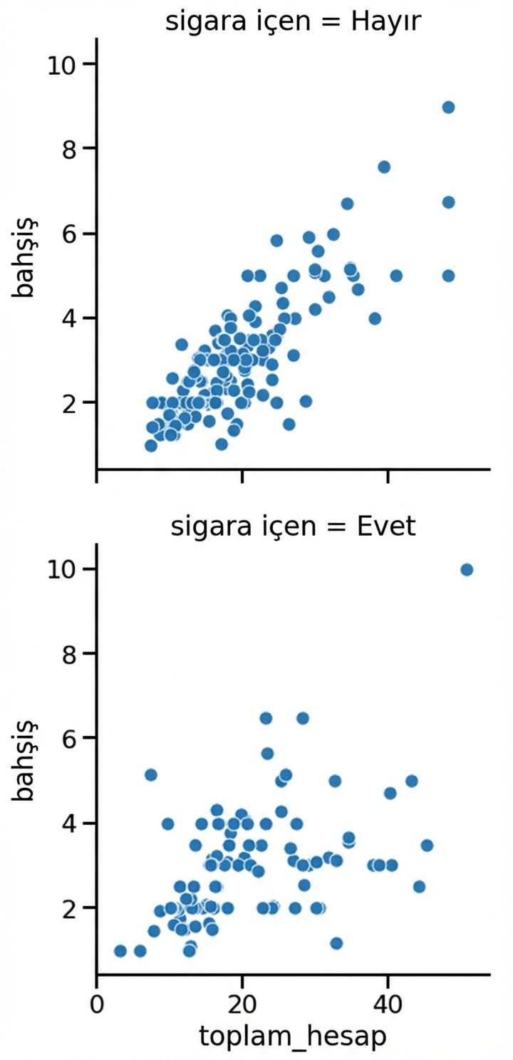
Satırlarda alt grafikler
1 Waskom, M. L. (2021). seaborn: statistical data visualization. https://seaborn.pydata.org/
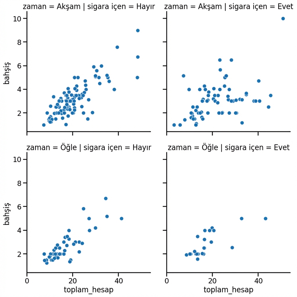
Satır ve sütunlarda alt grafikler
1 Waskom, M. L. (2021). seaborn: statistical data visualization. https://seaborn.pydata.org/
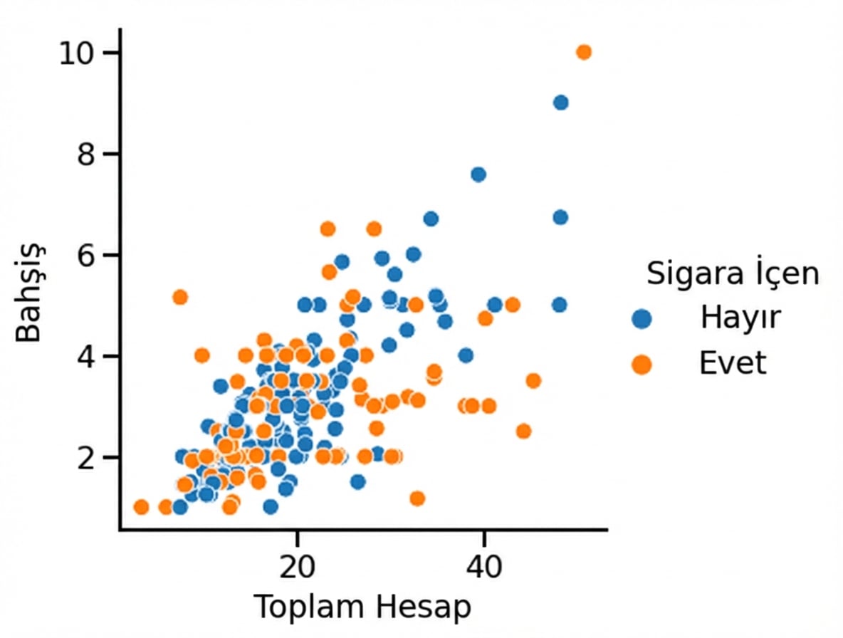
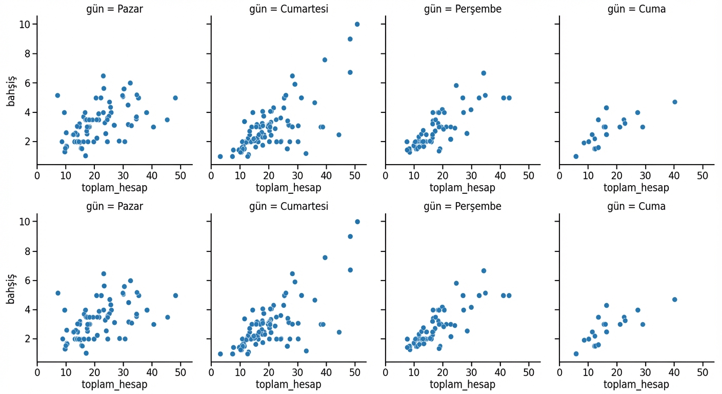
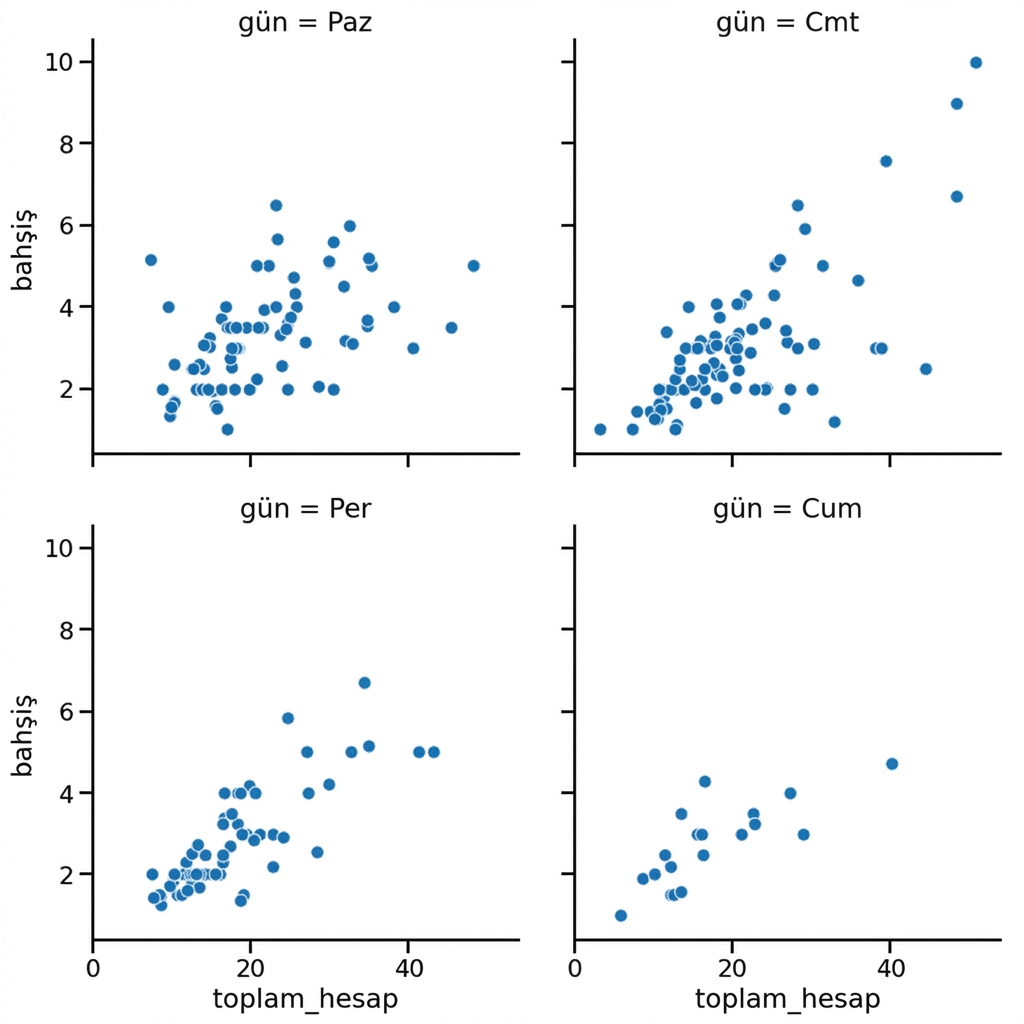
Haftanın günlerine göre alt gruplar
1 Waskom, M. L. (2021). seaborn: statistical data visualization. https://seaborn.pydata.org/
Sütunları sarmalama
1 Waskom, M. L. (2021). seaborn: statistical data visualization. https://seaborn.pydata.org/
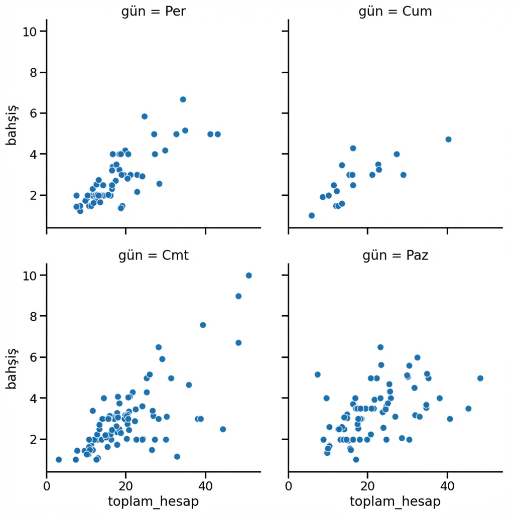
Sütunları sıralama
1 Waskom, M. L. (2021). seaborn: statistical data visualization. https://seaborn.pydata.org/

