Count plot ve bar plot
Seaborn ile Veri Görselleştirmeye Giriş

Content Team
DataCamp
Kategorik grafikler
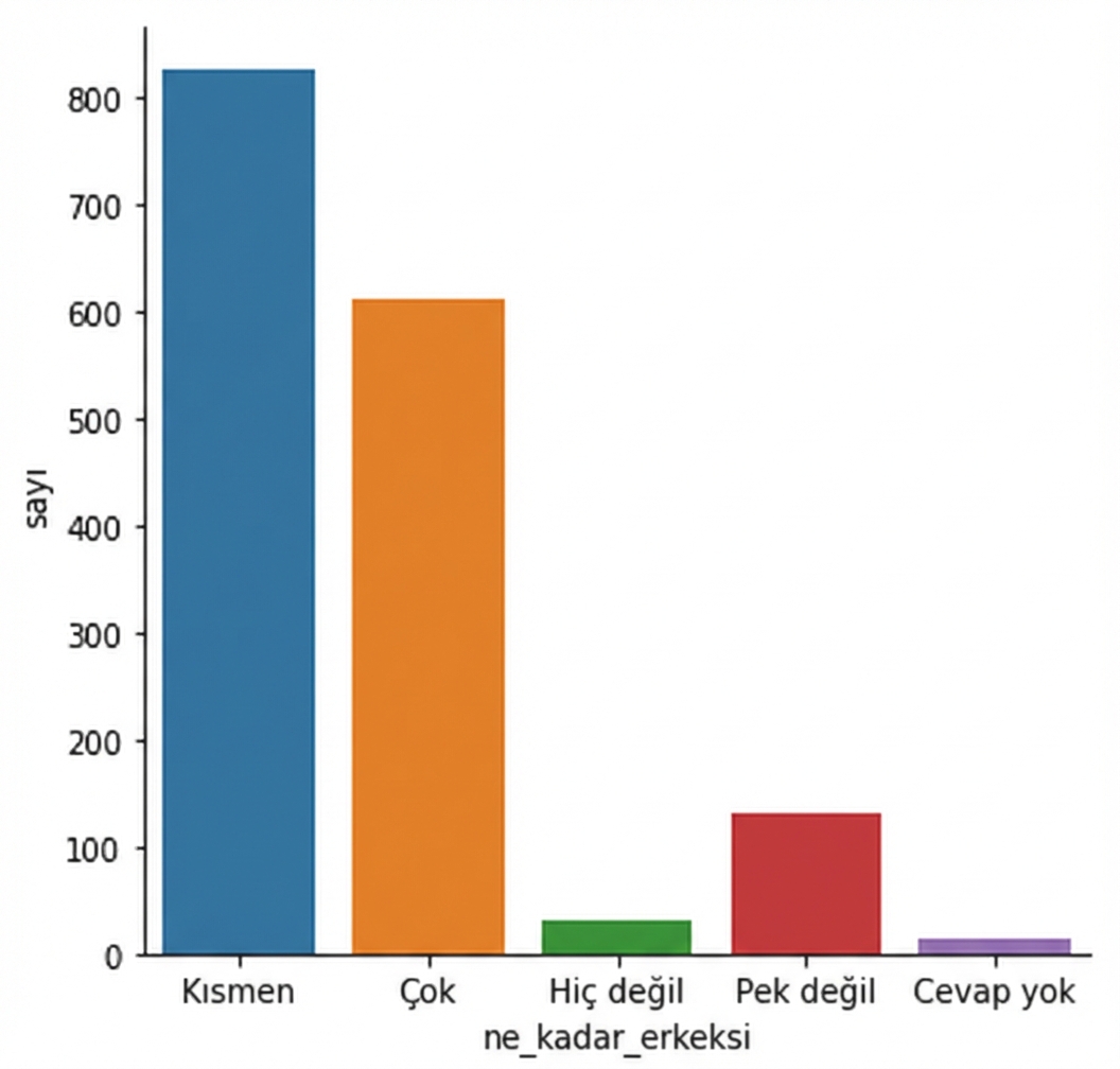
countplot() vs. catplot()
countplot() vs. catplot()
Sıralamayı değiştirme

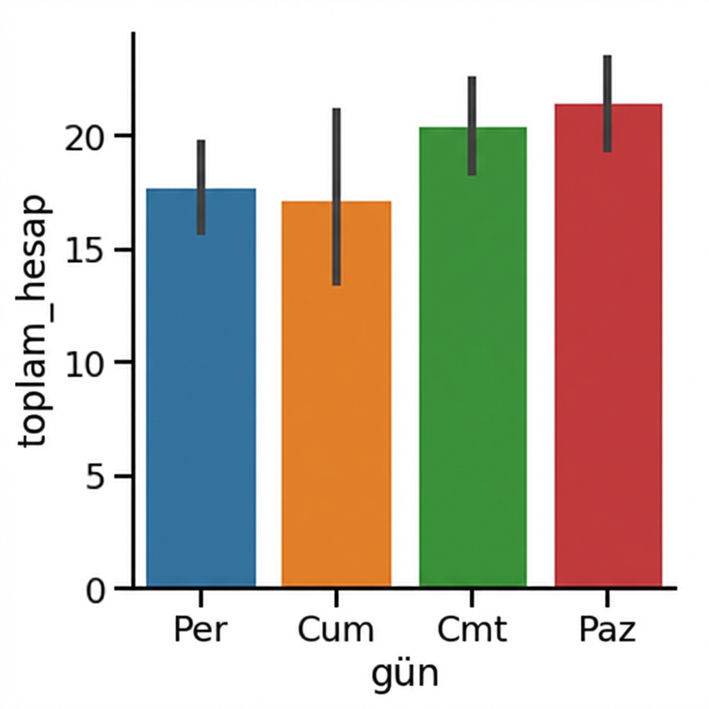
Bar plot’lar
1 Waskom, M. L. (2021). seaborn: statistical data visualization. https://seaborn.pydata.org/
Güven aralıkları
1 Waskom, M. L. (2021). seaborn: statistical data visualization. https://seaborn.pydata.org/
Güven aralıklarını kapatma

1 Waskom, M. L. (2021). seaborn: statistical data visualization. https://seaborn.pydata.org/
Yönü değiştirme

1 Waskom, M. L. (2021). seaborn: statistical data visualization. https://seaborn.pydata.org/

