Python'da Veri Görselleştirmelerini İyileştirme
Nick Strayer
Instructor
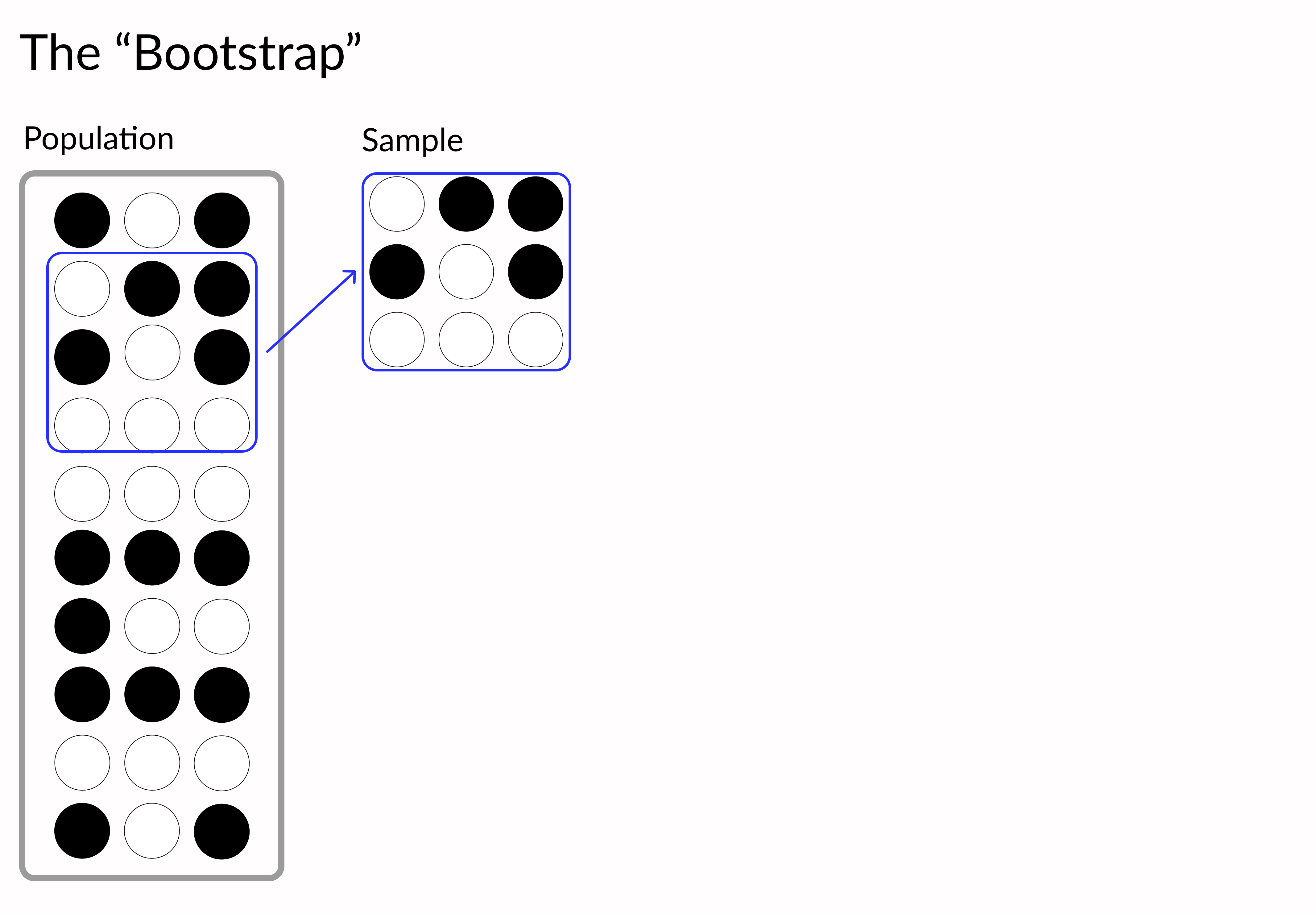
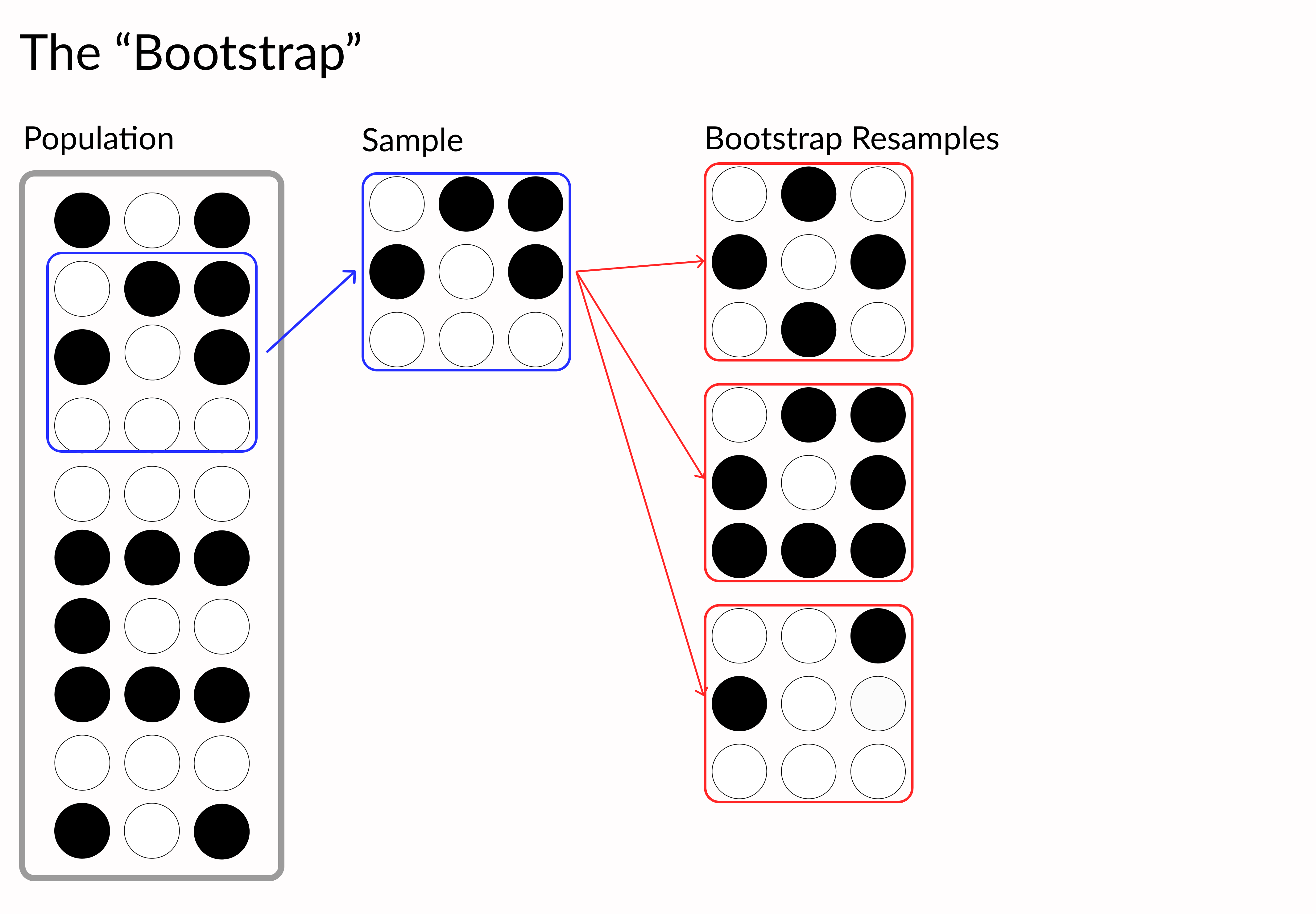
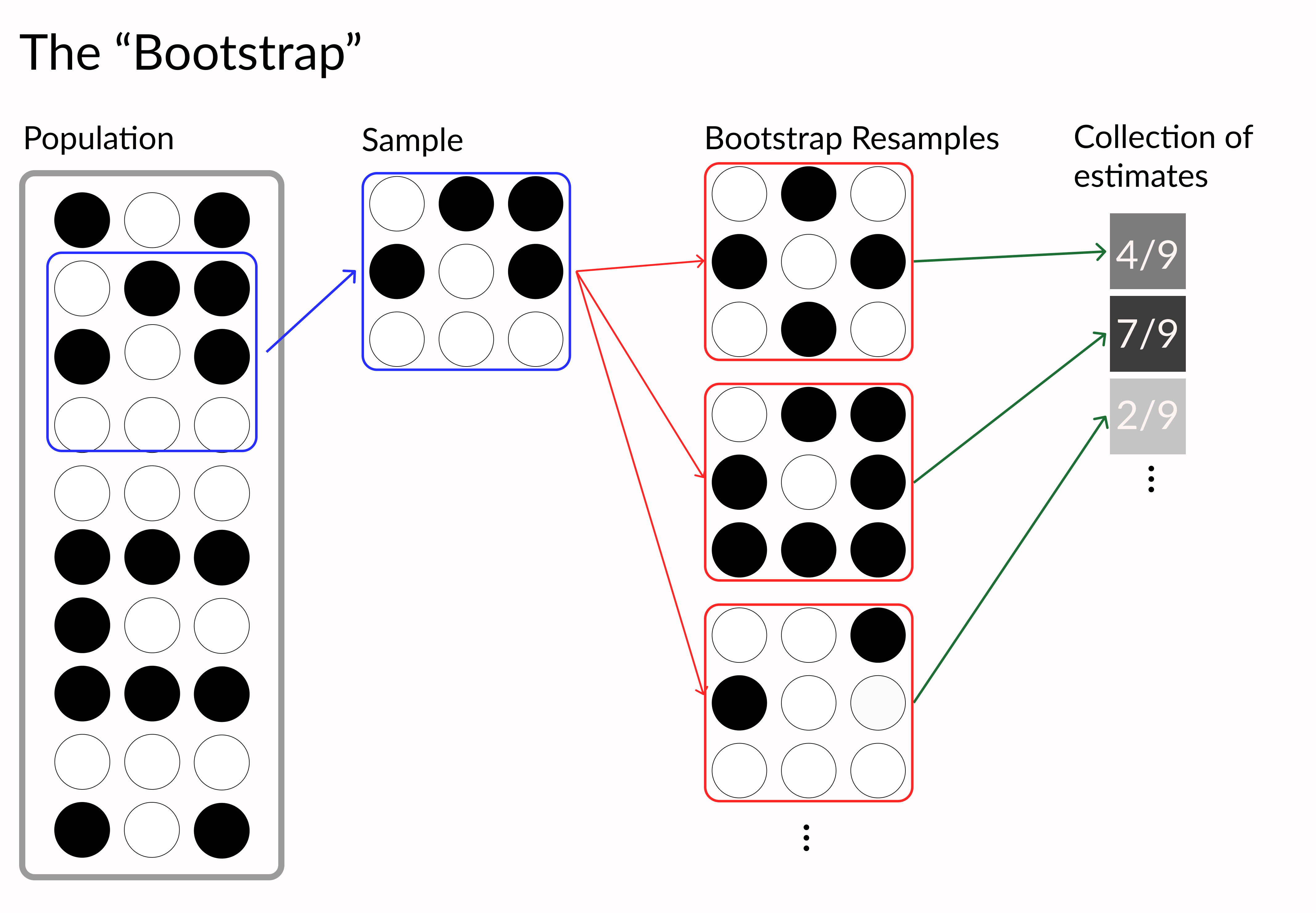
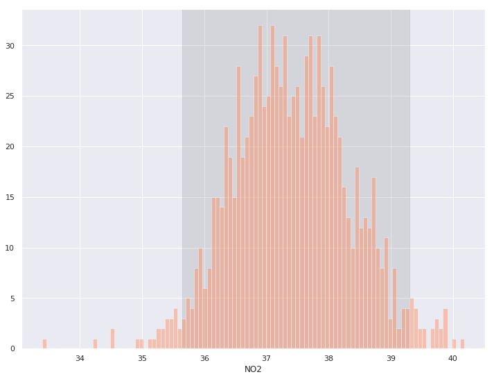
denver_may = pollution.query("city == 'Denver' & month == 8")

# Perform bootstrapped mean on a vector
def bootstrap(data, n_boots):
    return [np.mean(np.random.choice(data,len(data)))
            for _ in range(n_boots) ]

# Generate 1,000 bootstrap samples
boot_means = bootstrap(denver_may.NO2, 1000)


# Get lower and upper 95% interval bounds
lower, upper = np.percentile(boot_means, [2.5, 97.5])

# Shaded background of interval
plt.axvspan(lower, upper, color='grey', alpha=0.2)

# Plot histogram of samples
sns.histplot(boot_means, bins = 100)
denver_may = pollution.query("city == 'Denver' & month == 8") # Perform bootstrapped mean on a vector def bootstrap(data, n_boots): return [np.mean(np.random.choice(data,len(data))) for _ in range(n_boots) ] # Generate 1,000 bootstrap samples boot_means = bootstrap(denver_may.NO2, 1000)
# Get lower and upper 95% interval bounds lower, upper = np.percentile(boot_means, [2.5, 97.5]) # Shaded background of interval plt.axvspan(lower, upper, color='grey', alpha=0.2)
# Plot histogram of samples sns.histplot(boot_means, bins = 100)
# Bootstrap verisinden DataFrame oluşturun
denver_may_boot = pd.concat([
    denver_may.sample(n=len(denver_may), replace=True).assign(sample=i)
    for i in range(100)])

# Her örneklem için regresyon çizin
sns.lmplot('CO', 'O3', data=denver_may_boot, scatter=False,

           # Seaborn’a her yeniden örnek için regresyon
           # çizgisi çizmesini söyleyin
           hue='sample',

           # Çizgileri turuncu ve saydam yapın
           line_kws = {'color': 'coral', 'alpha': 0.2},

           # Güven aralığı yok
           ci=None, legend = False)
# Bootstrap verisinden DataFrame oluşturun denver_may_boot = pd.concat([ denver_may.sample(n=len(denver_may), replace=True).assign(sample=i) for i in range(100)]) # Her örneklem için regresyon çizin sns.lmplot('CO', 'O3', data=denver_may_boot, scatter=False,
# Seaborn’a her yeniden örnek için regresyon # çizgisi çizmesini söyleyin hue='sample',
# Çizgileri turuncu ve saydam yapın line_kws = {'color': 'coral', 'alpha': 0.2},
# Güven aralığı yok ci=None, legend = False)
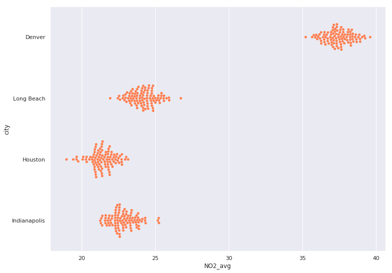
aug_pol = pollution.query("month == 8")

# Bootstrap örnekleri için tutucu DataFrame
city_boots = pd.DataFrame()

for city in ['Denver', 'Long Beach', 'Houston', 'Indianapolis']:
    # Şehrin NO2 verisini filtreleyin
    city_NO2 = aug_pol[aug_pol.city == city].NO2
    # Şehrin NO2’sinden 100 bootstrap örneği alıp DataFrame’e koyun
    cur_boot = pd.DataFrame({ 'NO2_avg': bootstrap(city_NO2, 100),
                              'city': city })
    # Diğer şehirlerin bootstrap’lerine ekleyin
    city_boots = pd.concat([city_boots,cur_boot])

# Bootstrap örneklerini görselleştirmek için arı sürüsü grafiği kullanın
sns.swarmplot(y="city", x="NO2_avg", data=city_boots,

              # Tüm renkleri aynı yapın
              color='coral')
aug_pol = pollution.query("month == 8") # Bootstrap örnekleri için tutucu DataFrame city_boots = pd.DataFrame() for city in ['Denver', 'Long Beach', 'Houston', 'Indianapolis']: # Şehrin NO2 verisini filtreleyin city_NO2 = aug_pol[aug_pol.city == city].NO2 # Şehrin NO2’sinden 100 bootstrap örneği alıp DataFrame’e koyun cur_boot = pd.DataFrame({ 'NO2_avg': bootstrap(city_NO2, 100), 'city': city }) # Diğer şehirlerin bootstrap’lerine ekleyin city_boots = pd.concat([city_boots,cur_boot]) # Bootstrap örneklerini görselleştirmek için arı sürüsü grafiği kullanın sns.swarmplot(y="city", x="NO2_avg", data=city_boots,
# Tüm renkleri aynı yapın color='coral')