shinydashboard ile Panolar Oluşturma
Png Kee Seng
Researcher
dashboardBody() ile tanımlanır ve genelde body olarak saklanırbody <- dashboardBody(...)

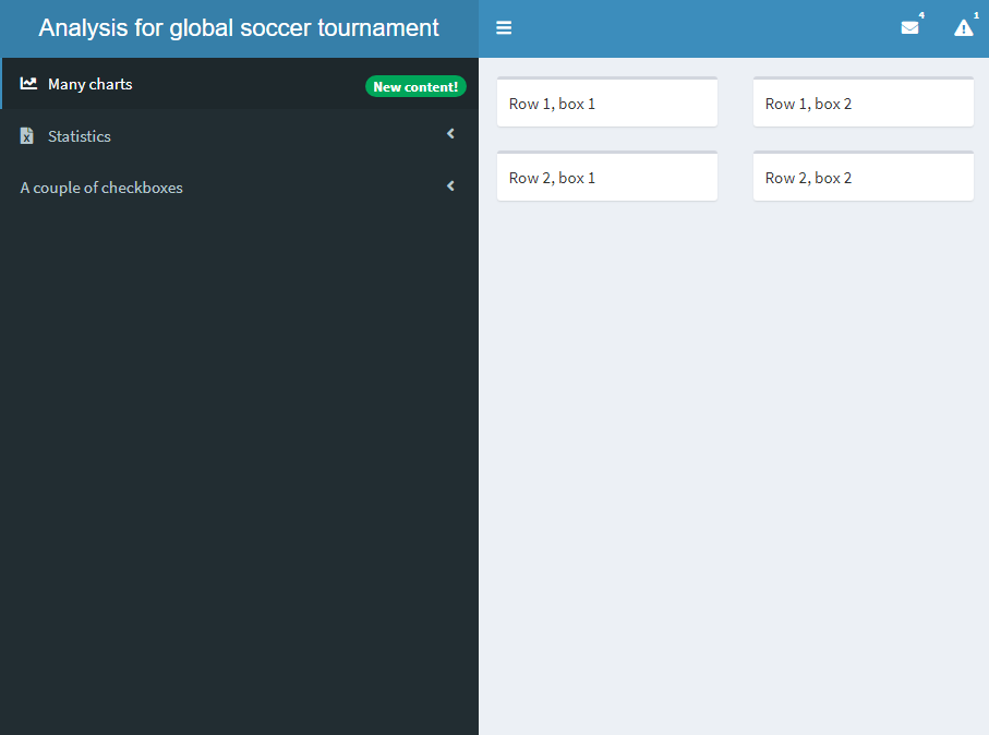
fluidRow() ile satırlar ekleyinbox() ile kutular ekleyin
body <- dashboardBody(fluidRow(box("Satır 1, kutu 1"), box("Satır 1, kutu 2")), fluidRow(box("Satır 2, kutu 1"), box("Satır 2, kutu 2")))

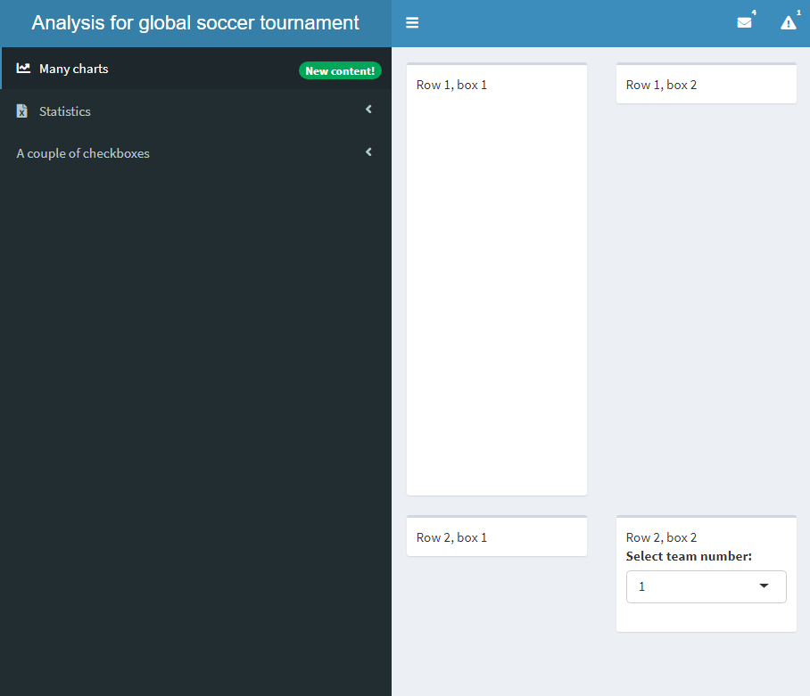
body <- dashboardBody( fluidRow(box("Satır 1, kutu 1",plotOutput('plot')),box("Satır 1, kutu 2")), fluidRow(box("Satır 2, kutu 1"), box("Satır 2, kutu 2",selectInput("select", "Takım numarasını seçin:", choices = c(1,2)))))
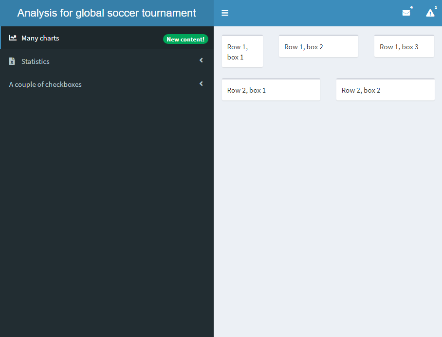
width ayarlayınbox() eklemek şiddetle önerilir
body <- dashboardBody(
fluidRow(box("Satır 1, kutu 1"),
box("Satır 1, kutu 2"),
box("Satır 1, kutu 3")),
fluidRow(box("Satır 2, kutu 1"),
box("Satır 2, kutu 2"))
)
body <- dashboardBody(
fluidRow(box("Satır 1, kutu 1", width = 3),
box("Satır 1, kutu 2", width = 5),
box("Satır 1, kutu 3", width = 4)),
fluidRow(box("Satır 2, kutu 1"),
box("Satır 2, kutu 2"))
)
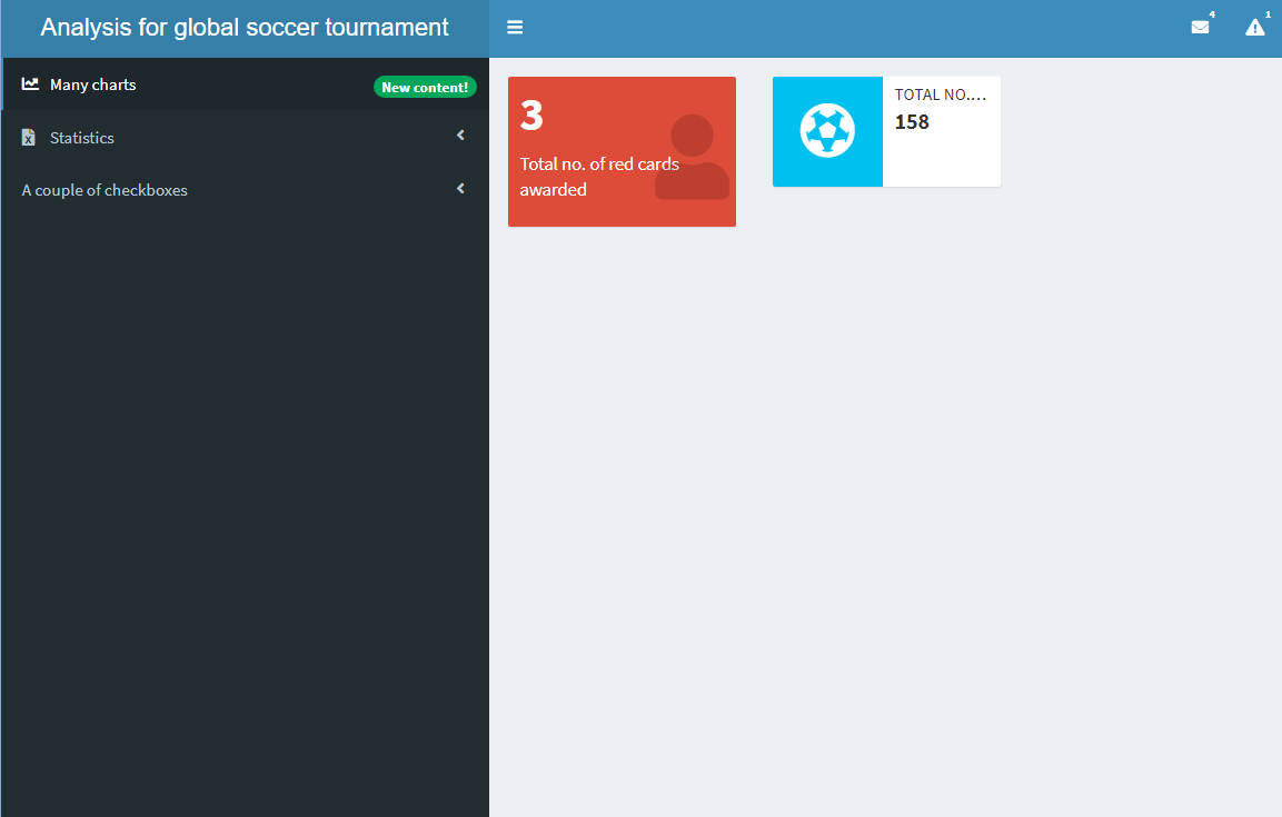
valueBox()infoBox()
body <- dashboardBody( fluidRow(valueBox(value = 3, subtitle = "Verilen kırmızı kart sayısı", icon = icon("user"), color = "red"),infoBox(value = 158, title = "Atılan gol sayısı", icon = icon("futbol")) ))
valueBox() ve infoBox() çeşitleri:
valueBoxOutput() ve infoBoxOutput()renderValueBox() ve renderInfoBox() da vardırvalueBox() ve infoBox() gereklidir
body <- dashboardBody(
fluidRow(valueBoxOutput(outputId = "valuebox1"),
infoBoxOutput(outputId = "infobox1")
))
server <- function(input, output){
output$valuebox1 <- renderValueBox(
valueBox(3, "Verilen kırmızı kart sayısı",
icon = icon("user"), color = "red"))
output$infobox1 <- renderInfoBox(
infoBox(158,
title = "Atılan gol sayısı",
icon = icon("futbol")))
}
plotOutput():renderPlot():server() içinde yer alırggplot() nesnesi içerirvalueBoxOutput():renderValueBox():server() içinde yer alırvalueBox() nesnesi içerirtabItems() eklemeliyiztabItem() ile tanımlanırmenuItem()-tabItem() çifti etiketleri eşleşmelidir
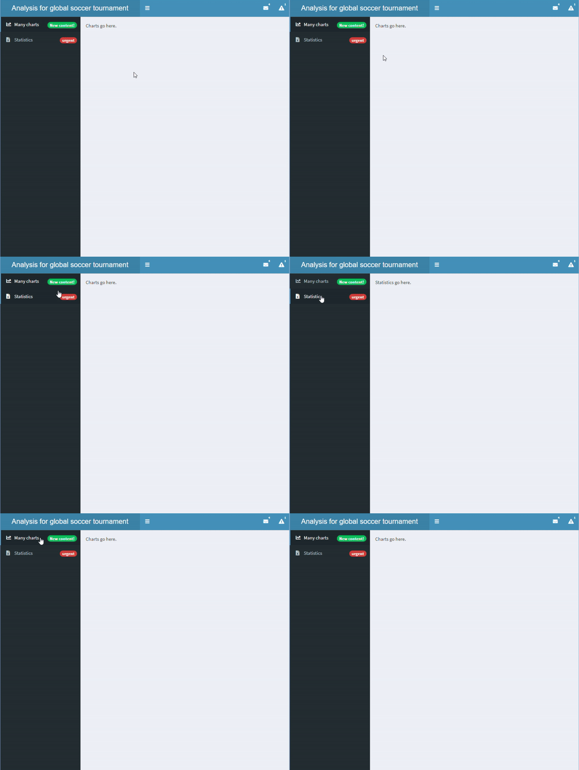
sidebar <- dashboardSidebar( sidebarMenu( id = "pages",menuItem("Many charts", tabName = "charts", icon = icon("chart-line"), badgeLabel = "New content!", badgeColor = "green"),menuItem("Statistics", icon = icon("file-excel"), tabName = "statistics", badgeLabel = "urgent", badgeColor = "red") ))body <- dashboardBody( tabItems(tabItem("charts", "Grafikler buraya gelecek." ), tabItem("statistics", "İstatistikler buraya gelecek." )))
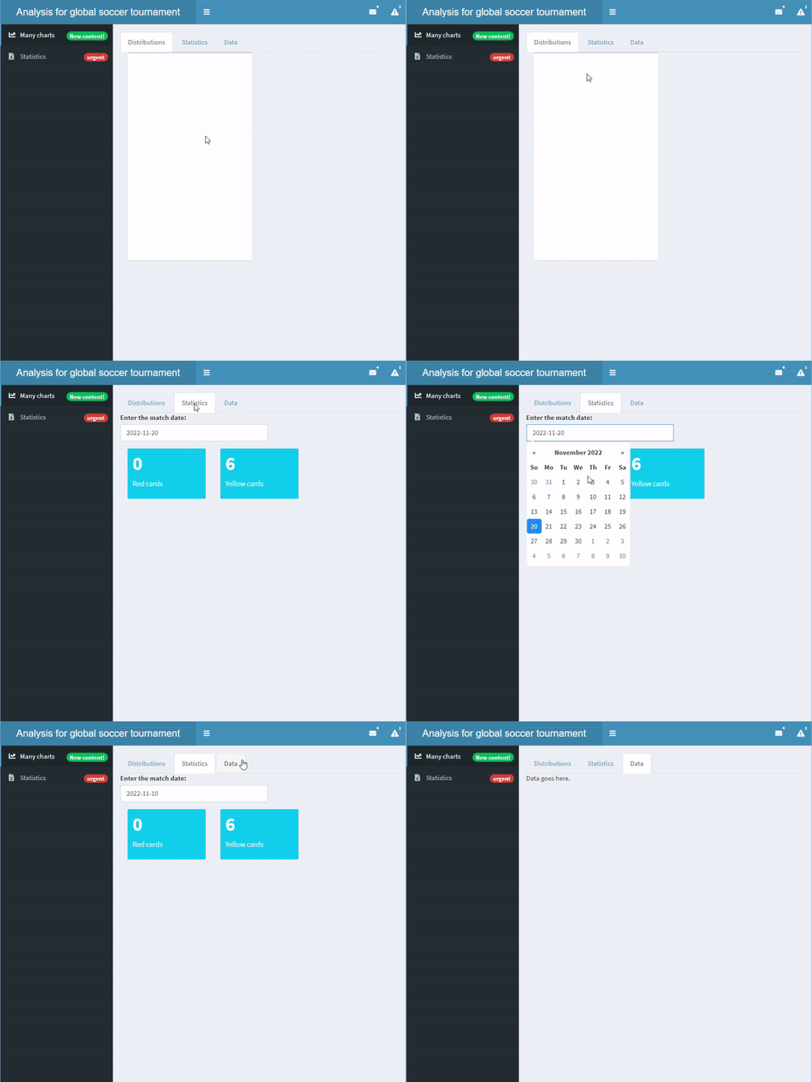
tabsetPanel() ile de tanımlanabilirtabPanel() ile tanımlanırtabItems() ve tabItem() ile karıştırmayın
body <- dashboardBody(tabsetPanel(tabPanel("Distributions", box(plotOutput("dist"))), tabPanel("Statistics", dateInput("matchdate", "Maç tarihini girin:", value = "2022-11-20"), valueBoxOutput("red"), valueBoxOutput("yellow")), tabPanel("Data", "Veri burada.", tableOutput("data"))))server <- function(input, output){ output$red <- renderValueBox(valueBox(0, "Kırmızı kart")) output$yellow <- renderValueBox(valueBox(6, "Sarı kart")) }
shinydashboard ile Panolar Oluşturma